


And ... we're off!


The start of the new trading year always feels a little bit like a horse race, only one that is the second one run by the same horses in a given day. Why do I say that? Because we always have the memory of how the last race - 2023 - ended. Will the momentum continue? Will there be profit-taking by traders? How will asset allocators react?
Aside from the noise of the early days - though there are those that contend the first five trading days of the year set the tone for January which sets the tone for the year - I am trying to stay disciplined to process. For me, there are still three scenarios in play for 2024: 1. Soft landing and Fed cuts rates: this is the scenario that the market has fully priced according to me. 2. Hard landing and Fed rate cuts: I would say this is the scenario the bulls are still focused on and we are getting data right now that can prove or disprove that. 3. Soft landing and no Fed cuts: this is the scenario I am becoming more aligned with right now, which would lead to lower markets but not nearly as much as in scenario 2.
Below, I put in a series of charts that I did for Investopedia’s Chart Advisor this week in conjunction with the CMT Association. Thus the email is a bit long, apologies for that. However, I wanted to make sure to look at everything I need to at the start of the year.
There are a few charts I didn’t put in that series because the data was coming out this week. I am putting those here right now.
Soft or hard landing?

The first place I want to look at for this is the ISM. I have discussed that plenty of times. ISM Manufacturing, which has a longer history and correlates better with stocks and bonds that ISM Services, looked like it was headed there, being dragged by new orders. However, it started to bounce and stabilize mid-year giving soft landing bulls hope. ISM came out this week and was inline to a little better at 47.4. That is the good news. The bad news is ISM New orders fell to 47.1 from 49.1 expected. Thus, there is still some doubt as to whether we get a recession this year.

I also wanted to look more at ISM All which is services + manufacturing. I also created a new orders composite for services + manufacturing. I look at the max history of these series and they only go back to 1996 (compared to 1947 for the others). I drew a line at 49. The thing is, it is really hard to get a strong notion of when and where a recession starts looking at this combined metric. It probably gives an idea of the magnitude of the recession, but not really when one starts or not. That said, ISM Services was the weak news of the new year, coming in at 50.6 vs 52.5 expected with Services new orders at 52.8 vs. 56.1 expected. Services - travel, restaurants and even healthcare - certainly carried the day in 2023. It is starting out by showing signs of weakness. I will continue to watch.

Ultimately, the difference between a soft and hard landing comes down to jobs. I tried to coin a phrase last year that never took off: job-full recession. It was meant to convey the exact opposite of the post GFC world which was a jobless recovery. That economy helped Wall Street and left Main Street behind. The job-full recession is meant to help Main Street and leave Wall Street behind. If we look at jobs in finance vs. the rest of the economy, that is starting to happen as the biggest layoffs are in investment banking. We also see more wage growth in Main Street jobs. This week, we got the non-farm payrolls number. It was stronger than expected which gives people a sense the soft landing can happen. However, it also meant the market started to ever-so-slightly price rate cuts out of Fed Funds Futures. The important metric to me with this series is 0.5%. Whenever the unemployment rate has risen by 0.5% from the cycle low (3.4% in this case), we have had a recession. I show this back to 1970. We are at 3.7% right now so not there. We can say “it’s different this time” but those are the four most dangerous words in finance. Right now, still soft landing. Let’s watch the next two months.

What does that mean for the short-term technicals. This one is a busy one but I think for now, in the very short-term, 460 is support for SPY. That is the white horiztonal line which was previous resistance. That is if this price action to start the year is just some noisy profit-taking by traders, with allocators and retail in 401k still buying. That is where if the strong trend from the end of 2023 continues, we would bounce. If the move lower is a little deeper, meaning that some money flows are reversing and not just profit-taking, we could pull back to the 426-438 area. This is the 38-50% retracement of the move from the December 2022 low to December 2023 high. A pullback to this level would still keep the longer-term bull trend intact. Only below there would I get worried and that would have to come from a growth and earnings scare.

Speaking of earnings, that is the next catalyst. it will start in earnest near the end of the month. I put in this table to show you that right now the bar is pretty high on earnings growth. Another way to see this is the high P/E on trailing and forward basis. Something else to keep in mind but it will matter more in a few weeks.
Finally, I will leave you with a week’s worth of charts that I put together for Chart Advisor at Investopedia. It is a really good service that I would recommend. Each week you get a series of charts from a different Chartered Market Technician that have all sorts of careers in finance. I was lucky to do it this week. It is easy and free. I copied those newsletters into LinkedIn articles that I shared this week. They are all below. I hope you enjoy. Please let me know your thoughts as we start the year. I would love to hear it.
Stay Vigilant
Some charts to start the year

Rich Excell CFA, CMT
Experienced hedge fund PM | Professor | Investment Exchange Forum & Macro Matters Podcast | Excell with Options and Stay Vigilant blogs
January 2, 2024
Open Immersive Reader
Yield Curve
One of the core tenets of technical analysis that is taught by the CMT Association but that is often overlooked by many who are beginning their technical journey is intermarket analysis. We too often want to look solely at a price chart of an individual security and make our decisions. However, there is a robust well of information that exists either in economic data we may only analyze in the moment, or in asset classes that we tend to not pay attention to. As I have been fortunate in my career to work in equities, foreign exchange, commodities and fixed income, I understand the depth of information other asset markets can bring to the equation.
My approach at Stay Vigilant is to demystify the world of finance for the average investor. I call it demystifinance. I try to show how an institutional investor may consider fundamental, technical and catalyst information to make an informed decision. My hope is that you can as well. A major part of my work is intermarket and intertemporal analysis. This is what I will dig into this week.
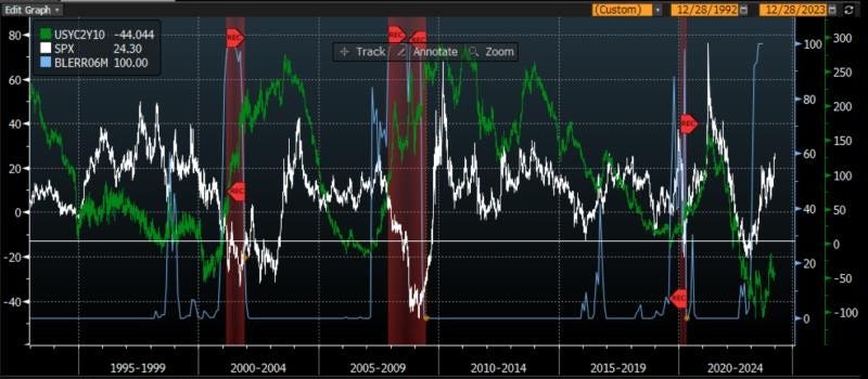
The first chart today considers the yield curve. Many have heard that the yield curve predicts recessions. This is correct as the yield curve has a perfect hit rate. However, a big problem is that it has long and variable lags i.e. a recession could occur anywhere from 3 months to 2 years after it inverts. This may be why many were too negative in 2023. There is a logic as to why it should work as an inverted yield curve makes it less appealing for banks to lend money, which eventually slows the economy.
This first chart looks at three things - the 2 year vs. 10 year part of the yield curve with a horizontal line drawn at 0 to show where it inverts, the Bloomberg consensus economist odds of a recession in 6 months, and the yearly returns of the SPX. We can see three things: 1. A recession (red-shaded area) does occur after the curve goes below 0 2. The consensus economists only get this pessimistic right before a recession 3. SPX yearly returns are always negative once a recession happens. While none of this may be immediately actionable, it is an important backdrop to keep in our heads.
Correlation
The most fundamental decision for investors, particularly at the start of the year, is whether (and how much) to allocate to stocks or to bonds. There are many approaches an advisor may take in helping a client reach this decision, but the fundamental premise is that the stability of fixed income can provide ballast to a sometimes volatile equity portfolio. As such, concepts such as the 60-40 portfolio for individual investors or risk parity for institutional investors have become quite common.
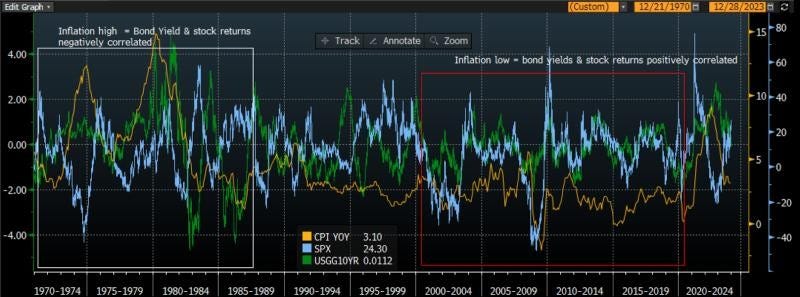
The second chart today looks at the correlation of stocks and bonds. For bonds, I use bond yields because I can get a longer time series of information. Remember, when bond yields go higher, bond prices go lower and vice versa. I look at the relative performance of stocks and bonds and compare it to inflation as measured by CPI. Inflation, after all, may have been THE story of 2023.
This chart shows that inflation is critical to the correlation of performance between stocks and bonds. On the right side of the chart, in the red box, I show that when inflation is low, stock returns and bond yields are positively correlated. This means stocks and bonds are negatively correlated. This is because the only concern is then growth, which means when stocks go higher on positive growth outlooks, bond yields (prices) go higher (lower) on expected higher rates. When stocks go lower on negative growth outlooks, bond yields go lower on expected Federal Reserve rate cuts. In both cases, stock prices and bond prices move in opposite directions meaning one hedges the other and provides a balanced portfolio.
However, on the left side of the chart, in the white box, we can see that in periods of high inflation/CPI, the opposite is true. Stock returns and bond yields are negatively correlated which means stock prices and bond prices are positively correlated. This is because the market is focused on inflation - higher inflation means higher yields expected and lower stock prices as inflation hurts margins. In these periods, the portfolio that consists of both stocks and bonds is not hedged as both assets move in the same direction. This is exactly what we saw on the negative side in 2022 and is what we have seen on the positive side in Q4 of 2023.
The question then remains for the investor: what is your view of inflation in 2024? Inflation will impact the move of stocks and bonds relative to one another.
Stocks vs. Bonds
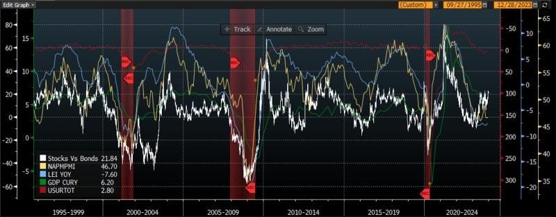
Sticking with the stocks vs. bonds relative performance, I create an indicator from the ratio of the total return of the SPX Index and the US Treasury bond index. I compare this relative performance to economic indicators that get tracked and discussed in the market. After all, the economy leads earnings and earnings lead stocks. If the economy is doing well, all else equal, stocks should do well. If it is not doing well, stocks may struggle.
We saw in the first chart that both the yield curve and the consensus economists suggest there could be struggles in the economy sometime in the next 6 months. What about other indicators that may be more timely than these?
The first two you should consider in this chart are the US ISM Index (NAPM PMI) and the Leading Economic Indicators (LEI). Both of these are coincident with the stock market, which itself is a leading indicator. You can see that both of these headed lower for much of 2023 but have flat-lined a bit of late. As these stopped going lower, the relative performance of stocks vs. bonds has shot higher, perhaps much more than the economic indicators may suggest if history is a guide.
Two other economic data points I add on this chart are GDP (green) and the US unemployment rate (inverted in purple). I add these on the chart in order to show you that both of these data points lag the relative performance of stocks and bonds quite badly. While many in the news like to discuss these data points extensively, both are lagging as to the point of being almost useless for most market practitioners.
FOMC Rate Cuts
The final chart I want to show is the yearly performance of the SPX compared to when the FOMC cuts its discount rates. After all, if the economy has risk to it as some of the other charts suggest, that should mean the FOMC will cut rates. This should be good for stocks, right?
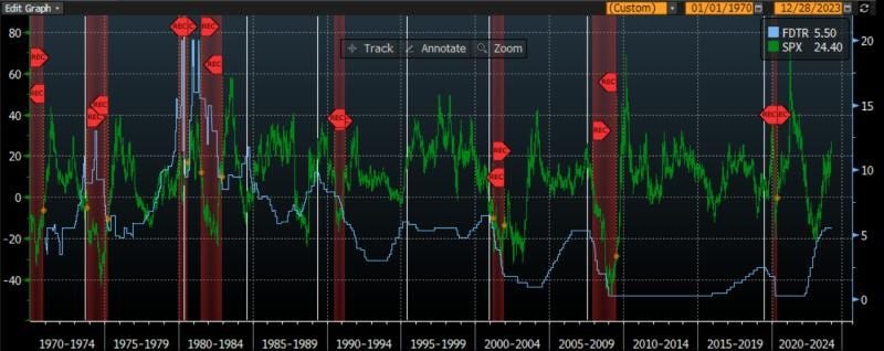
The market has been pricing in 6 rate cuts throughout 2024 even though the market broadly speaking is expecting a soft landing and not a recession. A soft landing is when the growth slows down but people don’t lose their jobs.
I look at 50 years of Federal Reserve Discount Rate and SPX yearly return data. I have drawn vertical white lines when the FOMC is cutting rates. The red-shaded area indicates when there is a recession. What you can see is that the FOMC has cut rates 8 times in these 50 years and there has been a recession 6 of these times. The other 2 times were what we would call a soft landing.
We can also see that if in fact we get a soft landing, the SPX yearly returns are positive. If we get a recession, the SPX returns are always negative. This would suggest the market returns right now are suggesting a soft landing with FOMC rate cuts forecast to occur. One finer point, however, the keen eye may see that the SPX yearly returns were negative in the period leading up to the rate cuts ahead of a soft landing. Thus, the market seems to have been responding more to no recession than actual rate cuts.
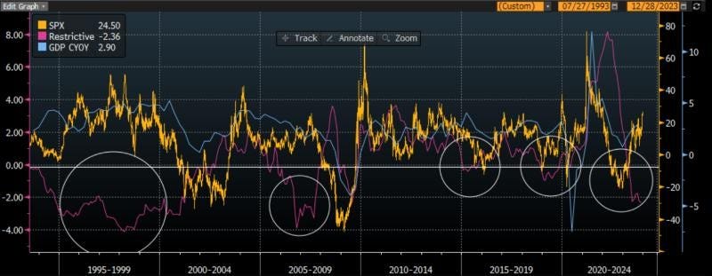
Restrictive Policy
Today I want to build on the concept of intermarket analysis, where we look at economic indicators, fundamental data and prices from other markets to help us assess the market that we invest in. We discussed the outlook for growth and inflation yesterday, and ended with the FOMC rate cuts and the economic soft landing being priced into the market.
The first chart today tries to anticipate why many in the market think the FOMC needs to cut rates in 2024. For this chart, I have created a custom index called ‘Restrictive’ which is simply the difference between CPI and the Federal Reserve Discount Rate. When this number is below zero, it means the Discount Rate is above the CPI and this policy may be deemed restrictive. When it is above zero, it means inflation is higher than the Discount Rate and the policy may be deemed easy. I compare this pink line to the yearly change in the SPX Index and the yearly change in GDP.
If we look at this pink line, when it has been below zero in the early 00s, around 2014-2015 and then in 2019, this restrictive policy has led to shrinking GDP and negative SPX returns. Right now, the policy by this measure would be deemed restrictive, yet we have seen neither negative SPX returns nor a shrinking GDP.
We can draw a parallel to the mid 1990s when this policy was also restrictive for quite some time but we saw neither negative growth nor negative equity returns. This is the soft landing period that we mentioned yesterday. This was a period of very strong global growth, particularly in emerging markets, that led to what Alan Greenspan referred to as a ‘savings conundrum’ with money flowing into the US from savers abroad. Perhaps this is what created easier financial conditions even though the policy was seen as restrictive.
Thus, investors today need to ask themselves if there are any exogenous factors that are making conditions easier today in the face of restrictive policy. This is what we may need to support economic and equity performance right now. Could it be an expansive fiscal policy? Could it be retiring Baby Boomers spending in the services economy? Could it be the development of AI?
Housing Market
One part of the US economy that is always a tried and true indicator of strength or weakness is the housing market. Given the large ‘multiplier’, housing stimulates economies by the large number of jobs created, the wide variety of products that need to go into a house, and the incremental of spending that results from orders for lumber, to copper for plumbing & electricity to the money spent at local diners by the workers. As a result, many people track housing as an important indicator of what may happen in the economy.
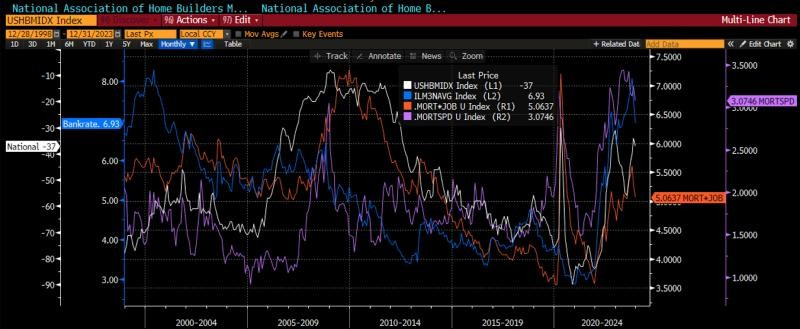
One critical data point that many investors follow is the National Association of Home Builders (NAHB) Index in white on the second chart. It is a composite index of strength or weakness in the economy and here I have inverted it so it lines up with the other data. It was strong in 2021, weak in 2022, started 2023 with a sharp bounce but has recently been struggling. What is leading to this?
The first suggestion would be mortgage rates. On this chart I use the average 30-year mortgage rate in the US in blue. We can see that it was historically low throughout the 2015-2021 period but moved sharply higher in 2022 and 2023. Federal Reserve rate hiking was a key driver to this but perhaps not the entire driver. I want to explore that because if the FOMC is set to cut rates, this could be a tailwind for housing.
The purple line is a custom index I created called mortgage spread (MORTSPD). It is the difference between the 30-year mortgage rate and 10-year US Treasury. I look at this spread because banks that provide mortgages will hedge their interest rate risk with the most liquid US Treasury which is the 10-year. Historically this spread averages between 1.5-2.0%. You can see that in 2023, this spread surge to 3.5%, the highest in 20 years. What happened? While we don’t know for sure, there are two things that I can think of that we may want to consider: 1. The Federal Reserve is shrinking its balance sheet which includes mortgage-backed securities 2. A banking crisis in March of 2023 has many banks unable or unwilling to make new loans. This is important as it may suggest some stickiness in how quickly mortgage rates will come lower even if the FOMC lowers rates.
The last line is another custom index that I created that I think does the best job of indicating the health of the housing market. Mortgage rates tell one piece of the story but as we all know, if mortgage rates are 0% and we do not have a job, we will not buy a house and take out a loan. Similarly, if mortgage rates are high, but we have a good job, we can afford those higher payments. My first mortgage was 8%. Thus, my custom index simply combines the 30-year mortgage rate and the US unemployment rate. You can see that this indicator did a better job of calling for strength in housing early last year when rates alone did not. It is still giving us a better signal, primarily because of the strength of the jobs market. This is another case where the soft landing (remember a slowdown with no job losses) is helpful to the economy and markets.
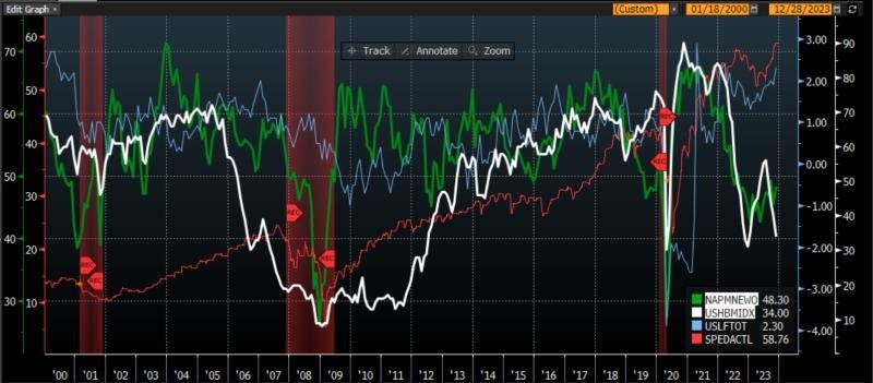
H.O.P.E.
A simple way that strategists have tried to capture this housing dynamic is in the acronym H.O.P.E. This stands for housing -> orders -> profits -> employment. The acronym covers how money/stimulus flows into and out of the economy. As lower rates make housing more appealing, the housing market picks up. This leads to a range of new orders for lumber, roofing, windows, copper and even furniture and landscaping. As companies start to process these new orders, they will start to generate profits. It is only after a company has been profitable for some time, that it starts to add workers and employment improves. This works in reverse too as a housing slowdown leads to a reduction in orders, declining profitability and then layoffs.
The third chart shows you visually this H.O.P.E. dynamic using the NAHB Index for housing, the ISM New Orders measure, S&P adjusted earnings per share and finally the yearly change in US labor force. As we look back through time, we can see that housing in white leads new orders in green. The next line to move is the profits in red and finally the employment in blue. The employment data is the most lagging of all of these, which is why I get less excited about it the first week of every month than everyone you may see in the media or politics.
Is the recent slowdown in housing a foreshadowing of tougher times ahead or was this just a blip in the data that will be reversed as mortgage rates come lower? This is a critical question that investors need to ask themselves.
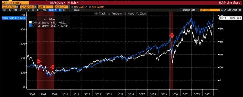
XHB vs SPY
Finally, we can pull this together by looking at the performance of the housing ETF (XHB) and the S&P 500 (SPY). You can see that this ETF ever-so-slightly leads the SPY into and out of not only recessions but also bigger moves higher and lower in the market. It was the rally in XHB from the late fall 2022 into the early part of 2023 that presaged the move higher in SPY for the year. It was also the fall in XHB from August through October of 2023 that led to the move lower in stocks across the board. Since then, the XHB has rallied sharply coincident with the strong rally in all assets into the end of 2023.
Can this rally continue? This is the question that should be top of mind for investors as we start 2024. As goes housing, so goes the US economy and the broader US stock market.
Asset Allocation
The investment process I have developed in my 30+ years in the market has three parts to it: fundamental, technical and catalyst. Much like technical analysis, my process is fractal that means it can work at any scale. For technical analysis that means we can use the same indicators for hourly, daily, weekly or yearly. For my process, that means I can use this approach at a single security or at a portfolio level. Essentially, if a security has fundamentals, technicals and catalysts in its favor, it is a full sized position. If only one is in its favor it is ⅓ of a position. If two categories cancel out, there is no position and I only watch. Much like all of technical analysis, this approach keeps a discipline that allows me to assess what at times seems to be competing flows of information.
The last two days, using the intermarket analysis, I covered areas that I would put into the fundamental category - growth, inflation, FOMC policy and portfolio construction. The next two days I will dig into the more technical portion of the process using more traditional technical charts.
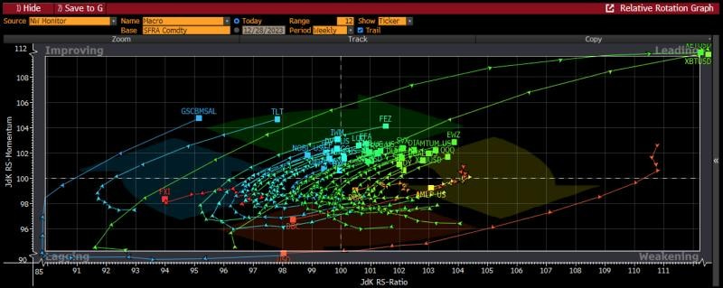
The first chart today is the Relative Rotation Graph (RRG) that I first learned about when I was studying for my CMT charter. I find this graph to be immensely powerful in that it can encapsulate flows and sentiment across a number of products in one graph. A trader or investor can set it up however they want, using the products and benchmark that they wish.
I have used a Bloomberg NW screen that holds ETFs and Indexes across a range of products. As the benchmark, I use SOFR futures, which is a 3-month cash rate with the idea that anyone can prefer cash to these products.
There are four quadrants on this chart starting in the upper right and moving clockwise: leading, weakening, lagging and improving. Assets in the upper right are leading all other assets and attracting the most attention and flows. Those in the weakening category are former leaders that are starting to wane in importance. This is a critical sign of potential weakness. The next category is lagging and these are the assets that investors are leaving behind and not paying attention to. You don’t want to be here. However, every laggard eventually starts to improve and moves to the upper right. Therefore, I always find the lower left and the upper right to be the most actionable places.
A quick glance shows us that the crypto products like Bitcoin and Ether are the clear leaders over the past 12 weeks while oil, commodities and China are the clear laggards. There is nothing really in the weakening category as the commodities have gone through here and into lagging. DBA - the agriculture ETF - is the only thing in the weakening category.
Most interesting to me are the number of products that are in the improving category. This includes; small caps, dividend stocks, emerging markets, bonds, buywrite ETFs and most favorite short indexes. For a market that has been criticized for not having enough breadth, there are a large number of laggards that are showing improving momentum right now.
Financial Conditions and IWM vs. SPY
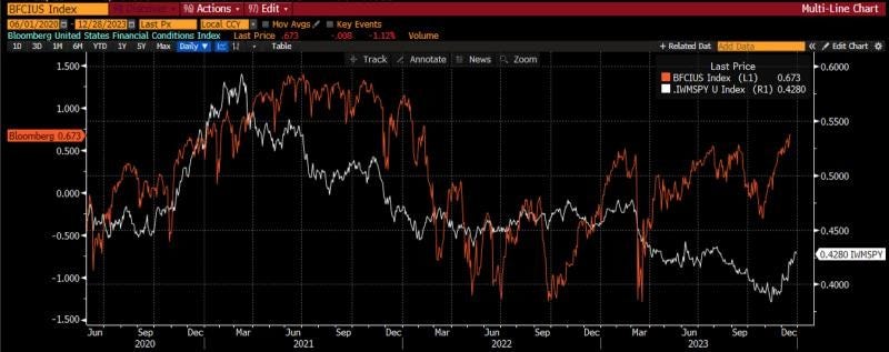
Speaking of small cap stocks, these had largely missed the entirety of the 2023 stock market rally until the last month of the year, when over 90% of the annual returns occurred. What drove this? We can perhaps see this in the second chart today.
On this chart I plot the Bloomberg US financial conditions and compare it to the relative performance of small cap stocks (IWM) and large cap stocks (SPY). There is intuitive logic in what the chart shows us. It says that as financial conditions improve, small caps tend to outperform and do the best. However, when conditions get more difficult, investors seek the safety of larger cap stocks.
We can see this as the very easy conditions in 2020 led to large IWM outperformance. However, as investors began to fear the removal of this stimulus, and then the active Fed policy at tightening conditions, the IWM went on an extended period of meaningful underperformance, that began in mid-2021 and lasted until December of 2023. Over the last month, the IWM has been one of the top performing assets and is in our improving category. What has changed? Financial conditions have begun to get easier again.
Commodities, FX and Rates
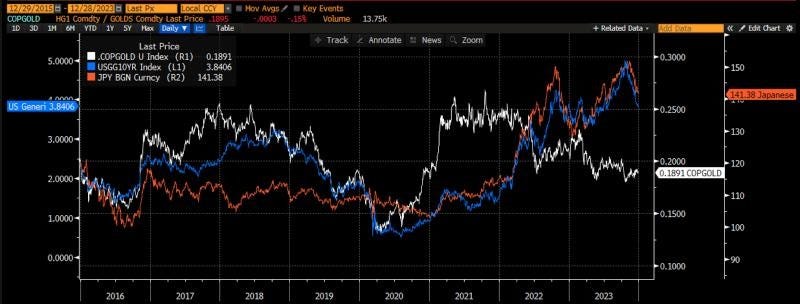
The third chart is a core chart for me. I make sure that I always make sure I know where these assets are. The blue line is the 10-year US Treasury yield. It is the benchmark rate upon which we price all other assets - mortgages and corporate bonds as a spread, foreign government bonds as a spread, commodity futures and equity multiples. I tell my students that if they can only remember one market measure, they should know 10-year yields. As we saw in the RRG, bonds had a very good Q4 and we can see that 10-year yields have fallen from 5% to under 4%. What is driving this?
The first reaction may be FOMC policy and this is certainly a component of it. However, there are some other drivers that I want to highlight. The first is the white line which is the ratio of copper prices to gold prices. This is a ratio that bond kings such as Bill Gross and Jeffrey Gundlach have both said is a ratio they strongly consider. This ratio measures the commodity market perception of global growth. Copper is a commodity that is used in plumbing and electricity, whether that is in residential housing or the electrification of the grid. It is used globally. When commodity investors are positive on growth, you can see copper outperform gold. When they are negative on growth, copper suffers on a relative basis. We use gold because it takes out any FX effects. It is a pure measure of global growth expectations. We can see this has been falling for much of 2022 and 2023 in spite of the stronger US economy.
The orange line is another important line. It is the USD/JPY FX rate. Japanese investors have the largest pool of savings in the world. These investors seek better returns outside of their home market when they feel the time is right. For much of 2023, Japanese investors, who are the largest owner of Treasuries, were less interested based on the FX rate. However, all of this changed in Q4 of 2023.
Both of these factors are leading to lower 10-year US Treasury rates, which underpin the pricing of all other assets. Can it continue in 2024?
Global Equity Flows
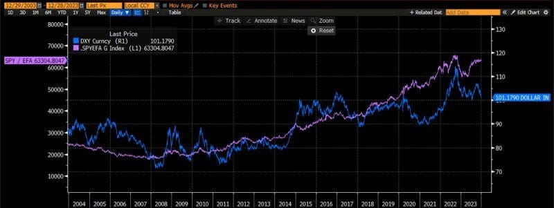
I started my career in the FX market and one thing I learned very early on is that FX rates are impacted by investors' perception of returns. FX doesn’t drive money flows, it is a symptom of money flows. As the saying goes, money flows to where it is treated the best.
As investors feel the relative growth rates are the highest in the US relative to the rest of the world, investors tend to prefer US assets, namely US equities, relative to other assets. Thus, we see a strong dollar index at this time. When investors feel global markets have a higher return potential, money flows outside the US and the dollar weakens.
We see this from 2004-2010 as investors thought returns would be higher outside the US, there was an outperformance of EFA which is the MSCI EAFE ETF. From 2011 through 2023, however, investors have preferred US markets as we see SPY outperforming EFA quite materially over this period. As a result, the dollar strengthens over the entire period. As we ended 2023, we started to see small signs of the relative performance of SPY starting to wane vis a vis EFA and have seen the corresponding weakening of the dollar index. Is this a trend that will continue in 2024?
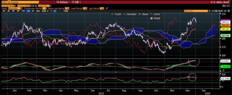
At this point in the process, I am now starting to dig into more specific measures that can give me near-term actionable ideas. This is when I turn to things such as daily charts to give me a signal for how I should be thinking of ideas that may have percolated earlier in the process.
A chart I have used since my days in FX in Asia, is the ichimoku kinko hyo chart. It translates to one glance equilibrium chart’ and there is a tremendous amount of information in the one chart. Without getting into the weeds too much, the cloud is the area of the market where the majority of investors have gotten either long or short. When the cloud is rising, it shows investors bullishness as they are willing to pay higher prices on average. When it is falling, investors are getting more bearish. Thus, we care where the current price (white candles) are in relation to the cloud. As the current price is well above the region where people have gotten long or short, this shows the bulls are firmly in control of the tape right now. The lagging span (red line) is a delayed measure of strength and it is also above the cloud suggesting a very strong tape for IWM right now.
I add two elements to this chart to give me extra information. In the middle panel is the MACD or moving average convergence divergence. This tells us the direction of moving averages and whether they are pointing in the same direction or at risk of crossing. We can see these moving averages have been pointed in the same direction - higher - for the last two months, a sign of strength. However, we can see that they are starting to flatten out and the shorter moving average is beginning to look like a risk of moving below the longer moving average. This is a yellow flag, not yet a red flag, and indicative of a trend that is weakening.
A momentum indicator that I use that can corroborate this is the RSI or relative strength index, in the bottom panel. I use the default setting of 30 and 70 which tells me that when the price is above 70% of the readings of the last year or below 30% of the readings of the last year. This indicates overbought or oversold conditions. You can see this reading is 72 right now which is not only high in absolute terms but is higher than any RSI reading of the last year, telling me the IWM is currently very overbought, another short-term yellow flag.
Well the trends look strong for IWM, there are still some yellow flags that investors should be wary of.
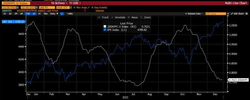
My single favorite measure for short-term performance is the ratio of put volume to call volume in the options market. I look at a 20 day moving average to smooth out the noise. I began my career in the options market and have used options extensively throughout my career. I understand the important information that can be gleaned by assessing what investors are doing in the options market. Are they seeking insurance? Yield enhancement? Leverage to a directional move?
While I can’t glean all of that from a single indicator, I find that the ratio of the put-call 20 day moving average does a very good job of indicating, or at least confirming, market direction in the short-term. When this ratio is falling, investors are trading more call options on a relative basis. This may be for yield enhancement or for directional leverage but either way it indicates investors are largely feeling pretty positive. When put volumes go up on a relative basis, investors are feeling nervous, as they do not systematically hedge but rather hedge when needed as option premium can be a drag on performance.
We see this in the chart. As the white line moves lower, investors are more bullish and the SPX heads higher. As the white line moves higher, investors are getting more bearish at the margin and the SPX begins to move lower. This index has been heading lower for the last two months. It looks like it is beginning to bottom and may head higher. This is another yellow flag for me. Not actionable to short the market, but certainly something I am watching closely. Given the price action this week, I would expect this to turn higher and give a short-term sell this week.
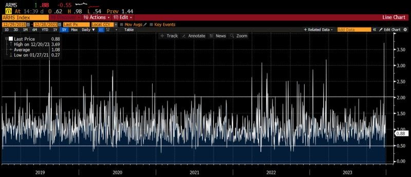
The next short-term measure I like is the ARMS Index. This index looks at the number of advancing stocks vs. declining stocks and compares them to the volume of advancing stocks vs. declining stocks. This is a good way to assess whether the overall market is getting overbought or oversold.
I have drawn two parallel lines at the levels that have historically indicated market-wide overbought or oversold conditions. The overbought level is when the index gets above 2.0 on any given day. The oversold level is when it gets below 0.50 on any given day. One could also choose to smooth this out by using a moving average if one prefers.
We can see that the market had spiked to some extremely overbought readings in the month of December, but has quieted down and normalized of late. There is no strong reading from the index right now which might give traders comfort that the entire market is not overbought at the moment.
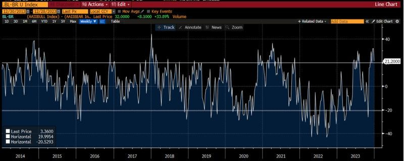
The final measure I want to consider is the American Association of Individual Investors Bulls. Vs. Bears measure. This is a long-time newsletter that assesses whether individuals are bullish, bearish or neutral. I have found that looking at the difference between bulls and bears can give me a good sense for when investors are too bullish or too bearish.
There are some that say this measure is no longer relevant as the market structure has changed through the years. However, I find it works as well now as it has always worked. The critical areas for me are when bulls outnumber bears by more that 20% (the upper vertical line) or when bears outnumber bulls by more than 20% (the lower vertical line).
Right now, bulls outnumber bears by about 21%, which tells me there is some widespread enthusiasm in the market among small investors, another yellow flag that I see as I look through the charts.
In summary, there are more warning signs than all-clear signs as I look through the short-term technical indicators, something we should all be wary of.
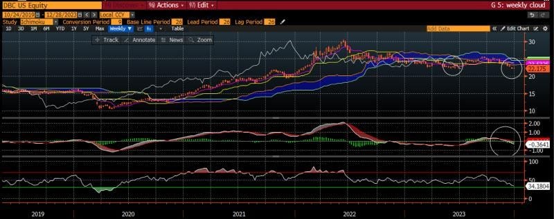
DBC Weekly chart
This week we have been looking at the market using intermarket analysis trying to assess the fundamental trend and the technical indicators that can give us a guide to what can happen with markets in the short and medium term as we enter the new year. We have seen some signs of a recession as we look forward, be that the continued inverted yield curve, leading economic indicators or the ISM. It should not be surprising that consensus economists see a very high probability of a recession in the next 6 months. Perhaps the cause of this is the restrictive policy of the Federal Reserve which has historically led to a weaker economy and lower stocks. Even the H.O.P.E. indicator is pointing lower with the recent rollover in housing, though the pullback in mortgage rates may suggest this is just short term weakness.
Lately we have seen the laggards in the market showing improving signs with emerging markets, small caps, dividend stocks, buywrite ETFs and bonds all doing well. In fact, small caps have done so well in the last two months that the daily chart is looking overbought on the RSI and the MACD may be rolling over. Add to this, short-term indicators like the AAII Bull minus Bear and the Put-Call ratio are giving some yellow flags that short-term there might be some risks.
With this in mind, it is time to look at the weekly charts across several asset classes to see where they stand. As it stands, investors are often faced with a choice of bonds, commodities, domestic stocks and international stocks. Sure, there could be other choices but these tend to dominate most 401(k) decisions.
The first asset I want to look at is the commodity market and I use the DBC ETF as the measure here. I use a weekly ichimoku chart with a MACD and RSI to get a sense of trend and momentum. I have circled here three things which I want to draw to your attention. The first is that prices have broken below the ichimoku cloud, which means that the bears are now in control of the tape. Not only that, the lagging span has also broken below the cloud which is indicative of a stronger negative signal. Add to this, the MACD has crossed below and is trending lower. All signs are indicative of a lower commodity market in the medium term. This ETF is not yet oversold so one can’t make the case it is overdone.
The question an investor should have when they see that is whether the weakness in commodities is being driven by higher supply or lower demand. Is global growth slowing so much that commodities weaken or have prices fallen so much that companies are producing more supply.
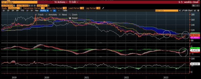
TLT weekly chart
The second chart I want to consider is the TLT ETF which is what many investors use for the bond market. As the ETF is actually an index of bonds with 20+ years to maturity, it has a longer duration than 10-year US Treasuries. However, as it is more easily traded by more investors, it tends to be the one most people follow.
I have also drawn three circles on this chart. The first two indicate that the bond market is running into some resistance at the ichimoku cloud, with both prices and the lagging span running into the cloud here. Before people think this suggests that prices should turn around and head lower, I would draw your attention to the circle in the middle panel, the MACD, where the trend is still pointing higher. While there may be some resistance, the trend is still higher and so a consolidation might be more likely in the bond market. This may be consistent with either falling inflation or slowing growth, both of which we can discern from the DBC chart.
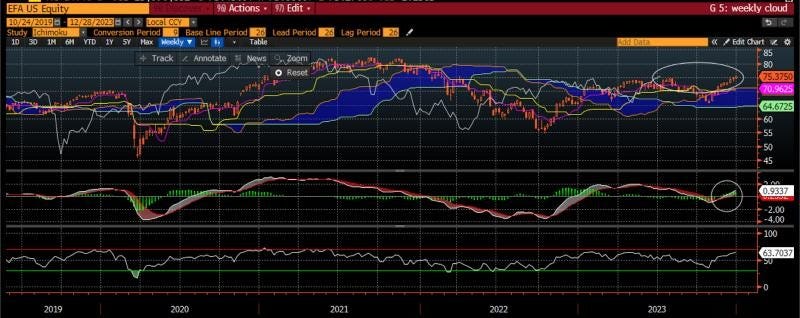
EFA weekly chart
The third chart is the MSCI EAFE ETF. EFA is the measure of global developed market stocks outside the US. Two days ago we looked at how this ETF has lagged the US for the past decade. We also saw that on the relative rotation graph, it is in the improving category. Is it time for this ETF to really start to work?
Looking at the weekly chart, EFA has broken out in both price and lagging span (oval) above the ichimoku cloud. This suggests some strength with bulls in control, though with a flat cloud, it isn’t as bullish as if the cloud itself was starting to point higher. However, the MACD is also turned up and heading higher which corroborates that the trend is looking positive. If global developed stocks look strong, does this suggest that the commodity and bond market prices are more indicative of falling inflation than slowing growth?
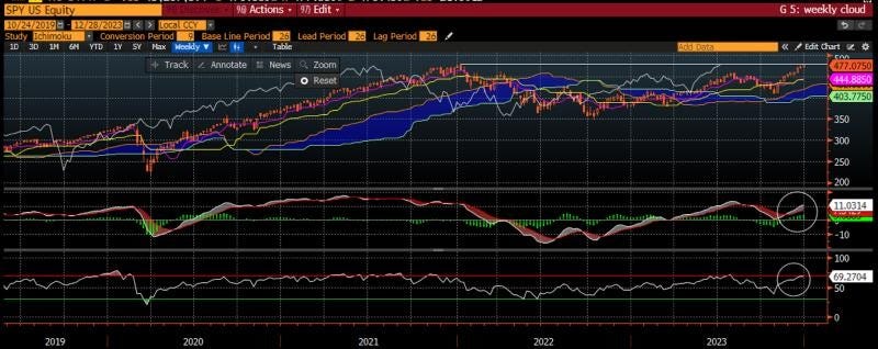
SPY weekly chart
Finally, the chart that is probably the most discussed chart in the world. This is the chart of the SPX Index. In this case I look at the weekly ichimoku cloud with MACD and RSI again, but using the SPY ETF to stay consistent with the other ETFs.
On this chart I have drawn a vertical line in the top panel which is drawn at the 2021 highs showing that while the bulls are in control with prices above the cloud, they are running into resistance at the old highs. The momentum indicator in the bottom panel (RSI) is also into overbought territory which may corroborate that we are running into resistance at these levels. The middle panel is still showing that the trend is higher and so any weakness would be consolidation of gains and not the start of a broader move lower. Once again, this is probably more consistent with falling inflation and not any concerns on the economic growth front, even though we can see there are reasons for that from the economic data. In fairness, for all of 2023, we had reasons to be negative based on economic data but the price action of the market told us to stay positive. This may be one of those times again.
I hope this week you have been able to learn a little bit about my process which may have taught you some new tools to use that will help your own. Good luck in 2024 and Stay Vigilant!
