Fire!
Shouting fire in a crowded theater is not protected speech in the real world. It can also cost you a lot of money in the markets. Unless there is actually a fire.
For those who have been following my blog all year long, you know that the second part of my investment process looks at the behavioral elements of the market. As I talk about in class when discussing individual equities, there is the fundamental of the company and the fundamental of the stock. There is what is likely going to happen in the business, and what is already priced into the stock. One needs to be aware of both of these. The same is true in the markets. We need to know what the fundamental trend of the economy, of money supply, of velocity etc. is. However, we also need to consider what is already being priced into the markets.
In a week like we have had this week, that is increasingly important. For those of you on social media, I am sure you have been deluged by many shouting “Fire!” after the massive move lower in equities and fixed income on Thursday. It was definitely a tail-risk type of move to be sure. However, was it the final capitulation of months of weakness or only the beginning? These are the important questions you need to ask yourself. What is being priced into the market and do I agree with that?
When I look at what is priced into the markets I want to look at sector performance and factor performance. We can do the empirical research to know what sectors and factors have worked when growth is rising but prices are still low, when both growth and inflation are rising, when inflation is still high and growth is slowing, or when growth and inflation are both falling. I use these quadrants because they help crystalize the Fed reaction function since its focus is on both growth (full employment) and inflation (price stability). I have done this work myself through time and have my students update it each semester so they can see for themselves what is working or not. It can be more enlightening when you do your own empirical analysis instead of just being shown a slide and say ‘trust me’. Never trust someone who says trust me.
On a year to date basis (and really going back until last October), energy has been the leading sector. Early in the move from October to February, we had materials and financials keeping pass. Technology has been the big loser over this entire time. This is classically what I would call stagflation - energy, materials lead and tech lags - where growth is slowing but still high and inflation is staying high. In the last month or two, there has been a subtle change. Utilities and Staples have been creeping up the table and now stand in second and third place year to date. These defensive sectors moving up has much more of a deflation - growth going into recession and inflation falling - feel to it. At the same time, markets are now down double digits. I have shown the graph before but the only time SPX returns are negative is when the ISM is below 50 and falling. Investors seem to be preparing for this. A lot of economic negativity (which I clearly seen in the fundamental trend) is getting priced into the market.
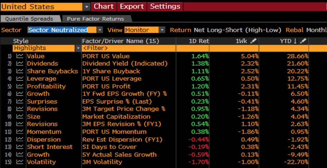
The same is true in the factor work. Importantly, I look at the sector-neutralized factors to take OUT the effect of the sectors above. When you see charts of SVX vs. SGX, the sectors are not taken out so you are really seeing both sector AND factors working. I want to look separately. You can see on a YTD basis, investors prefer Value, Dividends, Buybacks. They want cheaper companies that are delivering cash to shareholders in some way. They hate growth and volatility. This is behavior that looks like the deflation I referenced above. Investors are pricing in inflation that leads to recession that pulls prices down. Yes, I see the same things other investors do. Yes, I think a lot is getting priced in.
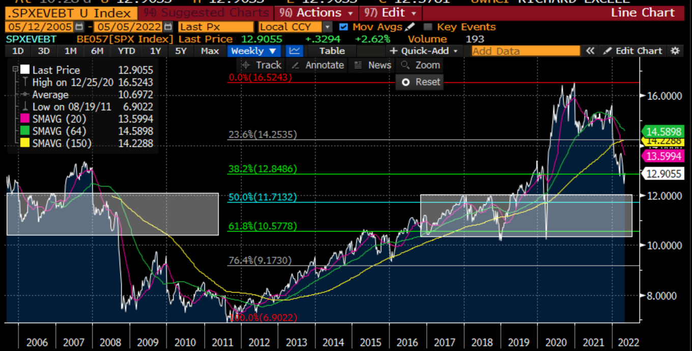
I told you before that I think of valuation as a sentiment index. It ultimately is as the amount an investor is willing to pay for a stream of earnings is not constant over time. I have said that finance is about cash flows and discount rates. When the Fed takes the risk-free rate higher, discount rates are higher. Multiples are the inverse of discount rates. Multiples also measure the conviction of cash flows. When conviction wanes, because of recession fears, multiples suffer. We can look at a variety of multiples. The one that works across the most sectors is EV/EBITDA. Enterprise value is all holders - equity and bond. EBITDA is the money available to all holders before leverage and taxes. We can see that the extensive monetary and fiscal stimulus in 2020 drove this investor confidence to all-time levels. However, it has been in retreat for a year. I have highlighted where it normally tends to stabilize. This is all finger-in-the-air stuff of course. However, using some technical analysis and seeing where things settle you can suggest that somewhere in the 11-12x EV/EBITDA feels like home. We are just below 13x now. So more downside.
Another way to think of the multiple is to compare it to the yield that investors are willing to pay for corporate bonds. The Baa Index and the SPX Index are about the same when it comes to creditworthiness. So the ‘price’ we pay for bonds and the ‘price’ we pay for stocks should be about the same. Yes, different parts of the cap structure. The price won’t be the same. The trend in the price will be the same. We can see that bonds have had a more difficult time this year. I have shown on LinkedIn how I felt there has been an overwhelming preference for credit over equities since the GFC. Thus the trade is more crowded and acting more poorly. Equities cannot bottom until credit does. However, an eyeball of this again suggests and 11-12x EV/EBITDA might be a decent place to end up. Again, more downside, but we may be closer to the bottom than the top.
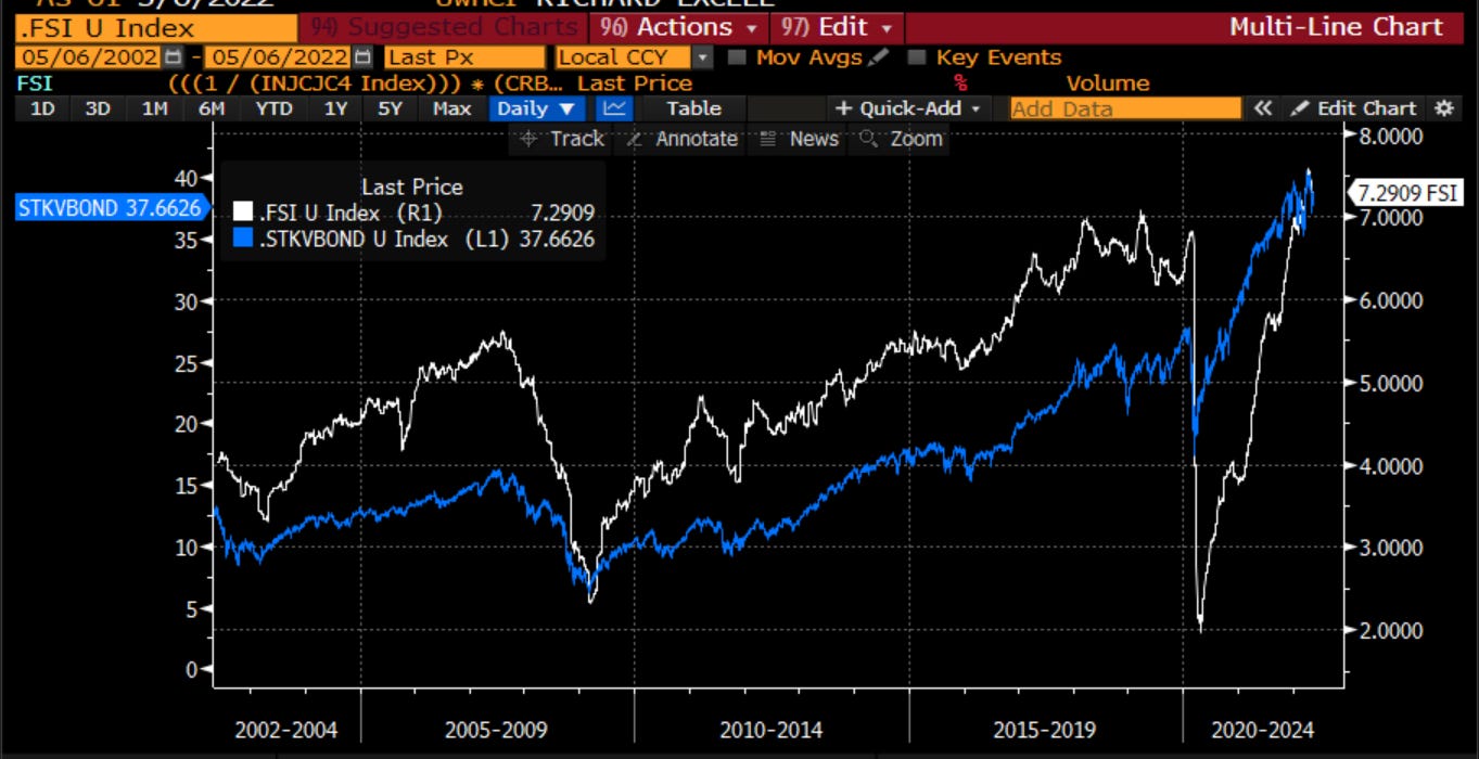
One of my favorite indicators is courtesy of Ed Yardeni, a very good follow on social media, and someone I have followed for the last 20 years. He has a fundamental stock indicator which looks at confidence, commodity prices and jobs. These three measures encapsulate all you need to know for what drives stocks. Here, I have plotted it vs. the ratio of SPX total return to Treasury total return in my own indicator. You can see there is a reasonable pattern to it. This suggests it might be too early to panic out of stocks and into bonds as the indicator is still pointing out. Given I felt bonds were the more overvalued asset class of the two for the past year, I am not surprised at this.
Digging into confidence more closely, I look at a number of measures of confidence. I look at small business confidence, Conference Board confidence, Univ. of Michiganc confidence and housing prices. The biggest difference between Conf. Board and U of M is the former focuses more on jobs and the latter more on inflation. That is why Michigan is down more. However, it isn’t alone. Small businesses have been downbeat for some time now. One indicator holding in there is house price. However, you can also see that housing did not keep up with the higher confidence numbers in the 2016-2018 period so there was some catch-up to do.
Looking at housing more closely, as I know it is the major topic of FinTwit now, I look at housing starts and existing home sales relative to both the change in mortgage rates and the change in the job opening/labor turnover index. House decisions are affected by mortgages but also by jobs. If mortgage rates are zero but I don’t have a job, I am not going to buy a house. We see that in 2005-2007. Rates were going lower yet jobs were too so housing numbers came down. Post crisis, housing stats did not pick up until jobs did. Right now, jobs are still holding in pretty well so it may be a little too early to call for a major top in housing but given the massive change in mortgage rates, this is definitely an area I want to keep watching. Also, housing leads the economy into and out of recession, so getting the timing right on housing affects our views on the economy.
Looking more closely at the sentiment and behavior of the markets, I have combined a few measures of risk for the markets to see if there is any panic or reprieve. I look at a moving average of put/call levels, the shape of the VIX curve and the global financial stress index. Both are still pointing to levels of risk moving higher and continuing to do so, and none are pointing to the panic we would normally see in order to sound the all-clear.
One part of the options market that has me a little confused is the level of skew in the market. Skew - the difference between the implied volatility on puts vs. calls in the equity market - is the way that traders adjust for the faulty assumptions of the Black-Scholes model. It is driven by end user demand. Options are insurance. Insurance for an equity portfolio are puts that reduce one’s exposure to the market when bad things happen. However, instead of just buying insurance, which is a drag on returns, many choose to also fund this by selling calls. Thus we see this constant skew in pricing, which typically elevates before and during sell-offs. When we look at current levels of skew, measured with a couple different indices, skew is pretty flat relative to normal. This suggests there is no panic at all among the active managers with the moves lower. Perhaps they were already hedged or had raised cash. Either way, this tells me that we are again within striking distance of a low.
Some may point to the high levels of the VIX. They would say ‘the fear gauge of the market is high’. However, I never felt this was a good description. Fear is when the level of implied volatility (what we think COULD happen) is much higher than realized volatility (what IS happening). This is fear. This is insurance premium. However, if the spread between them is not that high, there is no fear. Right now, based on the last 5 years, we are at levels of implied volatility that match the realized volatility. We are dead in the middle of the distribution. Implied volatility is high BECAUSE realized is high NOT because we think things get worse. Realized is high because of the broken microstructure of the market due to passive flows. Thus, while the market is volatile and can be expected to stay so with liquidity being reduced, there is no FEAR in the market right now.
There was one measure of fear that hit the markets yesterday. The ARMS index measure the volume in stocks trading lower vs. the volume in stocks trading higher. When this number is high, people are puking out of their stocks that are down. When this number is low, people are adding to longs. Yesterday, we got above 2.0 which is historically a number that signals an oversold condition. With the reprieve in stocks today, it is lower. You can see a few times in the last week there has been an oversold market. Again, we are getting close to a low.
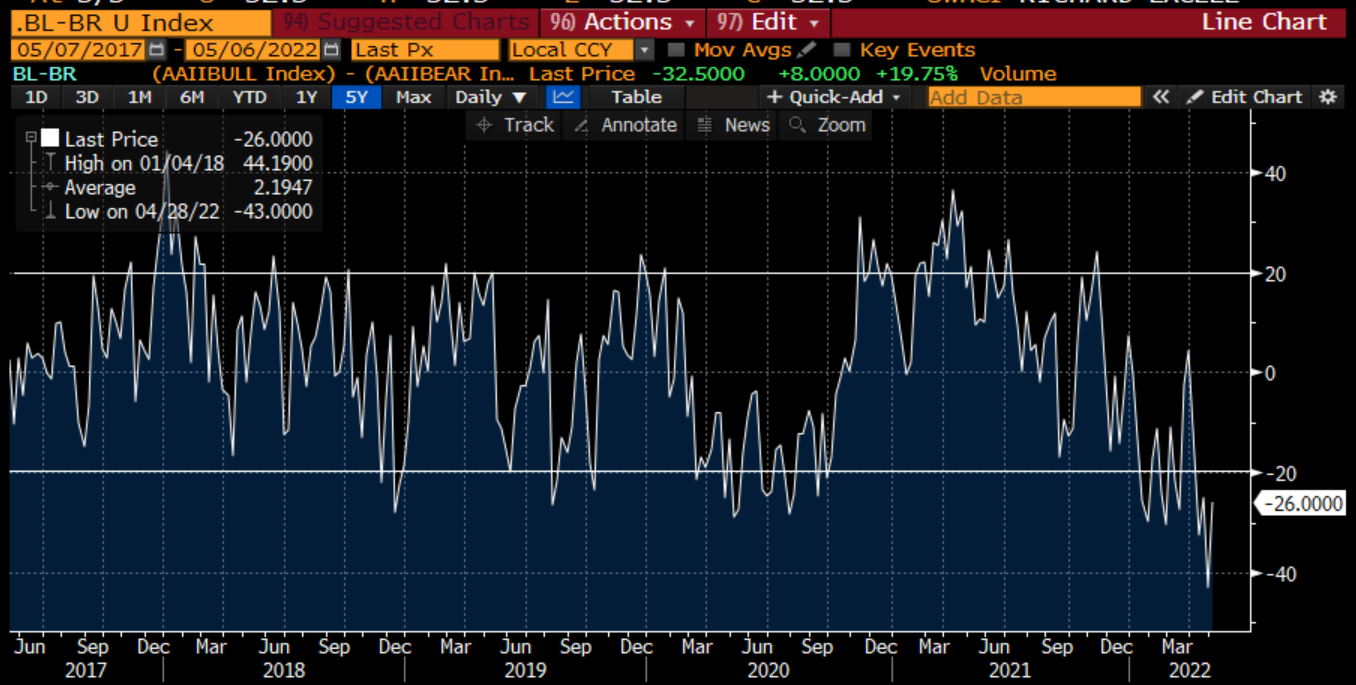
Who is giving up on stocks? If institutional investors are not panicking, who is selling things into oversold conditions? It appears retail investors. AAII measures the number of bulls and the number of bears. When Bulls outnumber Bears by 20% points, it usually is a contrarian indicator that people are too upbeat. Similarly, when Bears outnumber Bulls by 20% points, people are too pessimistic. We recently got to a level of 40% more Bears than Bulls. This is the highest number of Bears on a long time. This is a signal of too many people on one side of the boat.
I like to think of new indicators too. Our industry and our economy is always being disrupted. Some of the disruption is in high growth tech. Some of it is in private markets that are attracting money and talent much better than public markets. Some of it is in Defi that is disrupting TradFi. All of these disruptors are getting smashed this year. The common theme is that they do not generate near term cash flows. Their valuations are dependent on implied future growth. They are susceptible to changes in discount rates as we present value that stream of cash flows. You can see in this chart that all such disruptors haven’t found a bottom just yet.
Continuing on with trying to get a sense for where sentiment sits, for where pain thresholds are breached, I look to technical analysis. The daily chart of the market still suggests there is downside in the days and weeks ahead. This is suggestive of a waterfall decline. We are not oversold in the medium term and no sign of a change in sentiment.
On the weekly chart over the last 5 years, you can see we are breaking down a bit. We appear to be at a point where there could well be a reversal of a trend that has been in place for years. Again, it suggests more trouble ahead for the market through the summer.
What are other asset classes saying? Stocks will struggle to bottom until discount rates bottom. The building block for discount rates is the 10-year US Treasury. It has broken out of a 35 year channel of lower yields. Similarly, one of the great suppliers of capital to the world is the Japanese investor. Given the differing policies of the BOJ vis a vis the Fed, the Japanese Yen has been weakening meaningfully. This is leading to some painful disruption among global investors. This is, imho, a big reason for the move lower in in the 10-year bond (higher in rates). We might not quite be there yet.
My favorite indicator of 10-year yields is the ratio of copper to gold. It was telling me all of last year that bond yields were too low. Right now it is giving me the opposite signal, that 10-year yields have overshot on the upside. I must respect this signal.
Equities also cannot bottom until credit bottoms as I mentioned up top. A chart o the HY bond etf shows no signs of bottoming. In fact, it still looks like it wants to trend lower. Credit leads equities and credit is showing no signs of finding a low just yet.
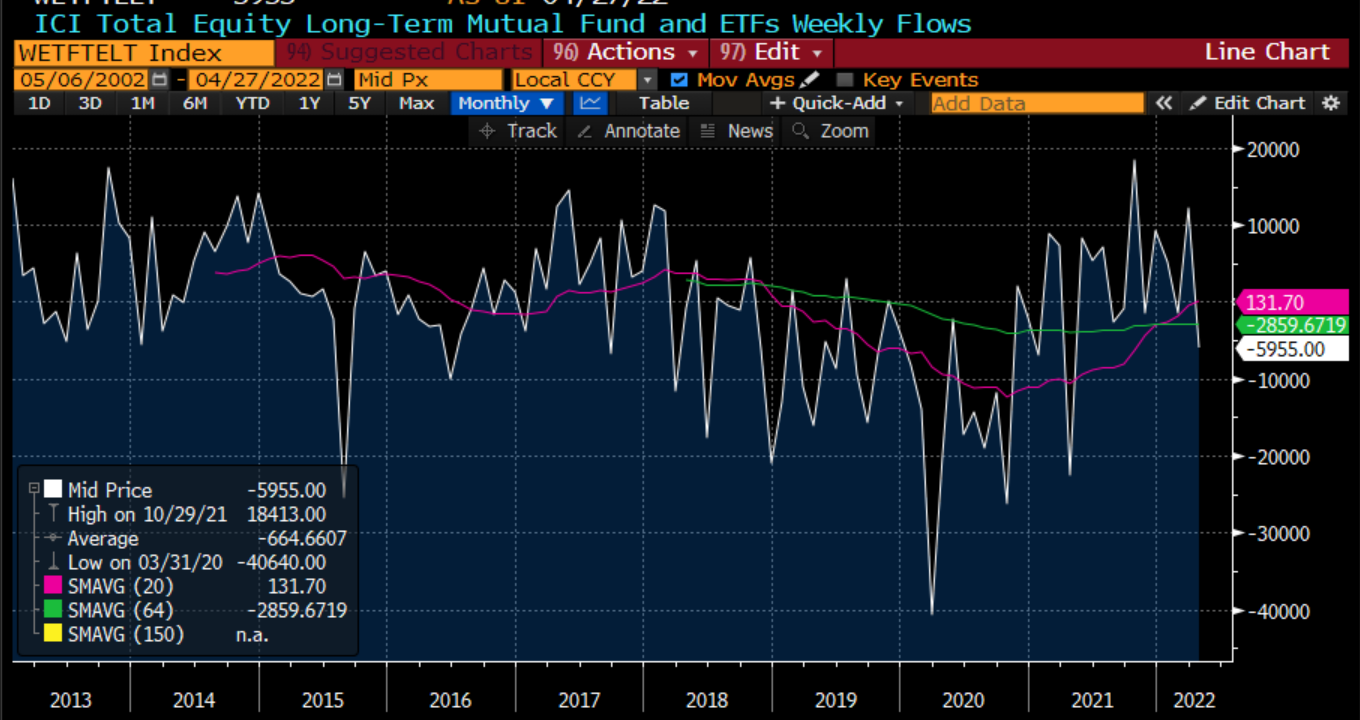
I mentioned at the top, in a world where passive flows dominate, money coming in buys the market and money going out sells the market. There is no thought given as there might be with active management. The flows have turned negative and after years of inflows, we should be on watch for how this continues.
How is corporate America thinking? Throughout this year, there has not been much slowdown in M&A. In fact, this month, Elon Musk announces taking Twitter private. We have not seen a loss of enthusiasm yet in the C suite.
However, private companies are not coming to market. There is a backlog being built. This is a positive if you are an investment banker. This is a negative if you are a private company or sponsor that wants to raise cash. This because of a road block and ultimately can serve to lower valuations in the private market.
All in all, there are some signs that the market is getting oversold. We are pricing a recession and deflation in stocks and factors slowly but surely. There are signs that retail investors are too bearish. There are signs that volumes in down stocks is getting too high. There are signs that institutional investors are showing no panic in volatility and could look to get more involved. This is all good. In the short-term. It does not change the more medium term view.
In the medium term, we could be seeing a change in trend in risky assets. We see a backlog that could slow down the private market. We see the big disruptors in private markets, in tech, in DeFi, still struggling. Ultimately, we will not see a bottom in stocks until we see a bottom in bonds and a bottom in credit. There are no signs we are close to that just yet. Valuation suggests we could still see 2 turns lower in valuation which suggests another 10% lower in stocks. So we might see some short term bounces, but understand the risk into the summer.
The main thing to do is to not panic. Just like shouting Fire in a crowded theater, panic can happen. This means do not panic when markets are heading lower. Look for the signs you need to see when a bottom is in. Also, do not panic when markets get those violent bounces like we saw on Wednesday. The most violent rallies happen in bear markets. The most important thing is to stay disciplined and …
Stay Vigilant









Good to hear from you! This is definitely homage to the 'books' I sent around in the old days, I just spread it out over a month. You are right about these indices. SKEW is almost more of a kurtosis measure. Both are coincident with the market and don't give any signaling. You are right about 90-110. However, maybe ironically, it is pretty flat too...
I tried commenting before but did not show up again, so here goes again, forgive me if it shows up twice. I always enjoyed those 40 pagers that you used to share with me back in the days of LEH and Nomura. Reading through this it was a trip down memory lane. I only recently discoverd that you had a substack. Just one suggestion. Forget SKEW and CSFB---these are flawed indicators that do not represent what you think they represent. Of course it is common to expect put skew to be elevated when the VIX is surging but you often find inverse correlation with these flawed measures which is down to their faulty construction. You are better off measuring skew more directly by looking at 3m or 6m 90%-110%. All the best.