
Good. Better. Best.
A few charts to describe what we are seeing this year and what it means


With the Chicago Bears still rolling in the NFL playoffs, I thought I would stay on that theme. The coach of the Bears, Ben Johnson, likes to use a motivational phrase that he first learned playing football in high school. It has become a mantra for the team and fans can’t wait to get the social media of them chanting it after a victory:
“Good, better, best
Never let it rest
Until your good gets better
And your better gets best”
Words to live by not just for a football team. We should all be striving to become the best version of ourselves, not just in investing but in life overall.
One of the best ways to do that is to continue to expand our universe of sources of information - by country, by asset class, and by source. The more we can understand about how money is flowing in different parts of the world, and in different asset classes, the better we will be at discerning what is happening in the world.
With that, I bring you the charts this week that I think are good, better, and best.
GOOD
First up comes from a note that I shared this week, but which I want to highlight again because I think it is important to watch:
I wrote:
Much of the buzz in the markets is still about AI. It has been the hottest theme for 2 years, and for better or worse, it is still in the headlines every day. Every. Single. Day.
However, while the media has not moved on, have investors? There may be some signs.
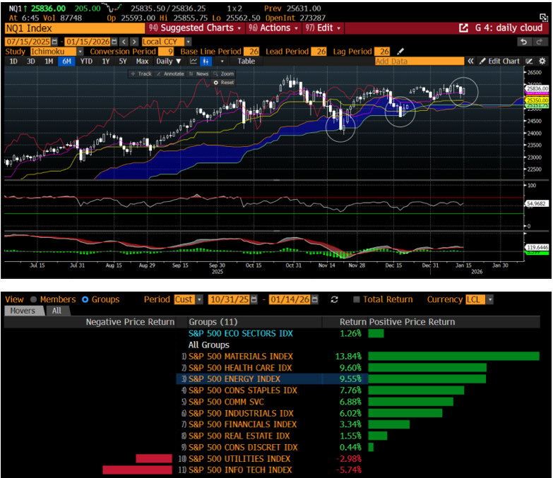
The AI-heavy Nasdaq Index chart is on top. Since the end of October, the highs have gotten lower. This is while other indices like the S&P 500 and Russell 2000 have hit new highs.
It has not broken yet and each time it has sold off to the trend support (see circles), it has held. Thus, it is not a broken chart at all but one we might refer to as 'distributive'.
This is a fancy word that means investors are selling any rally and re-investing those assets in other places. Where are those assets going? Let's look further.
The bottom chart shows you the sector performance of SPX since that Oct 31 high in NDX. You can see in that 2+ months, the index is only up small, just over 1%. Over that same period, the materials sector is up almost 14%. Healthcare and energy are up almost 10%. What about tech? It is down almost 6%. The only other negative sector is utilities, which last year was another AI-themed sector.
Investors appear to be selling out of their AI-theme and moving into a different theme, one that likely includes a view of higher inflation, at least higher commodity inflation, as evidenced by materials and energy.
In fact, in my Applied Portfolio Management, this sector performance would scream Stagflation - views of growth falling while views of inflation are sticky or higher.
Perhaps it is simply rebalancing into those that have underperformed. We have to be open to that possibility. Since Oct 31, the SPX is up 1.25%, the NDX is down and the Russell 2k is up 7%.
Over that same period, the Nikkei in Japan is up 3.7%, the Emerging Markets Index is up 5.55% and the Stoxx600 in Europe up 7.4%.
While many are bearish and calling for meaningfully lower stock prices, they may be missing that money is coming out of the market, or at least the biggest theme in most people's portfolios.
Money is clearly coming out of (or at least not coming into) the US and preferring to go abroad. Within the US, investors prefer small cap stocks. Within the large cap index, investors prefer commodity and healthcare and are coming out of tech.
There is a lot of action going on in the stock market that we miss if we only focus on the moves of a headline index day to day.
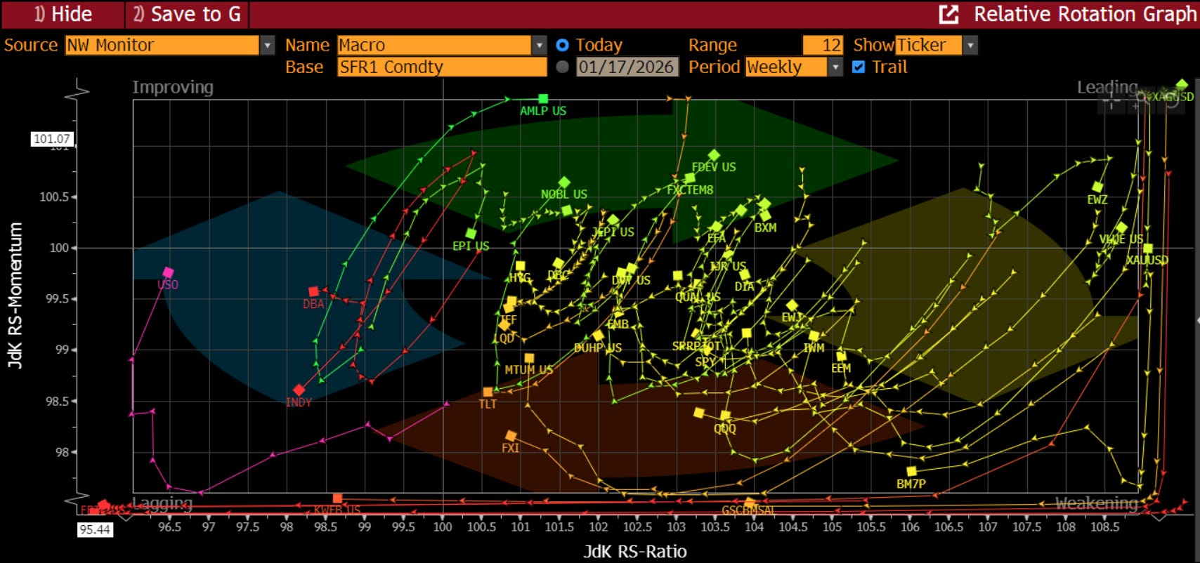
If we dig into the rotation, we can see that the ETF’s/indexes that are leading are assets that have not led the market in some time - developed markets outside the US, pipelines, buywrites, value, and FX carry. The assets that are falling into the dreaded ‘weakening’ category, are Mag7, QQQ, China, EM, bonds (Treasuries and corporates). This likely feels fairly defensive in nature to you, and maybe this is not a surprise given the Q4 growth scare that we have. I think it is important as we have shown that stocks outside the US massively outperformed last year, are outperforming this year, and are still less expensive on a relative basis. Are 401k flows going into indexes and funds that are targeting assets outside the US? I can tell you that an international index I own, that had lagged the previous two years, was up 35% last year vs. the SPX up 17% total return. This is a lot of catch-up in one year, but quite frankly, there is more to go:
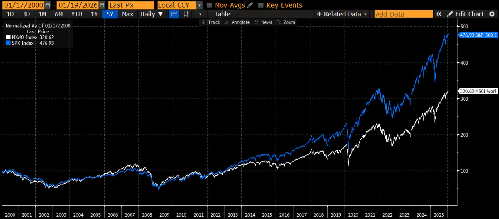
Since the Great Financial Crisis, the US has massively outperformed the rest of the world. Some of this was the US banks, and therefore the economy, recovering more quickly. The bulk is the desire to own US tech stocks, particularly Mag7. However, if tech is lagging now, and the Mag7 is lagging as well, and investors prefer energy and materials, isn’t it better to look for those exposures in markets outside the US, where the exposures are larger in the index? If you want materials companies, isn’t Europe a better place to look than the US?
I explored this on “The Futures Rundown” podcast with Marck Longo this week. You can access it here
Better
Why might investors want to own materials? I explored that:
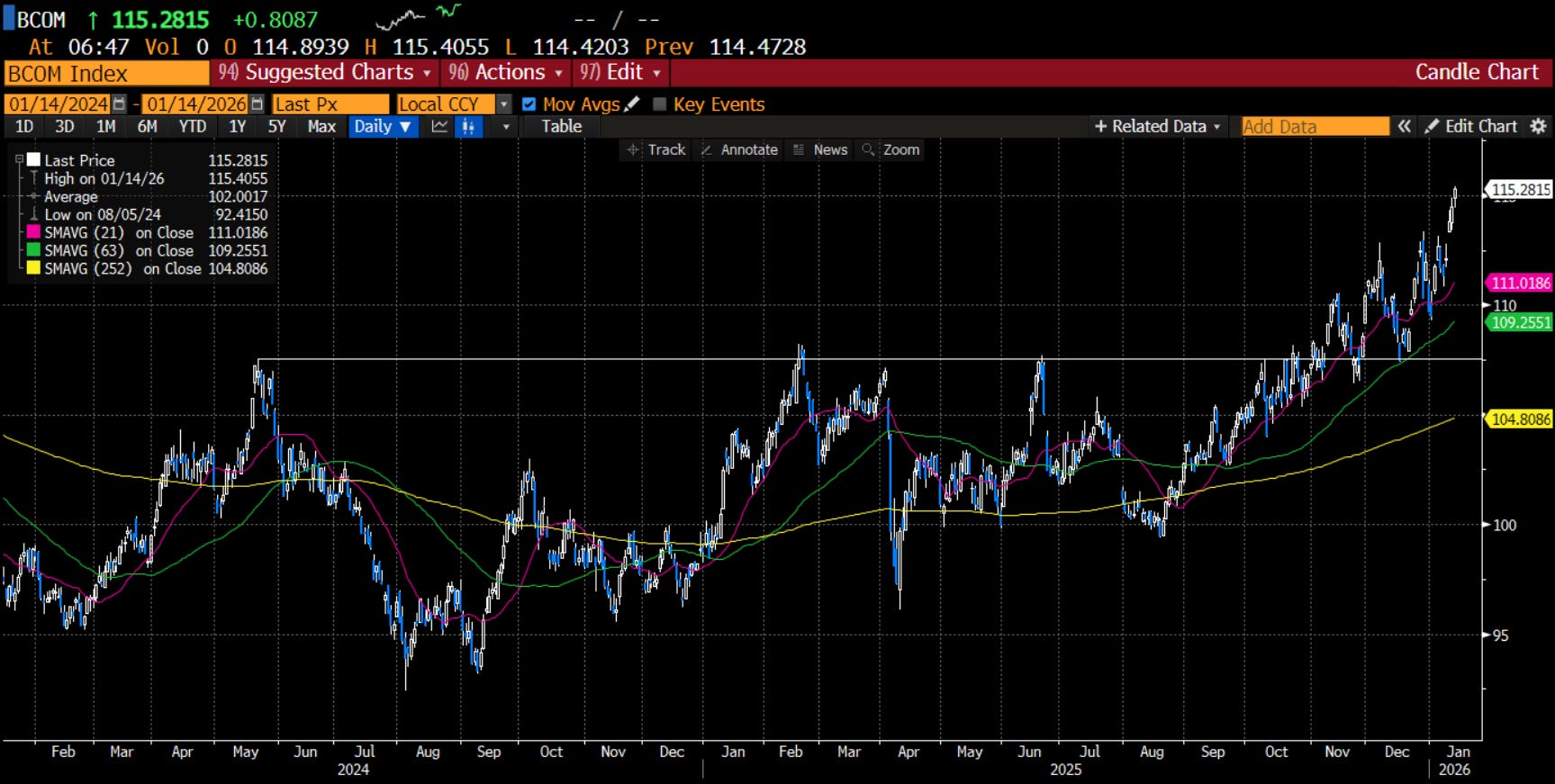
Chart of the Day - still think this is a big story
Perhaps one of the bigger market stories of 2026 so far is the breakout in commodities. Sure, there are plenty of other stories out there, but this may be the one that few are paying attention to, so I want to highlight it again.
Many are well aware of the massive move higher in gold over the past two years. Most are aware that silver caught up and is surging in an unprecedented fashion. I know the word 'unprecedented' is over-used, but in this case, it really is.
Many wanted to compare this move to the short squeeze by the Hunt Brothers in the early 80s. However, this is not some speculation or financial chicanery. Futures are moving higher only because the spot market is going crazy in demand for silver.
China stockpiling silver for solar and other uses is paying a huge premium to build inventories. India made it legal to use silver as collateral for consumer loans and so consumer demand for silver, already high, has exploded. The futures markets are just along for the ride.
Now, copper is starting to catch up. It is a substitute for silver in industrial uses. It’s not just copper, though. It’s nickel, zinc, aluminum, tin etc.
Not to be left out, oil (and by extension gasoline) is marching higher. Oil prices could not go lower on the negative news of the Venezuelan incursion. When prices don't go lower on bad news, that is a sign. It is a sign that traders are too short (they are if you look at the CFTC data). It is a sign that the oversupply in the spot market cannot continue (it can't, MBS will give up). Another sign might be that traders who are short could be fearing that the US gets involved in Iran in a kinetic fashion.
Maybe the only commodity market that still looks bleak is the Ags. With the WASDE report out yesterday, that market was under renewed pressure. Yields were moved higher as were ending stocks. In corn, it was the largest crop in history last year. When one farmer has a good crop that is great. When they all do, uh oh.
In aggregate, though, we can look at the Bloomberg Commodity Index attached. If I didn't put a label on that and asked you "buy, sell or hold" I am pretty confident everyone would buy.
Breaking out to new highs. Short, medium and long term moving averages pointing higher. Not overbought on RSI. MACD crossed and turned higher. Prices have tested the previous resistance/new support and bounced vigorously from there.
This matters for all investors. We can see this move higher in commodities as a potential sign of higher nominal growth. How much of that is split between real growth and inflation is still to be determined.
However, that has implications for tactical allocation across sectors of the equity market. It has implications for FOMC policy (which is likely already leaning toward pausing for a lot of reasons). It has implications for bonds and yield curves.
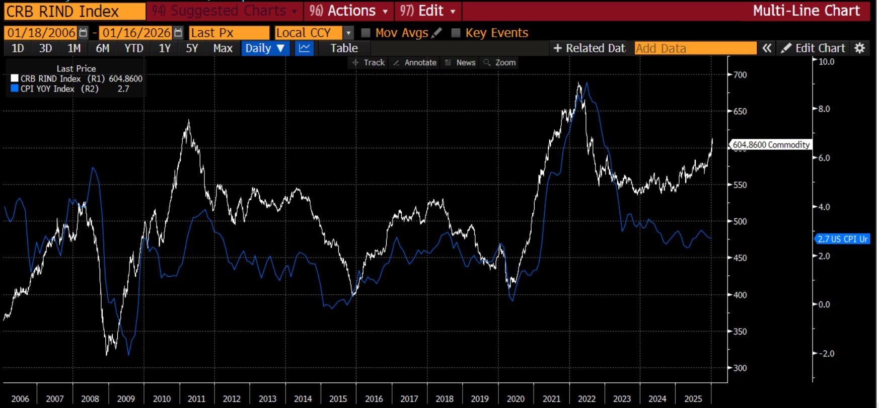
I know, I know. I listened to many a podcast or webinar that espoused how the CPI would continue to fall over the course of the year. “It’s simply mechanical” was one view. Their logic is that shelter is 35% of CPI and it will continue to fall because owner’s equivalent rent lags the national rental index which is in decline. Perhaps this is the case. I just struggle to ignore the chart above. Input prices are going higher for more things than they are not. This tweet from Mohammad El-Arian captures it well:
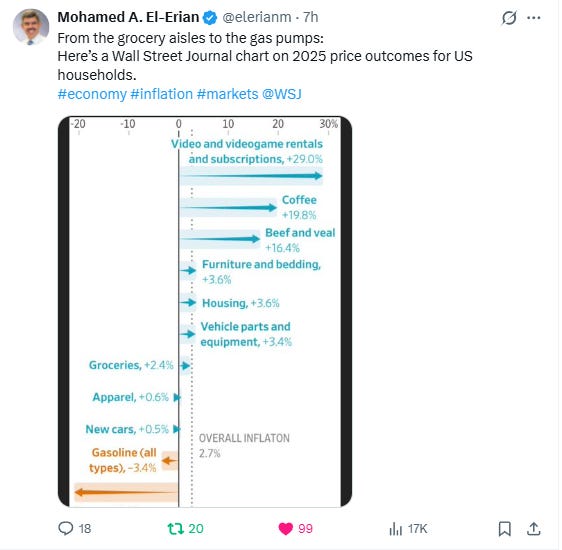
Yes, gasoline matters. It is the ONE price that every consumers can tell you what it is, probably within a dime. It is the one Biden focused on ahead of midterms, successfully mind you, in 2022, and the one that Trump is likely to focus on this year. Yet, most other stuff still goes higher. Affordability is really the issue. Will the FOMC be able to lower? Now that we think it is Kevin Warsh, will they feel as strongly to lower?
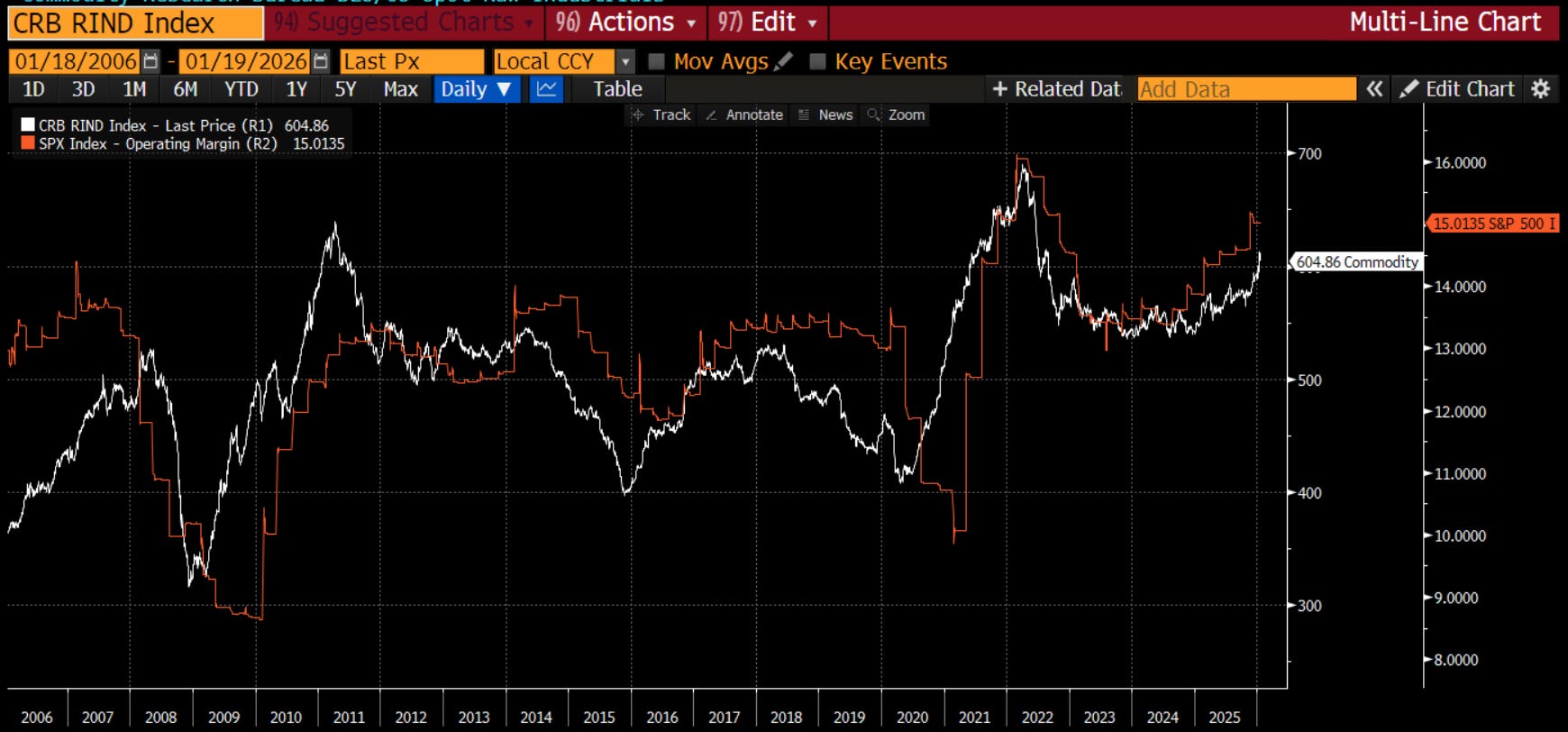
One bit of good news, it seems, is that the spot commodity prices also have strong co-movement with S&P 500 operating margins. My sense is this is because these types of costs are easier to pass along through the supply chain. Other costs become more difficult. Perhaps there is something else at work, and if you know, let me know, but while higher rates than expected may mean multiples contract (or more likely, don’t expand), it does appear earnings growth may not be at risk.
Best
The last thing I explored in Notes and on LinkedIn this week was the credit market. This may be the best chart of the week, certainly for bulls.
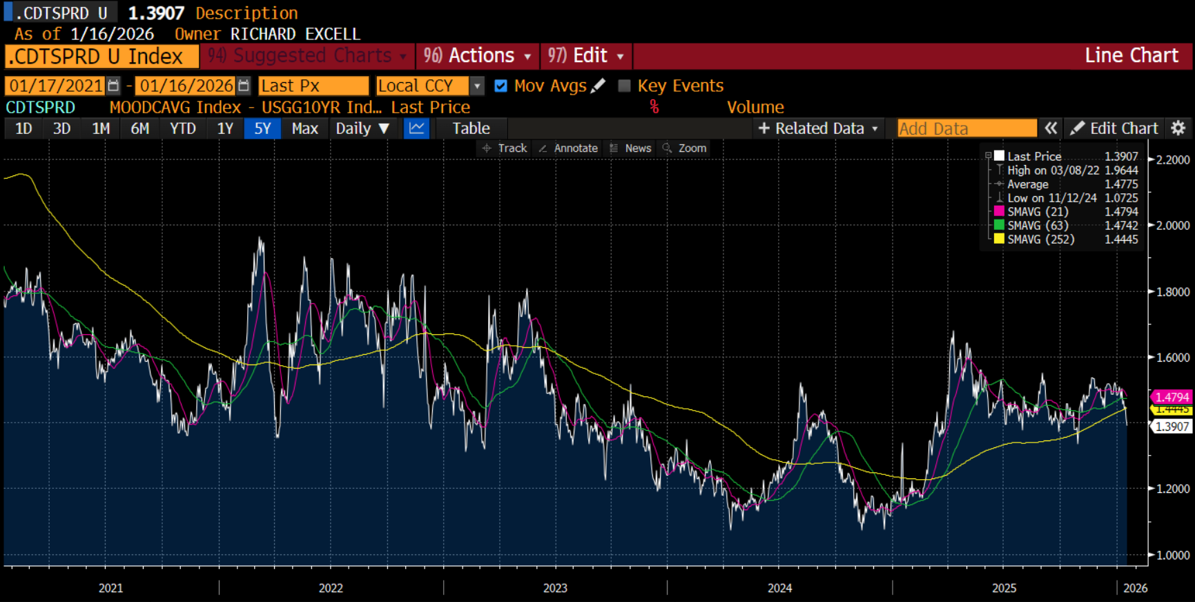
Chart of the Day - it's all good
I log into Bloomberg today and I am met with this top story:
"Hottest Credit Markets Since ‘07 Spur Warning on Complacency"
"Summary by Bloomberg AI:
Global credit markets are running at their hottest in two decades, prompting warnings against complacency from money managers including Aberdeen Investments and Pimco.
Yield premiums on corporate debt have narrowed to 103 basis points, the least since June 2007, amid a resilient economic outlook and a Bloomberg index of bonds.
Money managers are diving into the rally due to prospects of interest-rate cuts, but are also cautious of risks including unpredictable US policy, geopolitical tensions, and hidden debts."
Early on in my career, a mentor told me to watch the credit markets. Equity markets would be volatile and move around. However credit markets were the key tell. If they were nervous, you should be nervous in stocks. If they felt good, stocks would be fine.
After all, credit is higher up on the balance sheet. It gets paid first. It only gets paid a coupon so does not chase the crazy future growth expectations. It only wants to get paid back. When it fears getting paid back, then you should be worried.
Small cap companies are more susceptible to credit than large cap because they are more dependent on loans for day to day biz. Many large cap companies are cash rich, particularly Mag7.
The peak in stocks was in Oct/Nov right when Jamie Dimon from JPM said there is never one cockroach in regards to the First Brands and Tricolor bankruptcies.
Late in 2025, the fear of many in the market was that hyperscalers were starting to take on too much debt that couldn't possibly be repaid. How many people saw the chart of the Oracle CDS spread compared to its stock price?
While this may be true of ORCL, it does not seem to be a problem for credit markets overall. As the article says, yield spreads are falling. This is a sign credit investors are feeling pretty good.
The chart today compares the Moody's Baa corporate bond average to 10-year Treasuries. You can see it is falling below the one year mov avg. and looks to be headed back to that 110 bps low it hit a few times in 2024.
If I widened this out, you would see 110 bps is the lowest level this century. Even at current levels of 139 bps, it is in the bottom decile of levels this century.
In previous scares, you get nervous when this spread moves above 2% on its way to 3.5%. This is the level hit in the 2001-02 credit event and Covid. It actually got to 4.5% in GFC.
What does the current spread tell us?
It's all good.
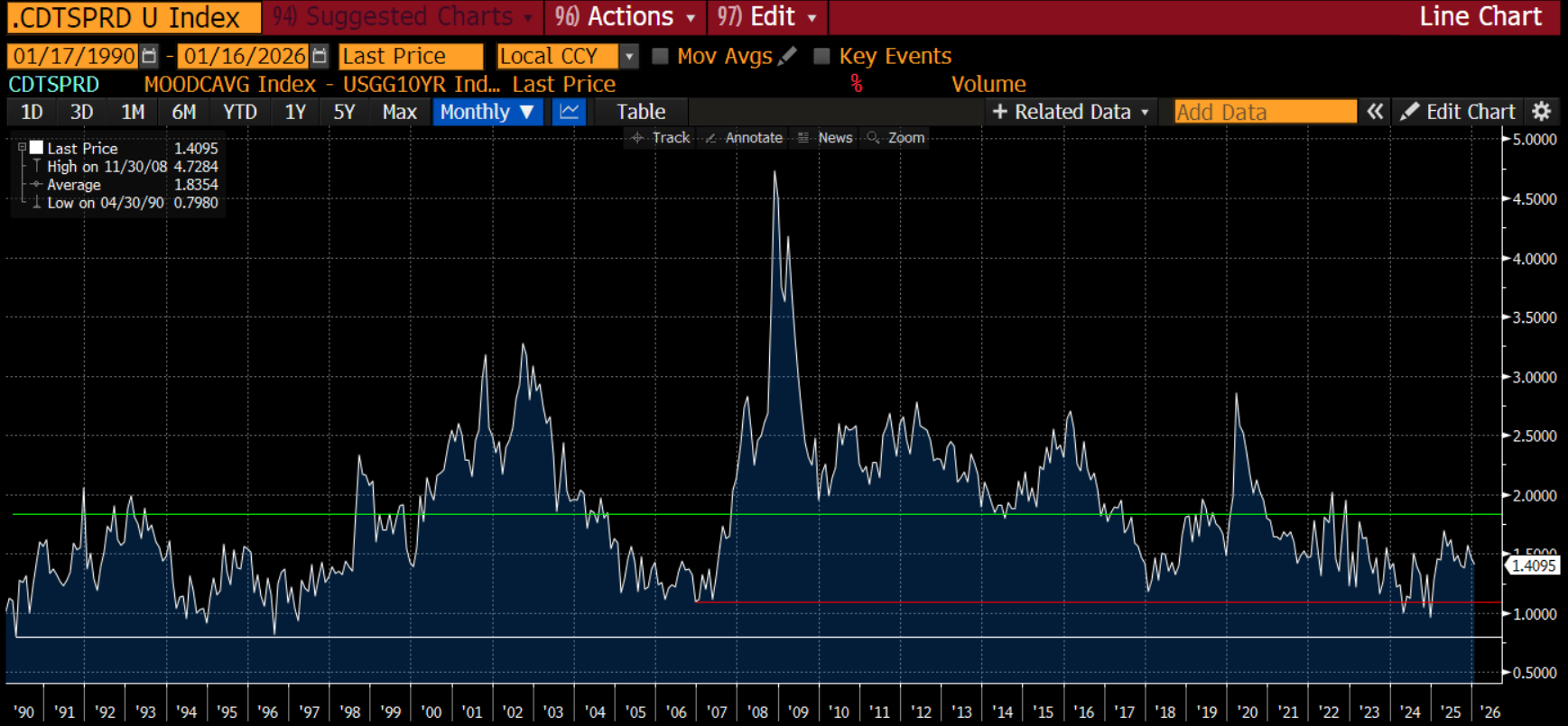
While well below the 35-year average, this measure of credit spreads is still above both the low reached before the Great Financial Crisis and the low hit in 2024. While one can suggest complacency, I would tell you two things: 1. Bank earnings this week still give us a picture of a healthy economy (it was lower than expected I-banking fees that caused lower stocks) 2. We know there is danger when this spread is moving higher above the long-term average, not falling further below.
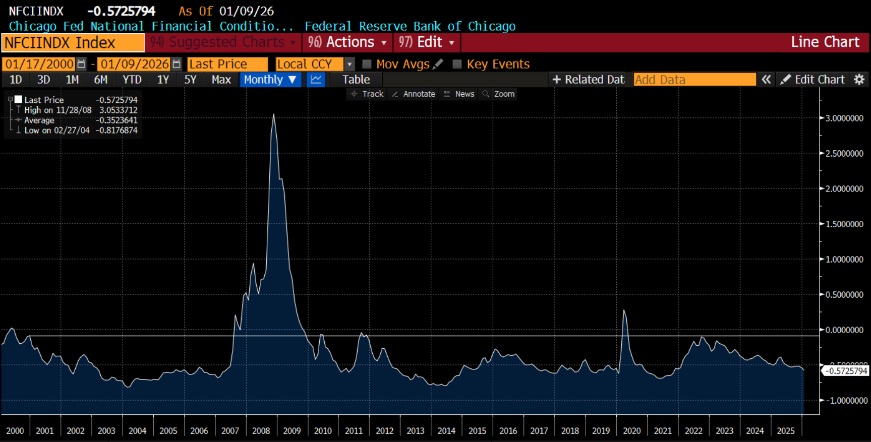
A different measure of financial conditions is the Chicago Fed National Credit Conditions index. It is designed to have a mean of 0 and a standard deviation of 1. Readings above 0 (line) mean credit conditions are getting tighter and above 1 means they are tight. Readings below 0 mean conditions are easy. We are -0.57 standard deviations easy. This is almost as easy as in 2021 when all assets ripped higher. Yes, we can see that the Fed has kept conditions largely pretty easy this entire century which is a story for another day. However, this also means that we are a long way from a problem.
P.S Be Careful
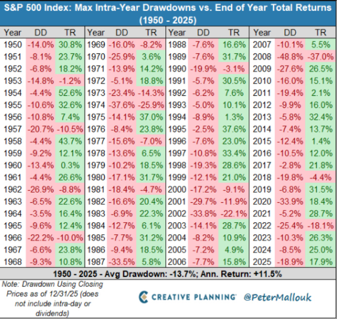
Lest I come across as too bullish, I want to leave you with a chart I came across on X.com. It shows that every year there is a drawdown, some steeper than others. In mid-term election years this century, the average drawdown has been 18.35%. These drawdowns can come from the peak, so in theory we could rally 18.35% and drawdown to zero for example. However, more realistically it suggests there will be some stumbles. My sense is this would happen more in the middle of the year when we start talking mid-terms, and less likely now when cash refunds are high. It is something that investors need to be aware of.
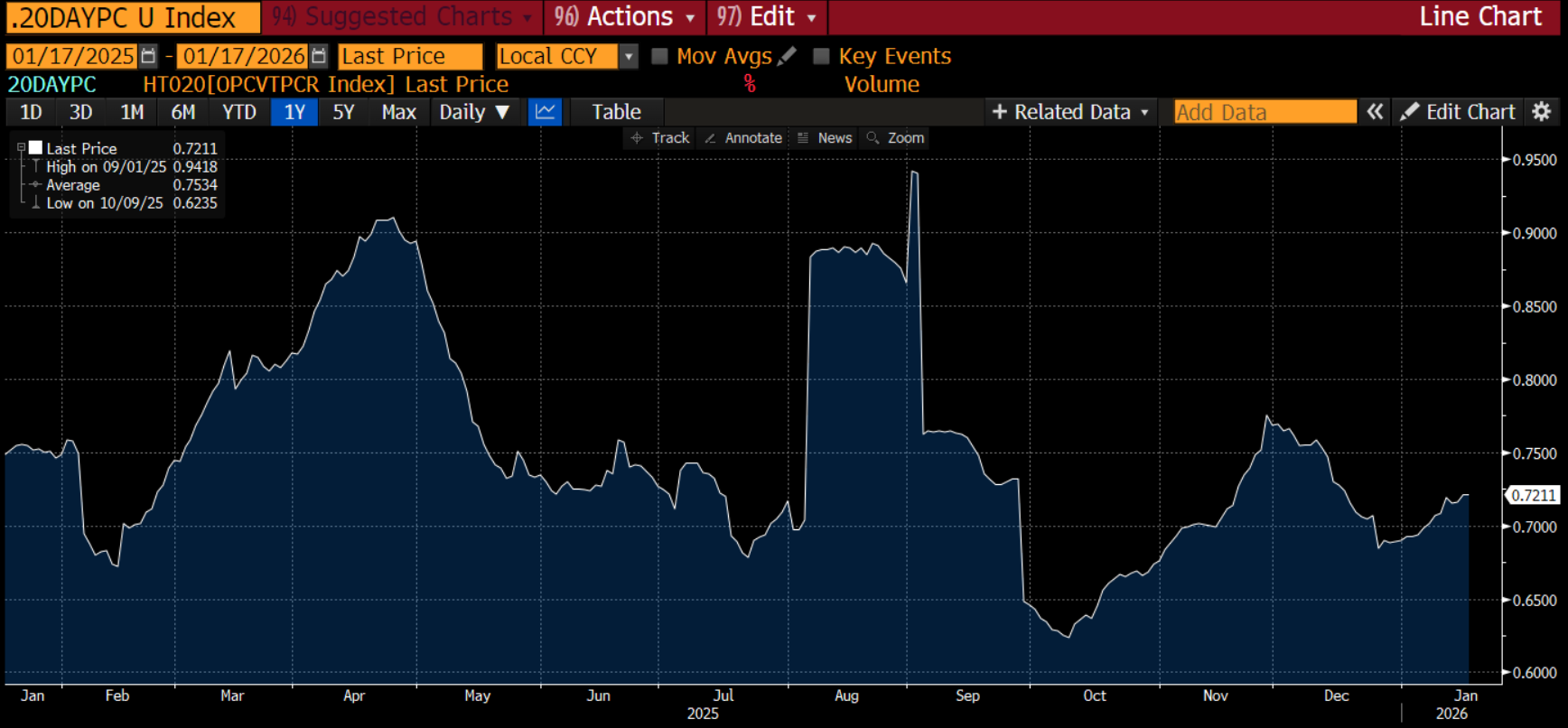
Short-term, the put-call ratio is giving some warning signs. As we just had an options expiration (often a catalyst for a sell-off) and earnings are beginning in earnest (and the bar is high), be careful out there.
I explored how the options market is viewing this on the “TWIFO” podcast this week. You can access it here
You are probably left feeling how Chicago Bears are feeling before their playoff game with the LA Rams, a very formidable opponent. On the one hand, there are plenty of reasons to feel optimistic and look for good outcomes. On the other, there are some signs of trouble which make you nervous.
The good news is in investing, unlike watching sports, you can control your own destiny. You can continually focus to ‘never let it rest until your good gets better, and your better gets best.”
Stay Vigilant

Da Bears --So sad, I was pulling for them...
Great analysis, not so great outcome for the 🏈 Bears, despite one of the most heroic and great late game touchdown passes in history. Quite a season though.