


Meh


Once again traders and investors have had to navigate a myriad of headlines and events to try and stay the course and eke out some profitability. In general, this week, I feel the market responded to news in a more positive fashion that we would have seen the previous month, usually a sign that investor appetite is back. I think a lot of this has to do with the leveraged funds who are back in the market after being stopped out in April. I have written about this before in Stay Vigilant, but I discussed again on LinkedIn this week:

Chart of the Day - volatility
I had the pleasure of doing an advanced options webinar for Saxo Bank this morning. One of the topics I covered was volatility and having a view on volatility
Volatility is the most important parameter in options pricing after all
When you trade options, the strategy you choose depends on your views of both the direction of the underlying (sometimes no bias is a view) and future volatility
Market makers are putting their views of future volatility of the underlying into option prices all of the time. This is the implied volatility of an option
How do they form those? It comes down to serial correlation and mean reversion
Serial correlation in that tomorrow's volatility will look like todays. Maybe not exactly the same. In fact, given today is FOMC day, there is possibly a higher level of volatility priced in than when we look out to the following day or two
Mean reversion in volatility in that as we look further out, we expect volatility to normalize at some point. If it is unusually high, it is expected to come lower at some point. It is is unusually low, it will be expected to move higher
Take for example the two volatility curves that I have in the chart. The first is what the VIX curve looked like on inauguration day. The front dated vols were lower but there was an expectation volatility would revert to more normal levels over time
The white line is the current VIX curve. it is much higher than normal and expected to revert lower. However, you can see that even when we look at the volatility contracts to the end of the year, it is still expected to be well above 'normal'
This is important because volatility is an input to capital allocation, whether it be Value-at-Risk models for hedge funds or volatility targeting strategies for asset owners
The higher the volatility, the less capital these investors are willing to invest in that asset class, whether it be long only or long/short. However, if and when volatility comes lower, more capital can and will be deployed
Even if you don't trade options, you should keep an eye on what the volatility markets are saying so you know what others may be doing
If you do trade options, your view on volatility will greatly impact how you want to build your options strategies
With investors looking to take on risk, it felt to me like I was the only one that was not seeing the great opportunity present in stocks. Like I said last week, there is certainly some good news out there, however, there is also bad and even ugly news. It doesn’t seem like the best of times to be levering up. As I thought more about this, I thought about what it would take for me to get off the sidelines. This gets to a fundamental idea that all traders and investors must face -is the reward to risk favorable? To put it in the words of Warren Buffet, the now retired CEO of Berkshire, is there a margin of safety? I explored that on LinkedIn this week:

Chart of the Day - margin of safety
Back in the late 90s/early 00s, the Fed Chairman at the time, Alan Greenspan, popularized the "Fed Model". He suggested at a very basic level the first decision for asset allocators was whether to take any risk
By this he meant should they move out of the risk-free asset (Treasury bonds) and move into the market most choose to take their risk (stocks). This gave rise to the so-called Fed model whereby we can compare the earnings yield on stocks to the bond yield on bonds and see how it compares
Sure, we can modify and look at stocks vs. credit or credit vs Treasuries etc. I will do that too. Nowadays we can suggest that maybe Treasuries aren't as risk-free as they once were. However, the basic idea holds. The first question we all must ask is whether we are being compensated to take risk
With money markets yielding 4% or thereabouts, it isn't as clear as you may think. In fact, in a conversation yesterday, we came to the conclusion that maybe SPAXX > SPX or the 3.99% in the Fidelity money market looked more attractive than the SPX right here
For me, it becomes a simple question. I think it is fair to say that right now there is an incredible amount of uncertainty. The uncertainty policy indexes show that it is higher than during Covid or the GFC
The market is hoping/expecting deals. We are up today on the expectation of a deal with the UK. Surveys suggest tariffs are only thought to be temporary and deals will get done
I do think getting the first deal done sets precedent. I am not sure that the terms of a UK deal will look the same as with India, Japan, China, EU and each of those has increasing levels of difficulty, but it isn't bad news
However, am I being compensated to take this risk?
The chart today shows the difference between the earnings yield of SPX and 10yr bond yield. The green areas are when the difference is 3% or higher where I say there is a margin of safety
The red areas are when the spread is less than 1% and we can see it has been negative for long periods of time. Everything in between is no man's land that I label as 'Meh'
Everyone can make their own decision on what to do with Meh. We spent a lot of time there before the GFC. That didn't end well but there were profits to be made. The most recent period we traversed thru there more quickly
Right now, we are in the 'No Margin of Safety' zone. Sure, if volatility comes lower, systematic allocations will bring people into the market. We discussed this yesterday
However, as Alan Greenspan posited, for asset allocators or long-term investors, the first question is whether to take risk. For me, answering that is whether I am being paid to do so
That answer is no

As I say above, some have a problem with the Fed Model because it compares a risky asset to a risk-free asset. Others prefer to compare equities to credit, which are similarly beta, even though there is a difference of where they sit in the capital stack. We can also compare equities via the earnings yield to a corporate credit yield. I use the Moody’s Baa corporate credit yield because it has the longest time series of data. It also closely represents the credit profile of the SPX. The chart above compares the two yields, and I draw a line at the 0% market. When we are above this line, equities look more favorable than credit. When we are below, credit looks more favorable to equities. You can see from the first oval, in the late 90s, equities were preferred to credit because of the expected growth. While the growth happened, the overvaluation pointed to returns that were sub-par. The second period was post GFC when credit was preferred because investor had gotten too burned on equities. Investors wanted their idiosyncratic risk via credit. While the growth in the 2011-17 period was not as high as in the late 90s, returns turned out better because of the valuation.
Right now, there is a 1.5% deficit in yield for equities, which means one is paying for the right to own stocks. Paying for the right to be lower in the capitalization table. You only do this when you think the growth profile is considerably strong. We will know over time whether it actually is or now. If we went back to last Fall, with the AI excitement, we know the investor perception was that growth will be huge. Is that as clear now? Even if it does pan out, does the overvaluation point to sub-par returns?
This also leads to another question, if credit looks favorable to equities, how does credit look relative to Treasuries?
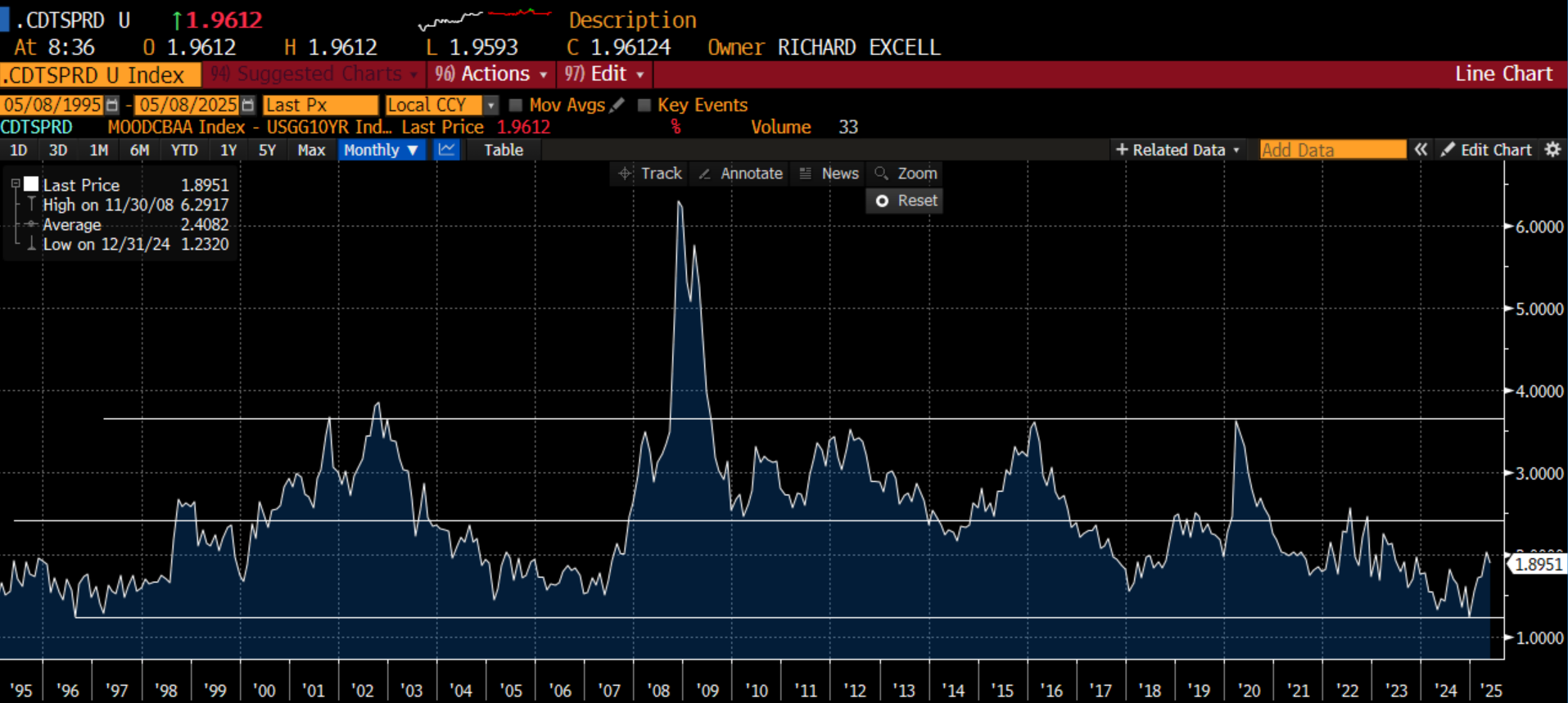
We can gauge this by looking at the same Moody’s Baa vs. the 10-year Treasury yield. I create this credit spread and look at this over a long period of time. You see the current spread have moved much higher from where it was at the start of the year. It sits at 190 basis points, which is well below the 245 basis points long-term average. I have drawn two other lines at 125 basis points and 360 basis points, a range that pretty much captures the tights and wides of this spread over 30 years with the exception of the GFC. Looking at this, while credit may compare favorably to equities, it doesn’t look that great relative to Treasuries. Sure, the default profile has been good the last two years. However, with so much uncertainty, shouldn’t an investor at least expect average levels of spreads? I look at credit, and while not extreme, it is in the ‘meh’ range for me.

Going back to my SPAXX vs. SPX discussion I referenced before, another way to consider the margin of safety is to look at that same equities earnings yield and compare it to the 3-month money market yield. This yield is pretty close to where the SPAXX yield is. Stocks are earning less than cash and have been since 2023. The only other time this was the case was in the late 90’s into 2001. I think it is fair to say most remember that as a time when equities were very overvalued. Yes, it recently popped back above cash, but given it is usually more in the 3-4% range, and has been as high as 8%, does the extra 40 bps you get buying stocks really sound that attractive? Sure, if growth is going to happen. Are you so sure of that?
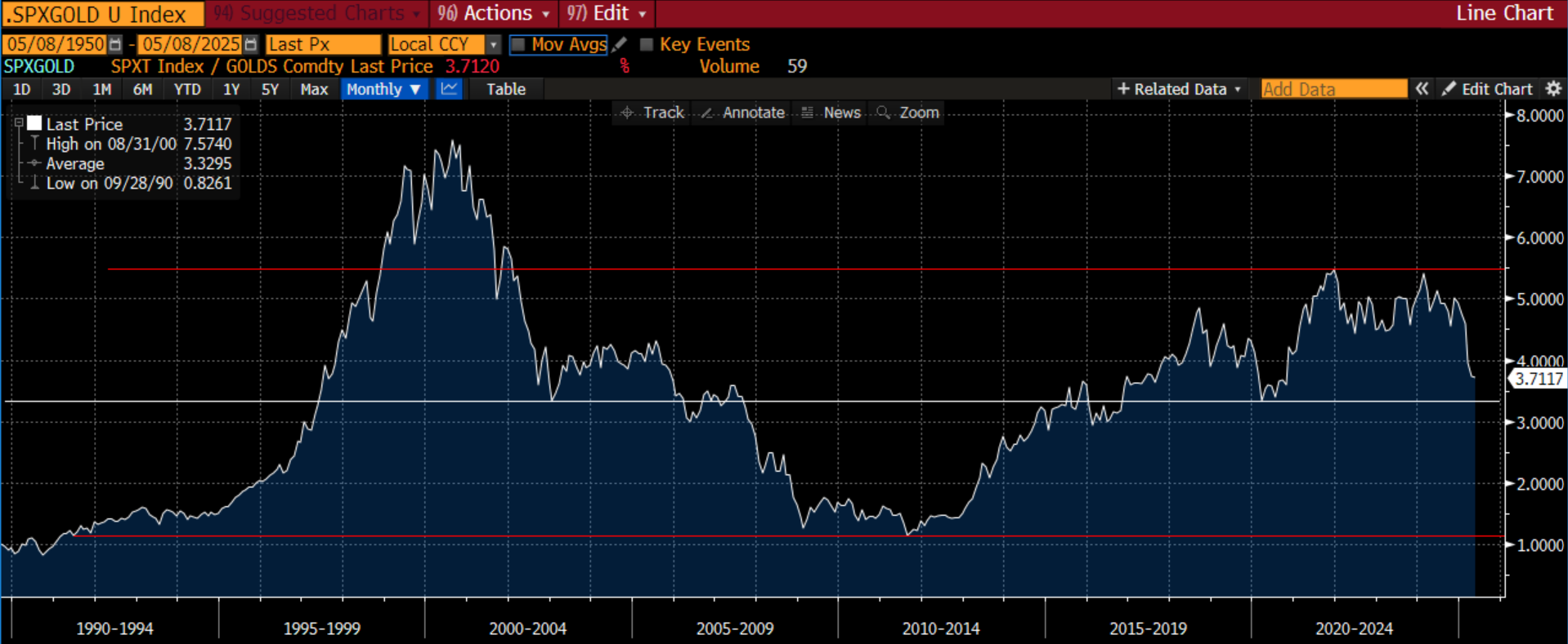
The last relative valuation approach I used was comparing SPX total return index to gold. While gold is certainly in the news and well-discussed now, it is always another way we can ask if we are being paid enough to take on risk. This index has been much more volatile, and will certainly trend for periods of time, however, it has ranged from 1%-5.5% with that famous period of overvaluation in the late 90s that took us above 7% (yes, everyone knew stocks were ridiculously overvalued, but they kept going higher and higher regardless as money flowed into mutual funds that bought stocks regardless). With the move lower in stocks, but particularly the move higher in gold, this index is moving back toward the long-term mean. There is no reason it has to stop here. In fact, as you see, it tends to go on 10-year trends: 1990-2000, 2000-2010, 2010-2020, 2020-? Are we in the midst of a 10-year trend that is going to take this back closer to 1x?
I keep coming back to the idea that investors are still willing to take more risk than I am willing to do. Am I the only one that feels this? Maybe not:
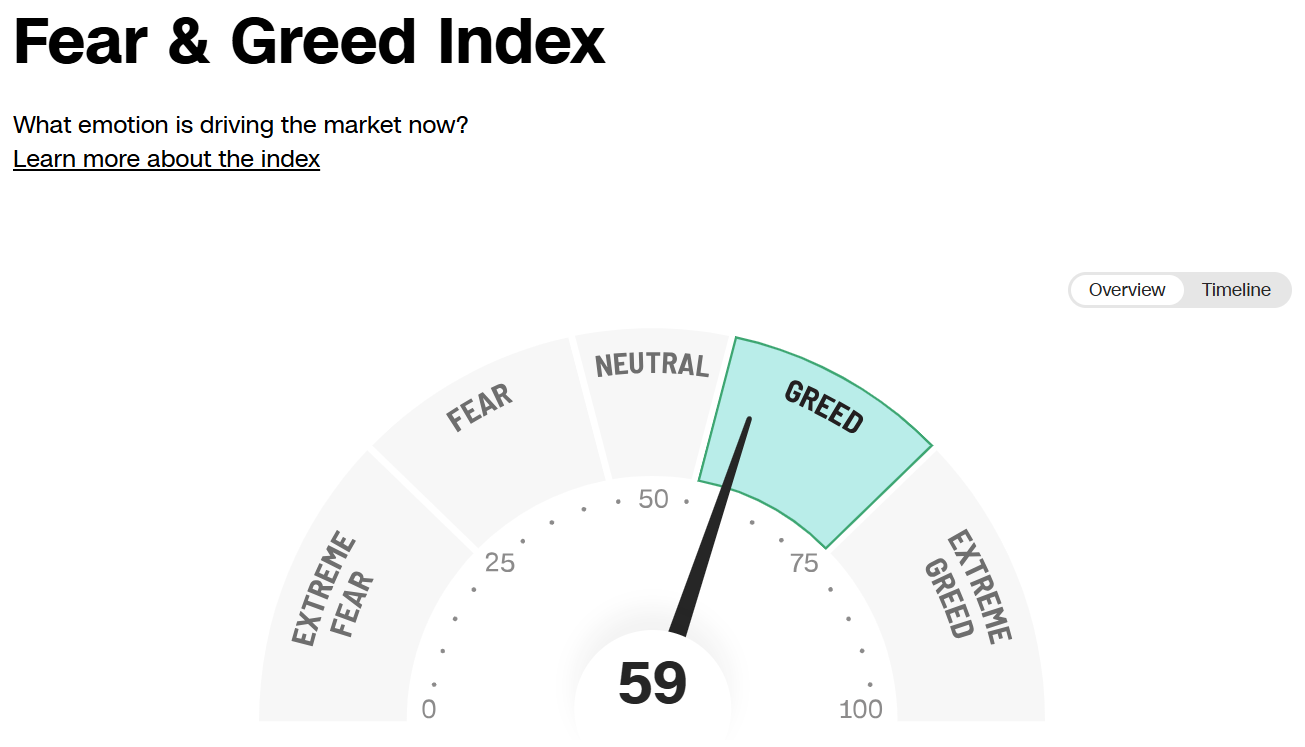
Perhaps surprising to many of us to see the Fear & Greed Index in Greed territory. Using a variety of market metrics, it is measurable that investors are being greedy right now. Back to what Warren Buffet says: be fearful when others are greedy and greedy when others are fearful. The price action right now signals that investors are being greedy. The valuation of stocks and even credit suggests investors are either greedy, or at least a bit too optimistic. When I look at all of the risk markets, I have one word that describes what I see:
Meh
Stay Vigilant

Cute. Never trust a cat, tho.
They can be dangerous.