

Ruh-roh


I had a very busy day on Friday with the first call at 7:30 A.M. and the last event ending at 8 P.M. In between it was chockfull of discussions that were not market-related, mostly as we are nearing a critical juncture for a massive capital campaign that I am part of the leadership for. I only bring this up to tell you why I wasn’t paying that close of attention to the market price action on Friday, April expiration, after I took a look at a few things very early in the day.
I looked at a few headlines and charts on my phone toward the middle of the afternoon, I came across this chart of NVDA, everyone’s favorite stock. As an aside, no matter which class I am teaching, this is the one stock that everyone, Freshmen to grad student, domestic to international, watches and wants to talk about. We know the market has its own fascination. Thus, you can imagine my reaction when I saw this:
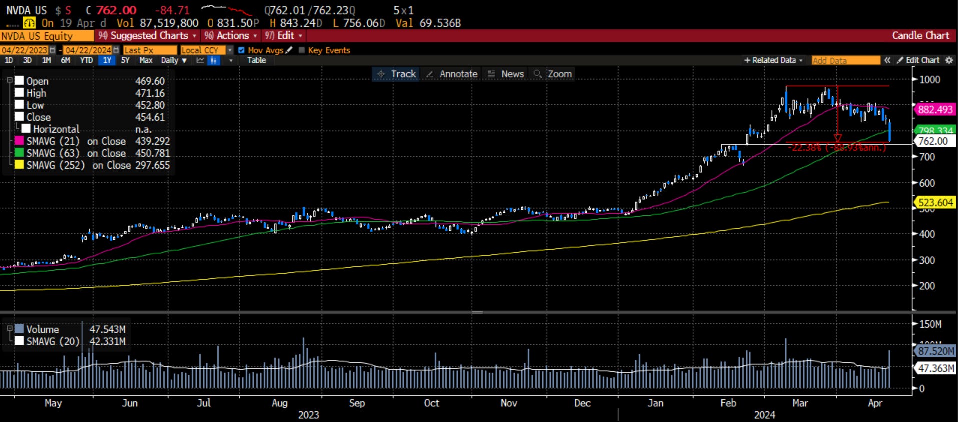
I looked at it, down more than 20% from the highs, breaking below the 50-day moving average, right above some critical support, with a large gap below that, and said out loud, channeling my inner Scooby-Doo, “Ruh Roh”. The market may not be all-in in terms of money, but it is definitely all-in sentimentally on this stock. If this doesn’t hold, and the next stop is $525 or flat YTD, we could be in for some trouble.
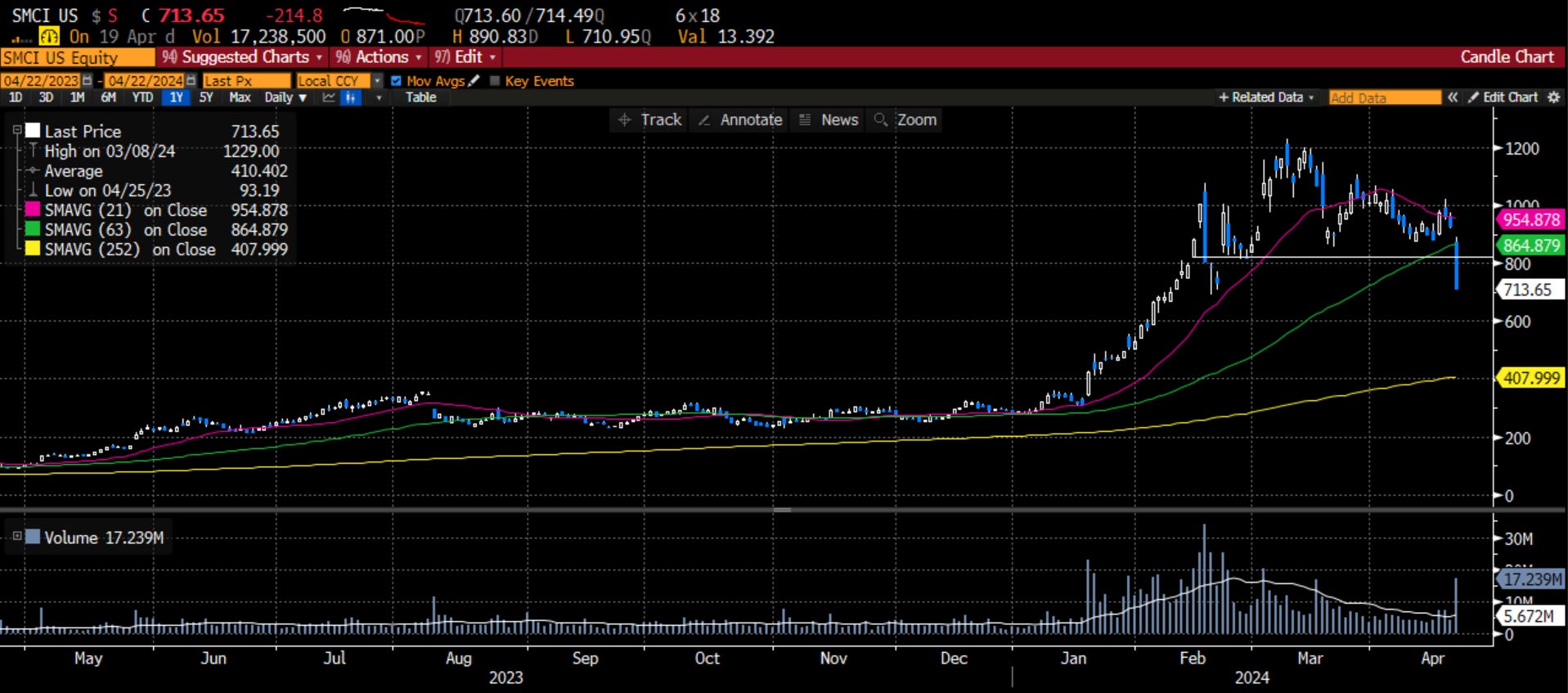
So, I took a look at NVDA-lite, SMCI, everyone’s second favorite stock to pitch when I tell them they can’t pitch NVDA, which is essentially a very, very poor man’s version of the AI war. It has broken that important support, and looks headed to $400 in my estimation.
As Fred would now chime in, “Looks like we have another mystery on our hands.” Why are the high-flying stocks looking so weak all of a sudden? I think Fred, who would fit in well in D.C. with his handsome ascot, might suggest this has something to do with the FOMC and Treasury dynamics we have been seeing of late. In the last couple of weeks, I have written and spoken on podcasts about the changing Fed expectations. I even commented that we should be impressed that the market of risky assets has help up quite well given the number of rate-cuts we have taken out. I did say that I thought there was more to go as I still believe there will be no rate cuts this year.
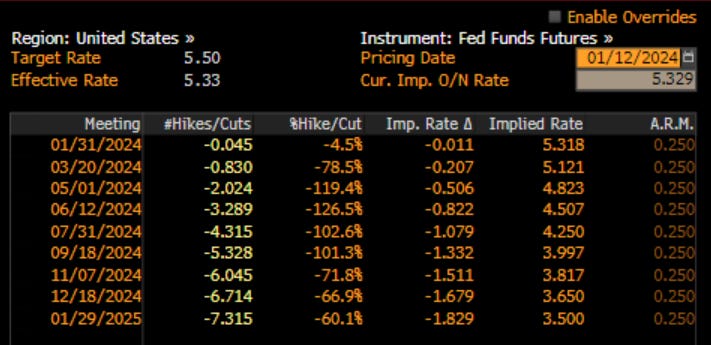
As a reminder, in January, fresh off the massive rate cut induced rally at the end of 2023, there were 6.7 rate cuts priced into the Fed Funds Futures market:
This week may have been the straw that broke the camel’s back. It started with comments that Jay Powell made, pointing to the ‘lack of progress’ of inflation falling back to the Fed’s target and rate cuts may have to wait until it does. I would ask, is it the absence of light or the presence of darkness, Jay? Is it a lack of progress or is it commodities prices moving higher due to geopolitical tensions, sanctions on Russian industrial metals or tariffs on Chinese steel and aluminum?
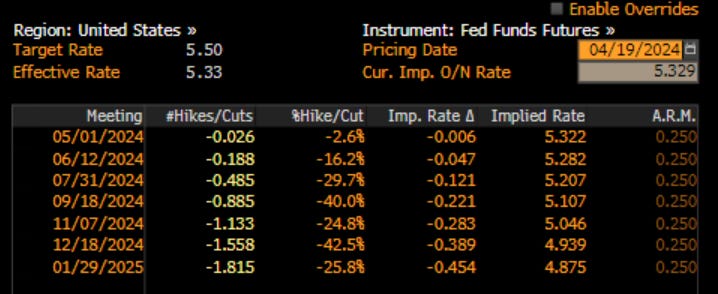
Then John Williams of the NY Fed chimed in the next day saying something to the order of ‘while it is not the base case, we have to consider the possibility of a rate HIKE if the economic data warrant it’. I think John knows it is the presence of darkness. As a result, the number of rate cuts priced in to 2024 fell to 1.5, which is still too high in my humble opinion.
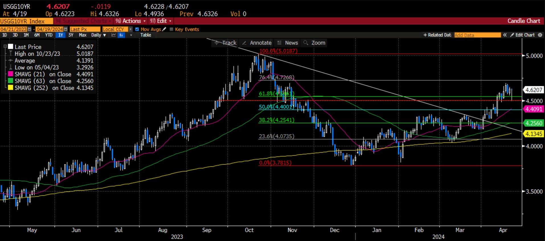
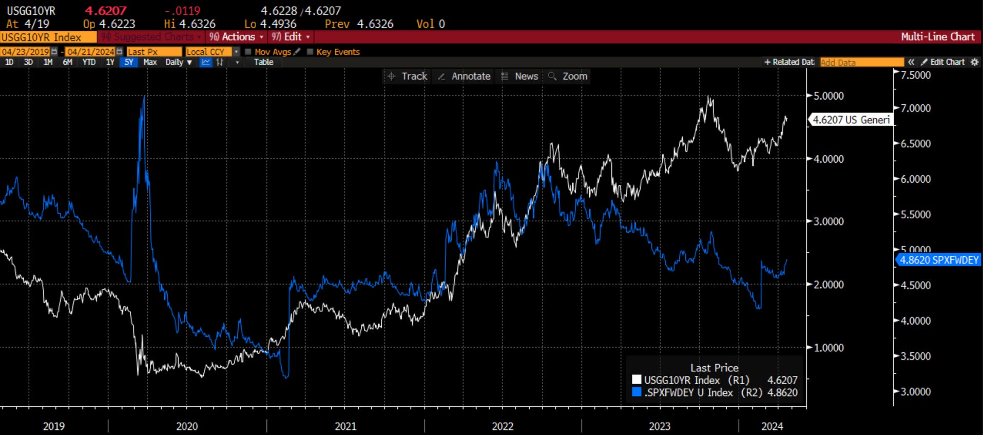
Of course this has ripple effects across the entire Treasury curve. Just 10 days ago, I highlighted that the critical 10-year US Treasury yield was at an extremely important inflection point:
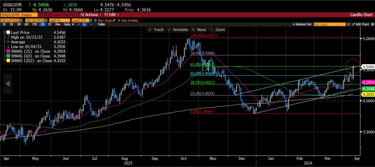
Since then, we have broken above that level, thrown back to the previous-resistance-now-support, and look to be headed higher. I really think 5% is in our sights this summer.
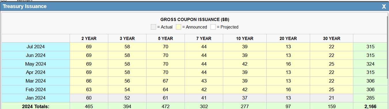
I think this is the move not just because of the technical charts but also because we are about to get over $1 trillion of issuance of coupons by the Treasury. With no slowdown in the fiscal spending right now, there is no relief in sight from this issuance.
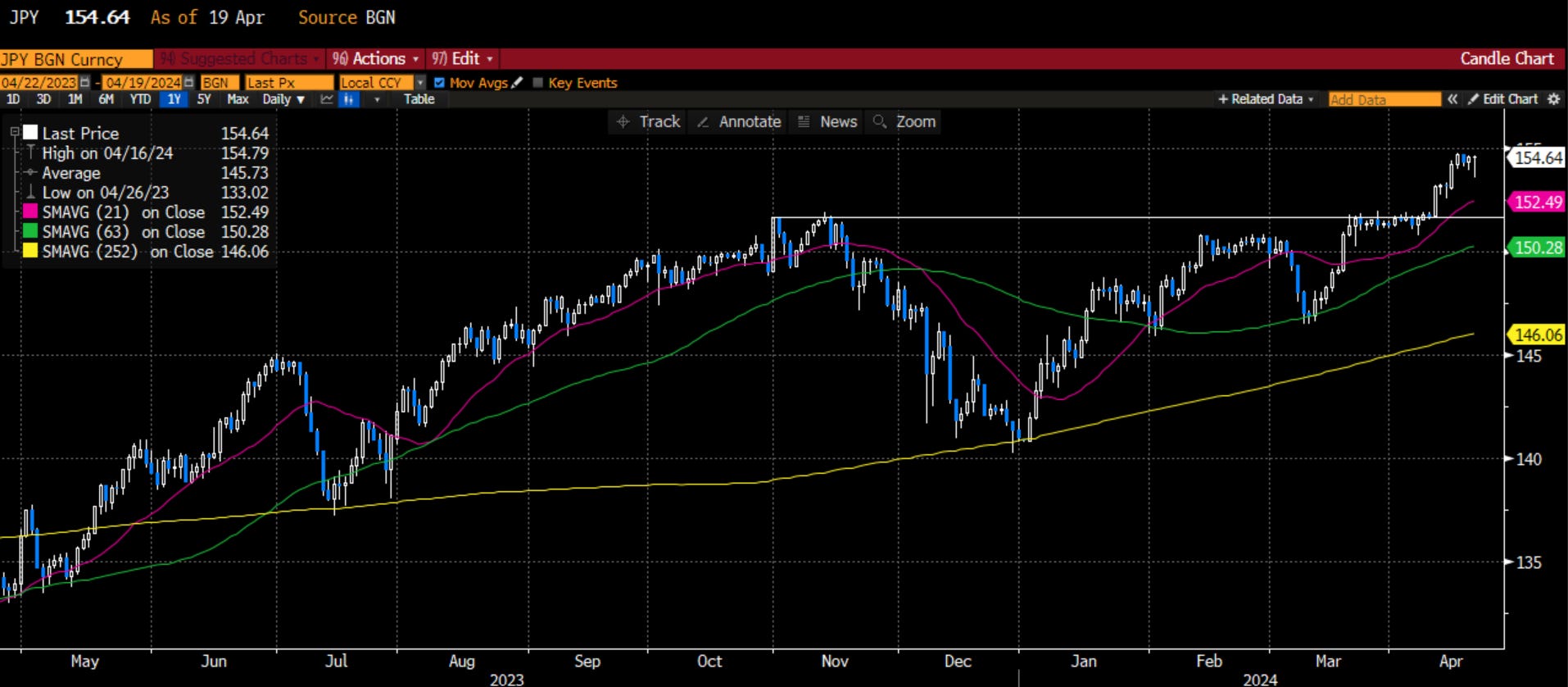
Also, at this time, our largest foreign buyer - Japan - is seeing it’s buying power greatly diminished as the Yen continues to weaken with the BOJ following an easing policy and previous intervention levels breached. Japan will step in to buy Treasury notes and bonds certainly, however, the yield it may demand is probably higher than the Treasury wants and certainly higher than a quarter ago.
The next two largest foreign buyers are the Chinese (just put tariffs on) and the UK (in a recession), which are also seeing their currencies weaken. Let’s also point out that US banks lost a lot of money holding bonds and US high net worth retail has shown a willingness to keep in cash earning 5% until it can get closer to 5% further out the curve.
I think this is where Daphne might step in and say “Jeepers” because we have found a clue. That clue is rates are headed higher, which means the earnings yield for stocks (the inverse of the multiple we pay) are also headed higher. This means a lower P/E (or EV/EBITDA etc.) for your stocks. The relationship has broken as equity investors are very optimistic about what 2024, soft landing with a risk of no landing, could hold. I fear this relationship may re-assert itself.
That is fine, as long as earnings can carry the day. I had this discussion on earnings with a teaching colleague who also managed money for over 30 years in the market. I wrote about it on LinkedIn this week:
Chart of the Day - beneath the surface
Yesterday we had a 'faculty meeting' at a beautiful outdoor location with trees, grass and, ironically, 18 flags randomly placed throughout. At first it would seem to be the perfect location to clear one's mind and work through important issues. However, high winds made for more of a challenge
With those winds, the water actually had some little whitecaps. The geese & ducks that have migrated here looked calm but you know that beneath the surface, their little legs were churning
We spoke about the markets & my comment, referencing my LinkedIn yesterday was that the earnings we had seen so far, while early, looked to be pretty solid in terms of surprise & growth. A colleague said 'you must be looking at different names than me because that is not what I have seen'
He was right. He focuses solely on small cap stocks & looking at earnings in that index, they are quite poor. The SPX has done quite a bit better on a relative basis. One's perspective is certainly colored by their universe
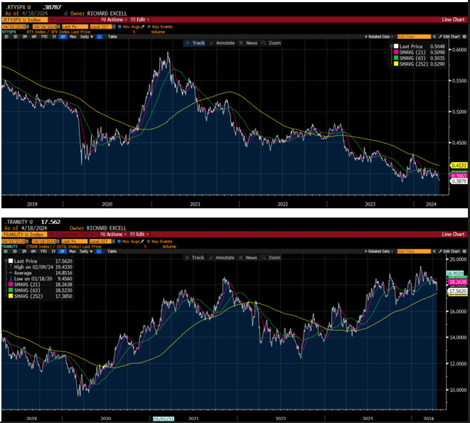
While the headline market is trying to determine where it should go in these choppy times - with a weaker daily view, a mixed weekly but still strong monthly trend - the action is often beneath the surface
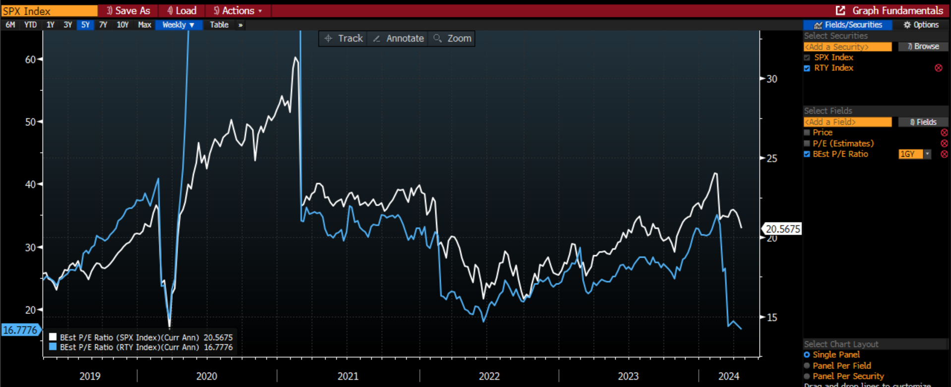
So today I looked at the relative performance of small caps (RTY) to large caps (SPX). That is the top chart. You can see that we are at the lows we saw early last Fall right before we got a broadening of the rally. These levels are the lowest we have seen since 2001
Seeing small caps struggle so mightily on a relative basis reinforces that the higher rates we have now are having an impact on the economy. We may not see it as the Mag 7 (errr Mag 5) continue to take us higher, but the broadening of the rally late last year has fizzled mightily
It led me to look at another ratio that technical analysts have used for decades. That is the ratio of the Dow Transports to the Dow Utilities. The logic is pretty straightforward - when the economy is doing well, we will see freight volume strong and rates moving higher which will hurt utilities. The opposite is true in a weaker economy
It also coincides with a different discussion with the same colleague where he referenced JB Hunt earnings, which were very poor, & served to pull lower many other transport names
So I pulled up the ratio of transports to utilities & while this longer term trend is much better than small vs. large caps, it is also rolling over here. It topped in early Feb, about the same time as rate cut expectations peaked, & headed lower, with an acceleration yesterday on the JBHT earnings
Another sign that things may not be as calm as they appear at first blush. Yes the SPX is still above 5000, but why are some subsectors stalling so badly on a relative basis?
We may enter a situation thinking everything is beautiful. When the winds start to blow, there can be a lot of action beneath the surface
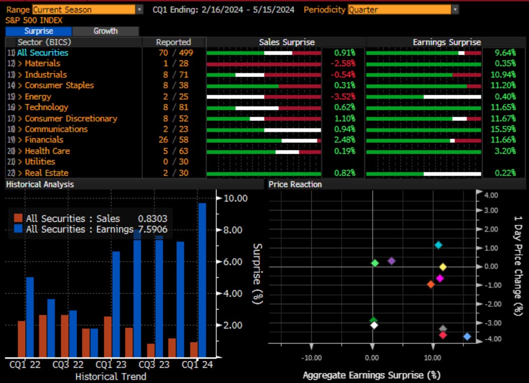
So, earnings can carry the day, right? This is a chart of what I was referring to in the post above. For the SPX, so far, the earnings surprise has been positive across the board, averaging almost double digits. Something I would highlight, though. In the lower right we see the stock reaction has not been positive which suggests that there are also elements in the release for example comments going forward, which the market doesn’t like.
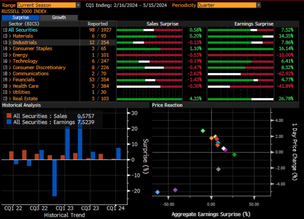
However, if we look at the Russell 2000, it has been much more of a mixed bag with a few sectors sharply in negative territory.
If we were to look purely at the growth numbers, which are up almost double digits in SPX as expectations were for flat earnings, we can see earnings growth is sharply negative.
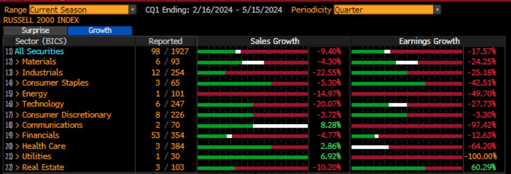
This is now reflected in investor sentiment numbers such as the P/E which has collapsed in the Russell 2000 small cap stocks vs. the larger cap brethren. It would seem smaller companies are feeling the weight of higher interest rates and slowing growth that we aren’t seeing, yet, in the larger caps:
This is where Velma chimes in and says “Jinkies”, because she has found a clue that probably has a little more meaning than even Daphne’s clue.
There were a couple of other charts that I wrote about this week that are still very important in my mind. The first is in regard to the options market and the desire for portfolio managers to seek insurance. Instead of bailing out of their positions, as we are still positive year to date, they prefer to hold their risk and hedge it. We can see this in the options market:
Chart of the Day - insurance
The late Nobel Prize winner Daniel Kahneman sums up the purpose of insurance by stating that it can be thought of as “a choice between a sure loss and the risk of a greater loss.”
In my career trading derivatives, I think this it is fair to suggest that most portfolio managers I worked with felt the very same when it came to trading options. At the very least, they hated they idea of a drag on returns typically because they never saw much gain in the times they needed it
For portfolio managers, options are either viewed as insurance policies (puts) or income generation (calls). Traders/speculators also see the value of leverage in option contracts but let's focus on the first two choices
In normal times, or times when there is not the expectation of large upward moves, it is not uncommon for a PM to prefer the income generation component of options. Selling calls against holdings, ideally with the strike near their target price, enables one to earn extra yield to help outperform
However, there are times, albeit infrequently, when a PM decides they are fine with paying some premium to protect returns because uncertainty levels are either too high or their returns volatility makes them uncomfortable
Because of these biases, we can look at the relative volume of calls and puts and get a sense for how portfolio managers, investment advisors and HNW retail feel about their investments
When times are good (but not too good) we see the volume of calls go up on a relative basis. When it is too much to handle, the volume of puts goes up relatively. Thus, this option market tell can give either a clue or a confirmation of a market move in the opposite direction
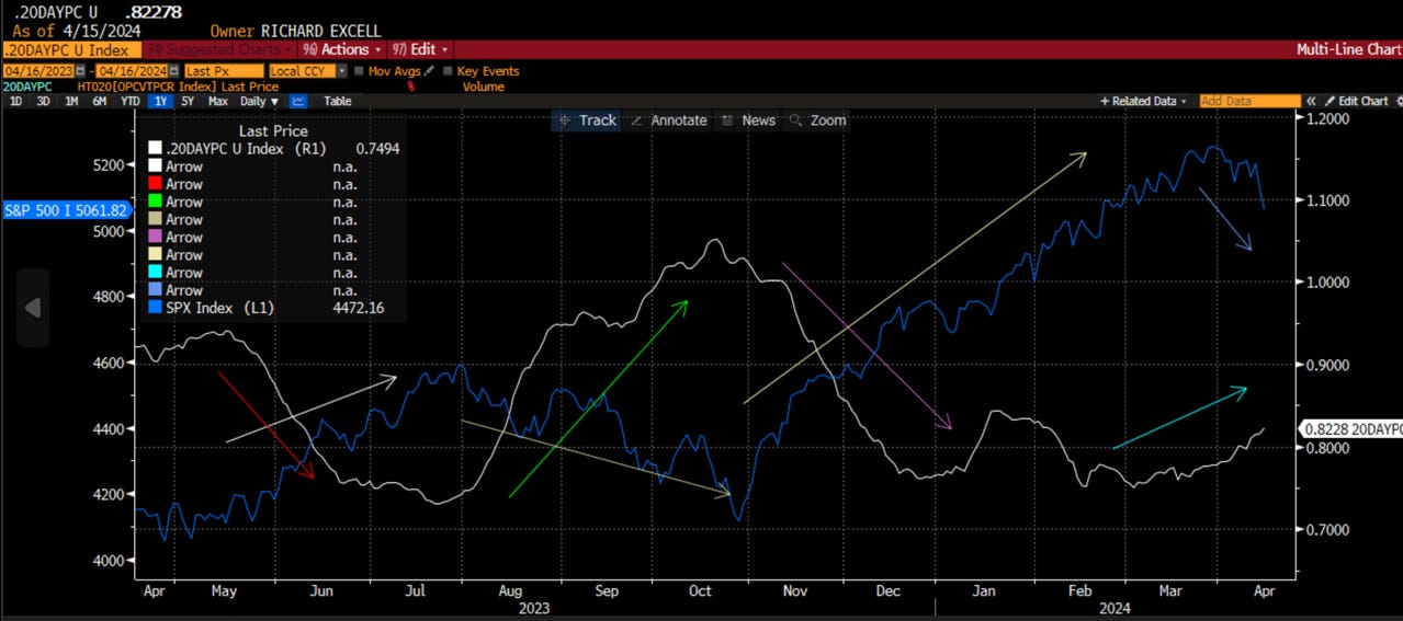
The chart today shows the last year of the SPX and the 20 day moving average of the Put-Call ratio. We can see when put volume moves higher on average, SPX declines. When call volume moves higher (Put-Call lower) the SPX rallies
This is a smoothed average of volume and yet it is still coincident. Faster moving measures, though noisy, can give an early tell
We can see the nervousness that picked up in risky assets from July to October of last year that coincided with much lower stock prices. Even a small move in this measure in early January, for a short time, pointed to consolidation
Well, it has begun moving higher again. While the early signs this a.m. were that risky assets were shrugging off the news of the weekend, the options market was telling us we should not get sucked in. PMs were actually nervous and by the end of the day we see that
Keep an eye on this measure and until it turns around, be careful. There is no margin of safety in risky assets at a time when risk is picking up
I followed that up with a chart on the VIX futures curve. I know this is a bit wonky for some, but just think about this as the cost of insurance across time. In general, you might choose to buy hurricane insurance that lasts for the next year. However, when it is deemed to be expensive, you wait and don’t buy it. However, when storms brew on the horizon, you run out to buy it, but because the cost has gone up, you only buy 1 month worth of insurance than 1 year. That is the dynamic I discuss here:
Chart of the Day - concern
Yesterday we looked at one dynamic of the options market where we can assess the relative demand for insurance vs. income, puts vs. calls, to determine how nervous investors are in the current environment
Another way I have historically looked to do this is to consider the shape of the VIX curve. The VIX is a constant 30 day measure of implied volatility in the SPX, using all tradable strikes to calculate a volatility swap
The curve is typically upward sloping, called contango. The term “contango” originated in nineteenth-century England. London Stock Exchange buyers paid a fee to sellers when they wished to defer the settlement of an agreed trade, otherwise called contango. The word itself likely comes from “continue.”
The VIX futures develop contango in a slightly different way. Back to the end-user discussion from yesterday, the short term demand for options is to generate income/overwrite a position when one expects little to happen near term. Sometimes we will see strong demand to buy calls & vols will move higher with spot but that is not the norm
Most hedgers, if they do it systematically, will be hedged further out: 1 quarter or often to the end of a calendar year. Thus the demand for insurance should it exist is buying options longer-date will the flow near term is to sell
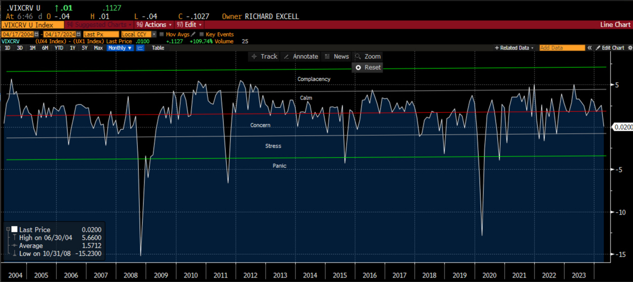
Thus the curve is on contango. The picture today is the 4th futures contract vs. the 1st futures contract. I have calculated it this way to line up with the direction of the market. This measure going negative means there is more demand for front month futures on a relative basis. This is usually negative
I have characterized different regimes given the level of contango. They range from complacency, to calm (where we have been for a year or more) to concern, stress & then panic. When we hit panic levels of more than 3 vol points, it is usually time to consider being contrarian
Right now, based on 20 yrs of futures curve data, we are in a concerned phase. The macro/geopolitics are looking ugly. The central bank is maybe back in play if we heard Jay Powell yesterday. Tariffs on Chinese metals & sanctions on Russian metals all sound inflationary. The top down view is not pretty
However, the bottom-up view is coming in pretty positive in the early days. Earnings growth & surprises are double digit. The commentary from investment banks is getting better. It is a conflicting market
In mkts like this, it is harder to be 'all-in' & just buy spot/stocks. It is also hard to be 'all-out' & go to cash as you might miss an earnings rally. Instead, now is a time with concern where investors want to stay invested but need a hedge
The next phase would be where investors start to get out. For CTA accounts, daily models are negative/short now. Weekly are starting to roll over but aren't quite negative. Monthly are still positive
There are many moving parts. The market is dynamic
With these last two charts, Shaggy finally steps in and says “Zoinks!”
The team is on the case and discovering that everything is not right in their surroundings. This is a time to sound a warning signal. This is when an analyst or a risk manager would go to the portfolio manager, who lagged their benchmark last year and probably has this year too, and asks “Do you think we should take some risk off in the portfolio? Would you do it for a Scooby snack?”
Of course, the portfolio manager tells you that ‘buy the dip’ has worked very well over the past 6 months. You can see this in the white circles as the SPX Index has held the 1 month moving average on every dip. However, being astute market watchers yourselves, you reach over to the portfolio manager and rip off her rose-colored glasses, highlighting that this ‘buy the dip’ strategy has recently stopped working, if we see that the 1 month moving average has broken badly:
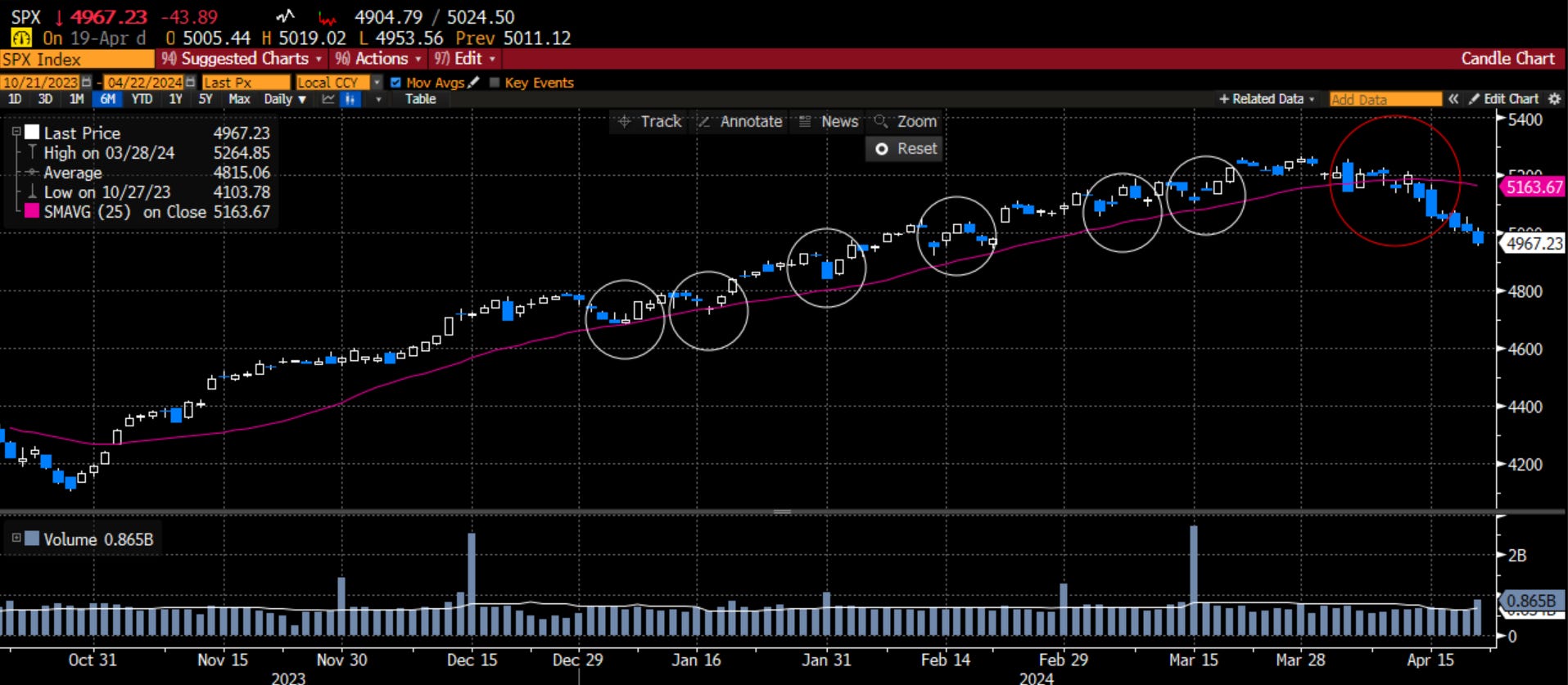
At this point, the portfolio manager has nothing to say but “it would have worked too, if it wasn’t for those meddling kids!”
Stay Vigilant

What a master class, Richard! thanks.
Easier than picking Charles Barkley for your pickup bball team.