


The times they are a-changin'


First of all, before we start, I want to wish a Happy St. Patrick’s Day to those who celebrate. While the city of Chicago may be split on a number of issues, it is not split on St. Patrick’s Day, and how to celebrate. You dye the Chicago River a bright green, and you celebrate all weekend long.

However, one topic the city has been viciously divided on is whether the best quarterback for the Chicago Bears is Justin Fields or Caleb Williams. For those outside the US, this may not mean much but you can imagine in any sport, when there is a debate as to whether the team should move on from one of the favorite players and bring in a rising young star. Well, the team decided after months of debate and it is moving on from the people’s favorite and going with the young star. It is choosing to go with its head over its heart.

Risky assets have been facing some of this same decision, whether to go with it’s head or its heart. The head tells you the yield curve is inverted and Fed policy has been getting more restrictive. This has led to recessions and poor stock performance in the past.

However, 95% of the market sees either a soft landing (75%) or no landing at all (20%) and this is leading to a large number of bulls and money flowing into risky assets.

Much like with the Chicago Bears, though, the times may be a-changin’. I wrote this on the subject on LinkedIn this week:
Chart of the Day - times they are a-changin'
Yesterday I took a look at the moves in the CRB Index and suggested that inflation rates have seen the lows and are probably headed higher this year. That was the CRB Raw Industrials index which is not tradable commodities but those used
So this is not the traders or hedge funds trying to force a narrative. Actually that is quite different. Earlier this week I showed how leveraged or managed money is short a lot of commodities I look at
Today I look at two commodities - copper and oil - that are priced in terms of gold to take out any FX effects. The mkt thinks of these as being tied to global growth for obvious reasons. In terms of gold, neither has done much
That may be changing though. If I looked at daily charts of these or of the individuals products, I would see copper and oil are breaking out while gold has hit an overbought peak and looks extended
How can this be though? China is in a recession. Japan is in a recession. Germany and the UK are in recessions. How can these commodities based on global growth be headed higher?
The purple line in this chart is the OECD (Organization of Economic Commitment & Development) G20 leading indicators. It is the best timely measure of the change in global growth. You can see it is clearly pointing higher
You can see it is clearly pointing higher for these commodities. The one market that is already sensing this and has turned? The US 10 yr yield. After hitting a low of 3.79% in Dec and 3.86% in Feb, the low was only 4.06% in March. The yield is also breaking out to the upside with the MACD turning higher
Why is this? Well, just look at the US. In early January, there were 6.7 cuts priced into the December Fed Funds. In early Feb, there were 4.5 cuts priced into December. Yesterday? There were 3 cuts priced into December
The hotter inflation numbers and hotter employment numbers are having the mkt take cuts out of the mkt. I am on record saying I think we see at most one cut this year. We might not seen any
I will be the first to admit that in the midst of this repricing of Fed expectations, risky assets like tech stocks and crypto have done amazingly well. However, if the 10yr moves back to 4.5% or higher, driven by higher commodities, maybe even confirmed by a FOMC mtg next week, what happens?
I fear the Ides of March, the time when the mkt tends to hit an inflection point and change trends
I fear the times they are a-changin'

The market has been focused on disinflation. However, the data of late has been leaning like inflation is NOT going away. With an FOMC meeting this week, is this something to take note of? Let’s look at where the market is on the FOMC end of year rates over the last few months:
January 6.7 cuts

February 4.5 cuts
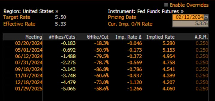
March less than 3 cuts

The market is sensing inflation.
What about growth? The sense here is that it might be stalling out. Recall I spoke about the Sahm Rule last week. Nancy Lazar highlighted this week that in 21 of the 50 dates, the Sahm Rule says we are in recession. Not nationwide yet, but moving in that direction:
The latest leading economic indicators are not screaming fast growth to us:

and home sales are still bouncing along the bottom in what is supposed to be a seasonally strong time of the year:

Not only that, but as I wrote on LinkedIn this week, home prices relative to the stock market, have never been cheaper:
Chart of the Day - relative value
I recall sitting on a trading floor in about 2015 and having the discussion about home prices. You see, this was more than 5 years on from the Great Financial Crisis and we had the benefit of introspection, and hindsight
The conversation started with a comment along the lines of 'if we knew now how the crisis would have played out, we would have bought all of those homes that were wildly discounted in price'
This was in reference to some of the big private pools of capital that snapped up houses by the 100s or 1000s and rented them out and were doing very well for themselves at that time
However, someone made the comment, 'if we knew now how it would have played out, we should have put all of that money into the SPX and done even better'
One needs to adjust each of the transactions for the same leverage etc, but the point is made, that stocks actually did outperform house prices, even though both went up considerably
It was thinking about this the other day as we see so many different asset prices making new all-time highs at the same time. I see some bigger homes around me not sitting on the market for very long at all. People seem to be cashing out of some stocks to buy houses
How many units of the SPX does it cost to buy the average house now? So I decided to take a look. The chart today is the median price of a home sold in the US divided by the SPX. It approximates how many units of SPX it takes to buy a house
The data go back to 1963 so I look at all of it. We can see that over the long haul, the average is somewhere between 250-300 units, though this line doesn't stay near the average for very long
We can see in the 1970s & into the 80s, the price of homes relative to SPX explodes higher. Perhaps this is due to the high inflation we had where real assets of all types went up much more than paper assets
Perhaps it is also because the Baby Boomer who are now retiring were then in their teenage years and so families were needing to buy bigger houses in order to house them all. Stocks were actually a relative bargain compared to buying a house
Now, if we look at it, house prices look cheap in comparison. It takes only about 81 units of the SPX to buy the media house in the US. This is a record low. Even in the tech bubble we were still more than 100
Now, with another massive demographic cohort in the Millennials in prime household formation age, looking to buy houses, with the inventory low, it would seem it may be a good time to cash out that SPX and buy a house
Yes, we have the problem of people locked into low mortgage rates who don't want to give them up. This will take some time to work through. However, you may be looking at home prices & thinking they are unaffordable. However, relative to the SPX, they have never been cheaper
As we would say on the trading floor, they are relative value

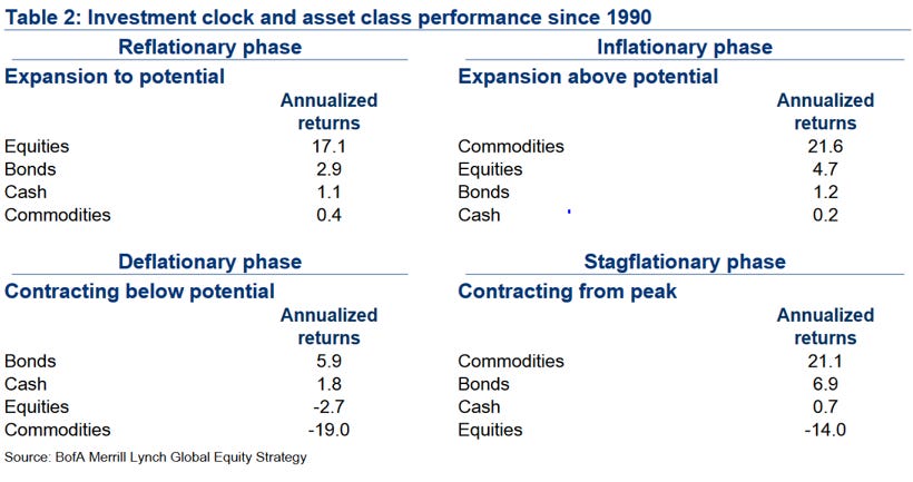
All of this starts to sound like stagnating, if not slowing growth, with inflation that is still sticky and potentially heading higher. In my Applied Portfolio Management class, we use a top-down investing technique, largely built around the concept of an Investment Clock that has been around for some time. There are clear allocations for the different phases of the economy. What does it say for stagflation?
Asset class - commodities should do the best, equities should start to struggle
On the relative rotation graph, look at the commodity ETFs starting to move into improving, while the leading equities are moving into weakening:

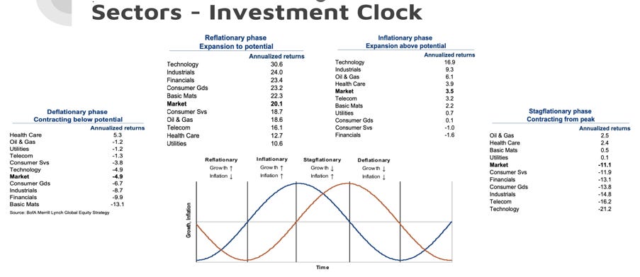
What about if we look at sector performance? In stagflation, oil & gas and healthcare lead the way, while technology suffers.
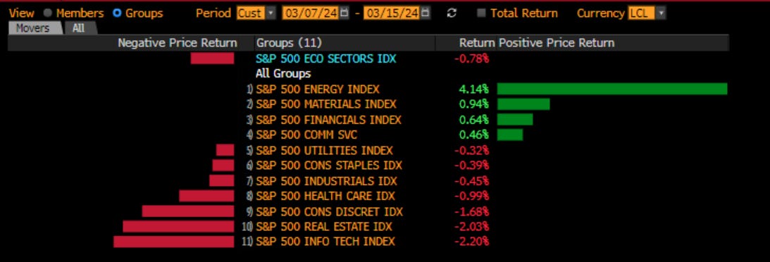
Look at returns over the last week or so. Is the market sensing a rotation?
Finally, what about by investing styles? JP Morgan did the work on this
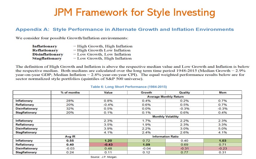
You can see over the last week, momentum is starting to struggle a little, while quality, profitability, variability, dividends are moving higher. Value, which does better when inflation is moving higher, is also doing better:

The market may be sensing that the Ides of March which we had on Friday, are a time of inflection points. Mr. Risk likes to point out that the Ides are an inflection either higher or lower. Last year it was higher. What about this year?

I think when we look through the price action of the market, and when we look through the data we have gotten, we can see that there is a shift. Much like the Bears shifted from Justin Fields to Caleb Williams, the market is starting to use its heart less and its head more. Why? The times, they are a-changin’
Stay Vigilant

Happy St Paddy’s day, Richard. Definitely feels like markets are at a crossroads trying to decide what to do next. I am staying mostly long with some dry powder on the side with more of an eye towards May/June/July…figuring out what to do between now and then. The summer of vigilance, imo…