


Tick tock, tick tock
What does your investment clock look like?


When it comes to investments, are you a bear, waiting for the alarm clock to ring and have this AI-led rally finally come to an end, waking up all of the people making ‘easy money’ in names like NVDA and now GME?

Or are you a bull, at the starting line, looking for the next stock to race higher because liquidity it abundant and even when it dries up, the Fed will be cutting rates and giving it another boost?

Or are you just biding time, punching the clock until you get to retirement, riding along in index funds and a 60-40 portfolio that may not be keeping up with NVDA, but are delivering returns that are just fine for you to maintain your lifestyle?
These are probably the questions many investment advisors try to ascertain of their clients when they sit down to meet them. I would argue, these are the questions you should probably be asking OF your investment advisor, because each of them falls into one of these categories as well.
For me, I have an entirely different type of clock. I have an Investment Clock.

Popularized by Bank America Merrill Lynch in the 2010s, the Investment Clock breaks the economy into four phases, delineated by growth and inflation, and suggests there are certain sectors and styles that will perform well in each of these phases and as we transition. BAML is not the only one to use this. I don’t even know if BAML invented it. In my portfolio management class, I teach the students about this but also go on to show them about 8 other firms that use some variation of this approach in determining asset allocation, country allocation, sector rotation and style shifts.
I like to look at the data, in order to assess where it looks where we might be going. Then I look at the performance of the market, to see where investors think we are going. I then determine if I think there may be an opportunity in all of this. As with a stock, investors all should try to understand what is priced into any investment. That is my approach in general and that will be my approach this week.
Growth
I started the week on LinkedIn but looking at growth. There is

Chart of the Day - pushing back
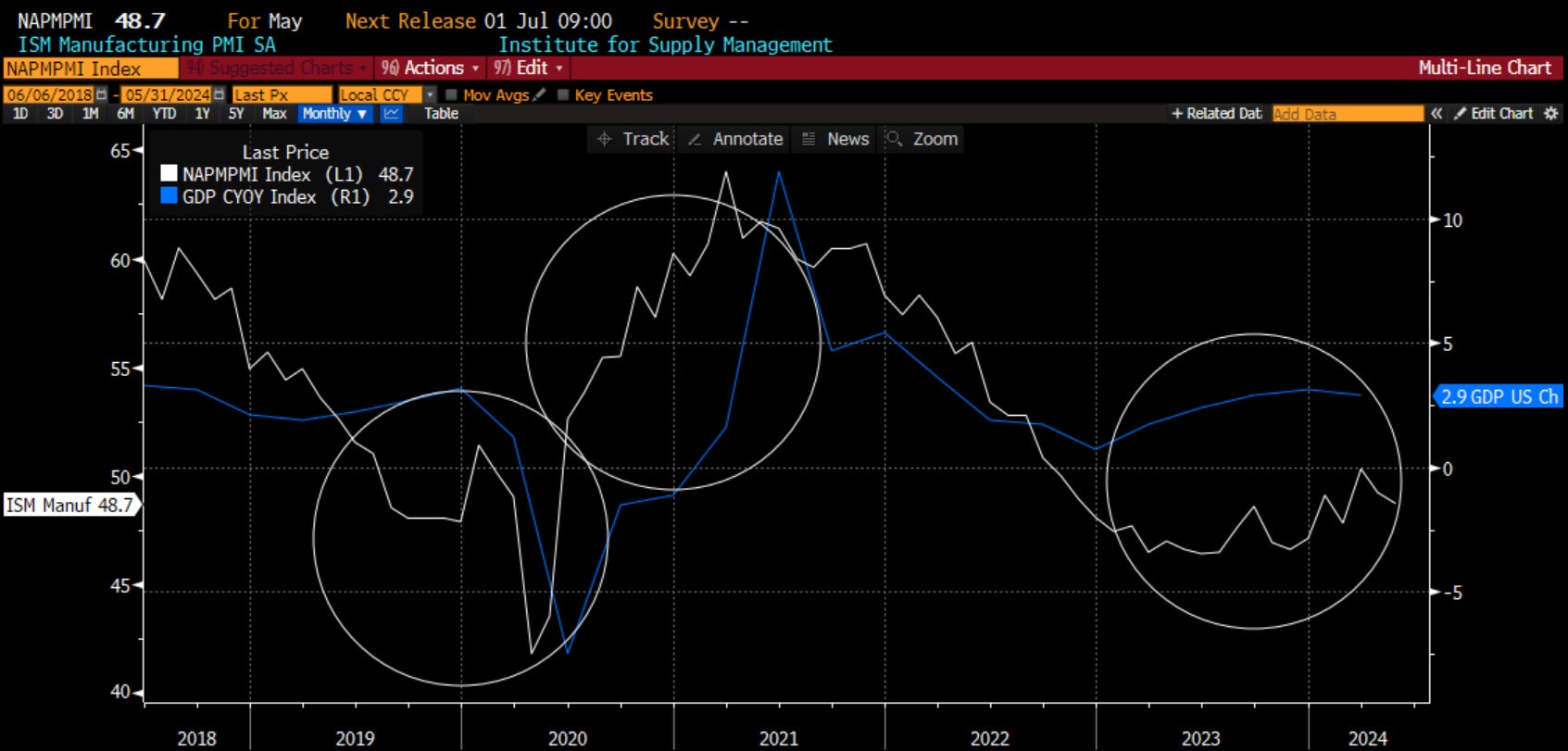
Yesterday the ISM came out weaker than expected. It wasn't just ISM headline but the new orders to inventories as well, which tends to lead the headline. Bond yields moved lower as a result.
However, maybe a bigger story of the day is that people came out & want to criticize ISM as not being accurate. They want to use GDP which has held up well. This is the same soft data vs. hard data debate that was going on back in 2018 & 2019
First, I think people misinterpret ISM. A reading below 50 does not signify a recession or even a contraction. The ISM itself tells us a contraction would come with ISM below 45
A reading below 50 means slowing growth. This is also why the ratio (or difference if you prefer) of new orders to inventories does such a good job of leading it. There is information in asking purchasing mgrs if they are ordering new things or running down inventory
Second, look at the results empirically. On the graph below we have 4 lines: the change in ISM, the change in GDP, the change in SPX & the ratio of new orders to inventory
As you can see, new orders to inventory leads the ISM which in turn leads the SPX. The GDP lags badly & is somewhat disconnected. It has not predictive power but tells us good what happened a quarter ago when equity investors care what will happen going forward
The GDP is also subject to continuous revisions. We get the first reading then then it is revised 3 more times before we get the final. The time series most data providers have is the final revised version. Is that particularly useful for forecasting?
Many will point to the strength in SPX the last 9 months, which has disconnected from ISM, to tell me I am wrong. However, look at the breadth of the mkt. Look at small caps which are saying the economy is tough. Look at the NDX without NVDA or the equal weight SPX
There are a handful of names on a powerful AI theme that are doing well. The others, not so much. One might suggest this is akin to the entire economy where there are a handful of people doing well & the rest not so much
Would love to hear your thoughts on which you prefer - ISM or GDP

Same graph (removed GDP) but added Russell 2000 small cap index. You can see small caps are performing in line with what ISM is telling us. The SPX is the outlier here. This does not mean that the SPX is a short, it means the SPX is telling us more about AI than the economy right now.

The debate on "soft data" versus "hard data" in financial markets has been a recurring theme, particularly highlighted during periods of economic uncertainty or when traditional economic indicators provide conflicting signals. This debate gained notable attention around 2017. During this year, the divergence between soft and hard data became particularly pronounced. Soft data indicators were showing strong optimism about economic growth and future prospects, while hard data indicators were not reflecting the same level of strength. This discrepancy led to significant discussions and debates among economists, analysts, and policymakers regarding which type of data provided a more accurate reflection of the economic reality. As we can see in the chart above, it was the soft data that ended up being correct as GDP ultimately caught up to ISM. I know which horse I want to bet on.
So, let’s look at the soft data and hard data again. Which data responded to the downside more quickly in 2019/2020, even before Covid? It was the soft data. What about in the recovery? Which data moved up the earliest and the fastest? It was the soft data. So, now that the soft data is pointing lower, while the hard data stays higher, this time it is different? This time the hard data is correct? Well, I know the four most dangerous words in finance are ‘this time it is different.’

Maybe I am biased by my preference for soft data like ISM. Perhaps I care about ISM New Orders too much. You know what leads the New Orders? Housing. How is the housing market looking right now? We get that picture from the chart above. Sure, I have included more soft data on there from the National Association of Home Builders, but that index has again rolled over and is looking weak. This is not surprising given the hard data of mortgage applications in blue is negative, as is the building permits data in orange. We all know that housing leads us out of and into recessions. The housing market is still struggling. This is a warning sign for growth. On the investment clock, we should be looking at the ‘growth weakens’ phase. Now we must determine inflation.
Inflation
One of my other LinkedIn charts this week was about liquidity. Even though the Fed has been ‘higher for longer’ and is embarking on quantitative tightening or QT, assets, especially the riskiest assets, are moving higher. Is this because our old measures don’t work anymore? Or is there something else afoot?

Chart of the Day - liquidity
I saw a good chart from MacroAlf yesterday that discussed the liquidity in the mkt, which is actually going up & not down even in the midst of the Fed's quantitative tightening (QT). This is because of the draining of the reverse repo facility (RRP)
The RRP was used just after the massive Covid monetary & fiscal stimulus as a way for the Fed to absorb some of the liquidity out of the system as it was pushing short rates to zero or even lower
Now, as the Fed does QT, mkt players are moving money out of RRP & into Treasury mkts. This then pushes each wave of investor a little further out the liquidity curve: from cash to 10yr, from 10yr to corp, from corp to equity, from equity to crypto
The chart today shows you the impact of this. I have inverted the RRP to show that as it went up, liquidity came out of the mkt. The assets most affected were Nasdaq, Bitcoin, Gold. You can see all fell in price
However, as the RRP gets drained, & it has gone from $2.3 trill in early 2023 to $370bb now, these same assets get pumped up. The constant bid for these assets that respond to liquidity is obvious in the mkt each day
One always asks how long this can last. Well, it could last another $370bb as you see it $0 back before Covid. However, the mkt is now also betting on the notion that by the time this ends, the Fed will be cutting rates, which will be stimulative too
We have seen this the last several days as odds of rate cuts in Sept & Nov are starting to be priced in. There are a handful of folks who are suggesting July is in play as well given the much worse than expected data of late. We have shown that with Citi Economic Surprise Index, ISM etc.
At the start of the year, I said I thought there could be three scenarios: 1. Fed does nothing because the economy is growing. Higher for longer but earnings hold up 2. Fed cuts rates in a soft landing, very bullish but already priced in 3. Fed cuts rates because the economy is slowing rapidly. Not as bullish as everyone thinks
We will still see how this plays out. The mkt was at 2 and started to move to 1. Now it is moving back to 2. Will it get to 3? For now, it doesn't matter with the liquidity being pumped in


One of my follows on Substack is Mark Higgins who wrote “Investing in US Financial History.” This week he shared a link to a podcast he did with Kathleen Hays. This took me down a little rabbit hole of listening to more of her pods. Kathleen’s is another good follow. I have the link above to the clip of Mark and Kathleen. Mark referenced various periods in history that the current period resembles. He focused on the late 60’s. He talked about not how the Fed is pushing on a string, but how the Fed is pushing on a spring. If it decides to cut now, it risks a repeat of the 1960s. Have a listen above. The chart above is an overlay, with all of the caveats about the risks of overlays, that shows the current period for CPI from 2020 to the present. It is compared to the period of 1964-1974, before things got really ugly.

I think the most important metric to follow is the core, ex-housing, services inflation or the supercore. It is in white above. I compare this to the 2-year US Treasury yield as well as Fed Funds. Supercore has been moving higher since the end of last year. With the labor market holding on, workers are looking for higher and higher wages. The market is responding by pricing rate cuts out of the curve, which is reflected in the 2-year. If we look back just a few years ago, the spike in supercore led to a move higher in the 2-year, which ultimately led to higher Fed Funds. Right now, we have a move higher in supercore, which is leading to higher 2-year, but somehow the market thinks the Fed is going to cut, with some suggesting it will cut in July. As you can tell, I do not agree. If they do, I think Mark is right and the Fed is risking pushing on a spring.

One last measure of inflation. Here I look at the Atlanta Fed sticky core inflation. The blue line is the 3-month annualized rate with the white being the 12-month rate. You can see that, not surprisingly, the 3-month leads the 12-month. There was some hope that the 12-month was falling. Over the last 6 months, the 3-month sticky core has been moving higher. Does this tell us that inflation may be heading back higher?

One last chart. This one is the change in M2 money supply. Recall that this is not just ‘the Fed printing money’ as some think. In fact, the central bank doesn’t create money supply. Commerical banks create money supply by extending credit. Of course, the central bank does create the conditions that make commercial banks feel comfortable to extend credit. So will competition from private market lenders. We have seen money supply growing. In the past, the moves higher, and lower, in this metric, has also driven the CRB raw industrials index, which are commodities not traded on exchanges. This index has led CPI. We will get CPI next week. What will it show? For me it will show inflation is either unchanged or moving higher. It will show inflation is still a problem. It will show that we need to be looking in the inflation rising phase.
Market moves
What has the market been doing?
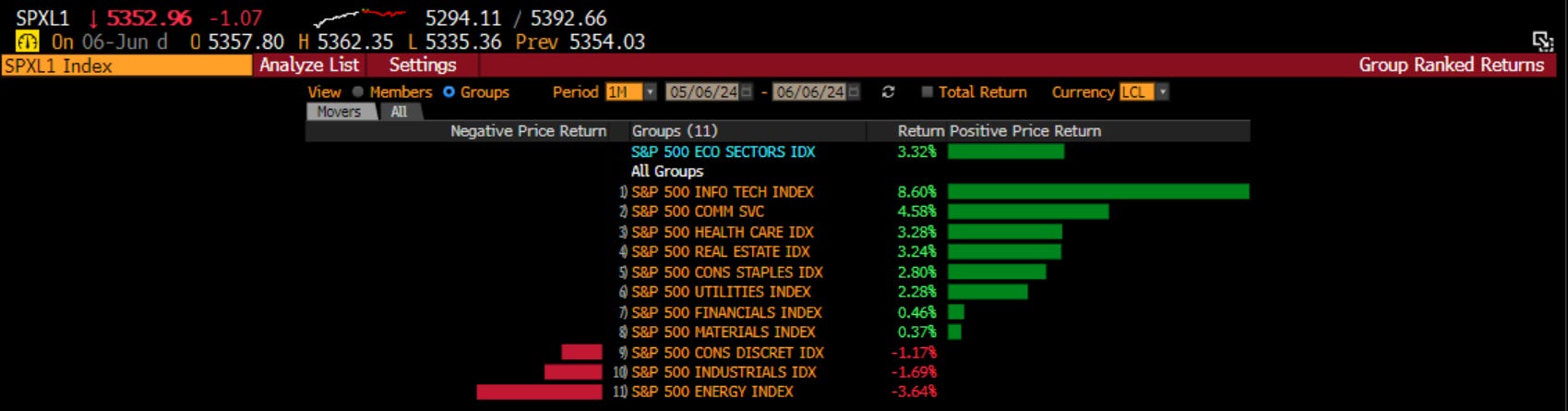
If we look on a sector basis, we can see it is tech, communications and healthcare leading the way while energy, industrials and consumer discretionary are falling.
What about the styles?

Momentum, large size, earnings revisions and low volatility are leading the pack. It is interesting to see what is lagging, as both share buybacks and short interest are down year to date when we look at the factors on a long/short, sector neutral basis. Value is also down on a year-to-date basis.
Bringing the Investment Clock back in, it is time to assess where we think we MIGHT go, while we also view where the market THINKS we are going. Recall, I said that the data appears to suggest growth will be weakening but inflation still rising. This puts us in the upper right corner of “Overheat”. What should be doing well at this time? Industrials, Materials and Energy. Cyclical stocks. Value stocks. How are those sectors and styles doing over the last month? Those are actually the worst performing areas of the market. Hmmm.
When we look at what has been working, what is the market expecting? Tech, communications and growth. This is in the upper left quadrant or the ‘Recovery’ phase. However, we do see that in this phase, Consumer Discretionary does well early but is the first of the sectors to fade. Go back above, how has it done the last month? It has been negative.
So, perhaps we are at 12 o’clock on the investment clock. Right at that time when we transition from recovery to overheat. When we transition from Communications to Energy, from Consumer to Industrials, from Growth to Value. Is the market positioned for this? Is the market looking for that or is there an opportunity?
It all depends on which clock you are watching.
Stay Vigilant
Definitely do not look at GDP. If you look at the historical revisions from the first print to the finally revised one years later you are looking at a 95% confidence band of nearly 500bps. That is one reason not to endorse Nominal GDP targeting as an alternative way to run monetary policy. So stick with ISM, but one final thought, I have never seen so much push back against surveys as we have had this cycle. Admittedly, this is more about political bias charge leveled at UofM survey, but to lesser extent all surveys seem to have been kicked to the turf more than usual. For me old habits die hard, I am sticking with the surveys as a good timely indicator.