The 14 charts of Christmas
With two weeks to go until Christmas, this week I will give you one chart to think about per day until December 25
It is that time of the year when many are shopping for and wrapping presents for friends and loved ones. It is also that time of the year when Christians have their Advent calendar where they open one door/box/compartment per day every day before Christmas and see what surprise is inside. I notice we have moved from chocolates or small toys to wine bottles, coffee or craft beer. Whatever your flavor, it is a time of anticipation and surprise.
With that in mind, and sticking to the same three component framework, I gave you a chart for each of the 14 days before Christmas. I will be writing less as the year winds down. Next week, I am going to post a podcast I just did that looks at China and Japan and the impact these two large economies can have on the rest of the world in 2023. The last Stay Vigilant of the year will be a review of the year. It is important for all of us to do that in our process, to see where we succeeded, where we failed and how we can improve. Look for that in the week between Christmas and New Year’s. For that, I am going back to the narrated slides that seemed to be well received.
For now, I hope you enjoy the 14 Charts of Christmas!
FUNDAMENTAL
Relative Valuation
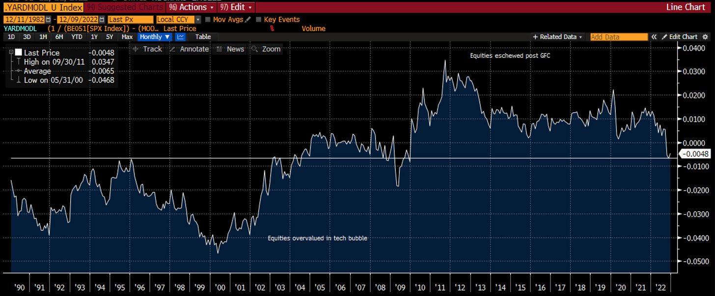
When one is looking across markets, either for guides to risk and opportunity, or for signals on how to tactically allocate, there needs to be some bases for relative valuation. As one can show statistically, for any market there is really no statistical significance between valuation and 1 year return. However, over a 10-year period, valuation is the only measure that matters. Thus, we can’t use this as a market timing tool, but we do want to understand the environment we are in and whether there is a margin of safety or not.
For this relative valuation, I use the Yardeni Model, which is a variation of the Fed model. The latter compares equities and Treasuries. The Yardeni Model compares equity and credit or the two beta markets that allocators may choose between. It uses the S&P 500 earnings yields and the Moody’s Baa corporate rate. You can see back in the 90s, with scores consistently negative, it showed that the equity market was overvalued for a long time vis a vis credit. This didn’t mean that equities were an obvious short because it took a while, however, it did point out the margin of safety was quite low. Post the GFC, we can see the same effect with investors favoring credit for most of the last decade, but this peaked in 2011-2012. At this point, we are at the average line of the last 40 years and basically at zero i.e. the earnings yield and corporate credit yield are the same.
Economic Trend
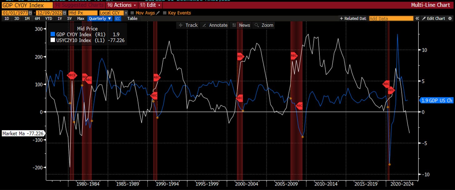
I have said repeatedly that the economy drives earnings and earnings drive stocks. Thus, one of the 14 charts has to be about the economic trend. There is no better forecaster for the economy that the yield curve. It has correctly predicted every recession. I show you the 2-year vs. 10-year yield curve (longest history) vs. real GDP. I also highlight the recession periods. We can see every time we have had an inversion (even if ever so slight), we have had a recession which has meant a negative real GDP. Even on this front, it was mild in the early 00s but that can be explained in some ways because of the stimulus that came as a result of 9/11. The yield curve is strongly signaling a recession and zero real GDP in the coming months. Are you prepared?
Liquidity
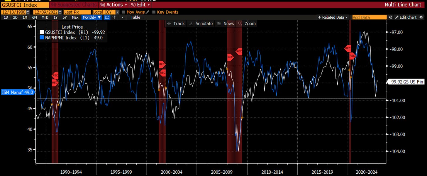
I have always looked to liquidity as a key to the economy and markets. It has a heightened sense of importance this time as no less than Jay Powell himself has highlighted financial conditions as a key criterion to watch. In this chart I use the Goldman Sachs financial conditions index because this is what the Fed uses as Bill Dudley created it while at GS and brought it to the Fed. Looking at the inverse of financial conditions, I overlay vs. the ISM. Falling levels here are also seen prior to recessions. The ISM has not hit the 47 ish level we typically see before a recession. However, with JayPo indicating that he wants financial conditions much tighter than now - driven by equity returns, credit spreads, the level of interest rates and the Dollar - a fall in ISM and a recession seem inevitable, or at least not consistent with the soft-landing many Fed speakers point to and the equity market appears to be pricing in.
Velocity
As a monetarist, I feel the Quantity Theory of Money is a very useful stylized version of the drivers of the economy. M * V = P * Y is not only an academic equation, but I find that many of the economic models my students build to forecast the economy have their roots in this equation as well. At the CFA Annual Dinner in 2020, Austin Goolsbee, the new Chicago Fed Chair, made an important point to the audience. At that time, all of the focus was on the growth in money supply, which had hit the highest level in the history of the USA. He pointed out that the Quantity Theory of Money showed us there is another critical measure to consider - velocity of money. IN practice, we can only observe this after the fact, but as a gauge of the propensity for companies and business to demand the use of money, there are many things we can watch - mortgages, auto loans, credit card usage etc. For companies, I feel one of the most important right now is Capex spending. Why? Companies are in the process of rationalizing supply chains, near-shoring, and building redundancies. When Capex spending drops below 0% on a year over year basis, there are almost always recessions (2015-2016 is an exception). Right now, this level is far from 0% and may be one metric that is suggesting a soft-landing.
BEHAVIORAL
Confirmation Bias is the tendency to interpret new evidence as confirmation of one's existing beliefs or theories.
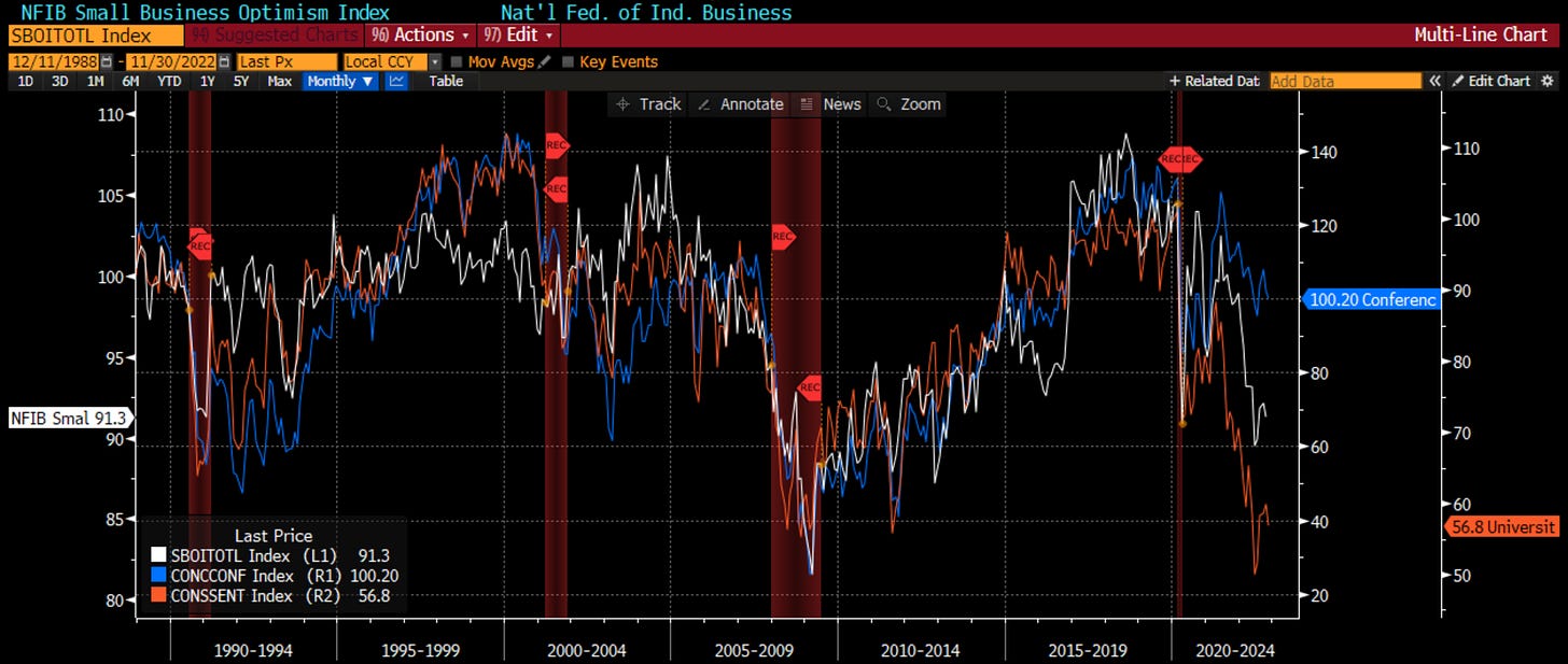
You can’t look at social media without seeing a survey that is confirming someone’s beliefs on the economy, on markets, on Elon Musk, on just about anything. We need to be careful to avoid confirmation bias ourselves. In order to do so, I look at all of the surveys combined. I will not bore you with a chart of all, but these are the three most important - Small business optimism, UofM confidence and Conference Board confidence. I have shaded the recessions too. You can see when Small Business Optimism falls below 95, we tend to have a recession. It isn’t perfect. Sometimes we do without it falling, and sometimes we don’t when it does. However, suffice to say that small businesses that hire the most Americans, are not feeling optimistic an dthis isn’t a good thing. I have highlighted the difference in the past between Conference Board and UofM (jobs vs. inflation), and one says we are clearly on the path to a recession while the other does not. However, even the 20% fall in the Conference Board tells us there is trouble ahead.
Representativeness heuristic is used when making judgments about the probability of an event under uncertainty.
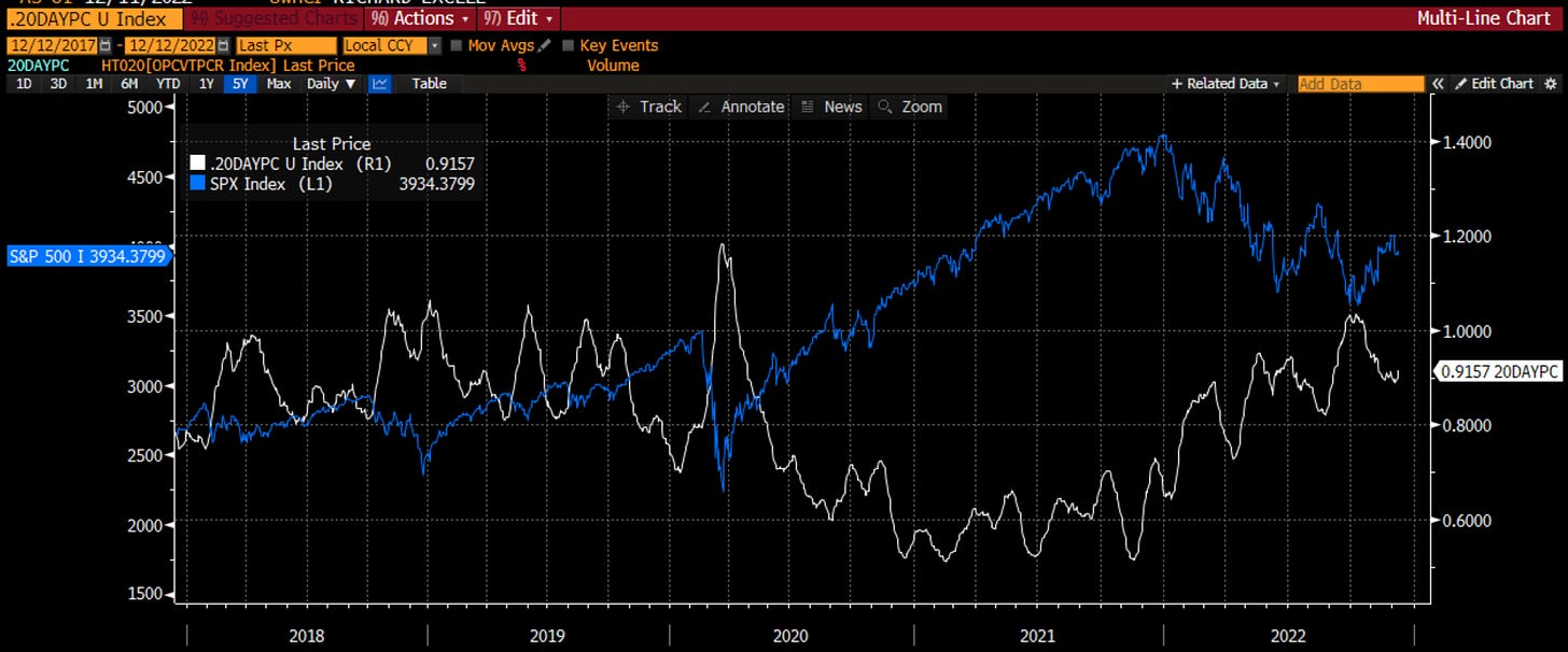
I feel that nothing explains this better than the options market. When investors are forced to make decisions under uncertainty, they often look to the insurance value of the options market. When we see more investors preferring the protection of put options, vs. the yield enhancement of call options, bad things tend to happen to stocks. I look at the 20-day moving average to smooth out the noise. We are coming out of a 6-week period where there was a preference for calls over puts. That is changing (you can ever so slightly see that). This potentially is a negative signal for stocks. Rising put-call levels lead to negative returns for stocks. When it starts to rise, it typically continues. Be careful.
Cognitive Dissonance is the state of having inconsistent thoughts, beliefs, or attitudes, especially as relating to behavioral decisions and attitude change.
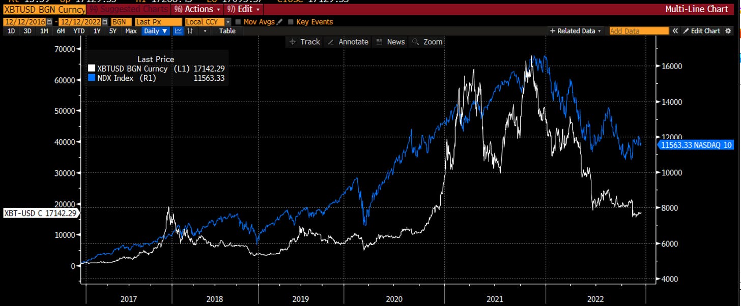
For many people, this may be their notions of cryptocurrencies vs. stocks. We see maximalists think that Bitcoin can go to a million while stocks should crash. We see others saying crypto has been identified as a scam, but we should by stocks for the start of a new bull market. However, for the last 6 years, outside of some timing differences, Bitcoin and the stock market (NDX here) have moved together, driven most likely by the same combination of free money and investor enthusiasm in growth that would endure forever. While I do not suggest one does or should lead the other, I would suggest that a disconnect tends to not be permanent. We saw a disconnect in 2021 that led to Bitcoin going back to the highs. We see one now. How will it be resolved? I have a feeling NDX fans won’t like the answer.
Loss Aversion is the tendency to prefer avoiding losses to acquiring equivalent gains.
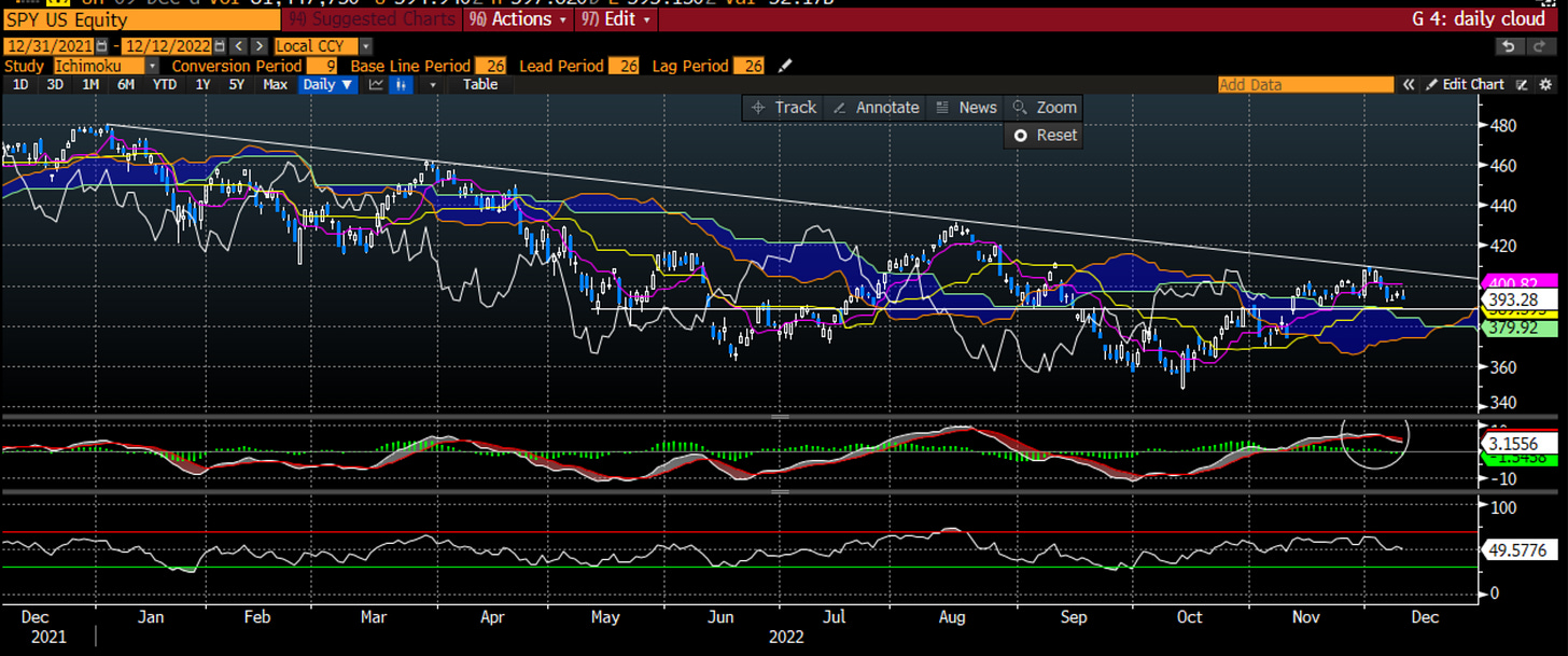
This is why I use technical analysis as part of my process. It brings a perspective, objectivity and discipline that can be lost in a purely qualitative approach. Looking at the weekly SPY chart, we can see the downtrend line that has worked all year long once again proved to be resistance. The MACD is rolling over. Neither of these are good signs. The support for SPY comes in at 388. If that doesn’t hold, we are quickly headed back to 360. Let’s just say, I own puts.
Anchoring Bias is a cognitive bias that causes us to rely too heavily on the first piece of information we are given about a topic.
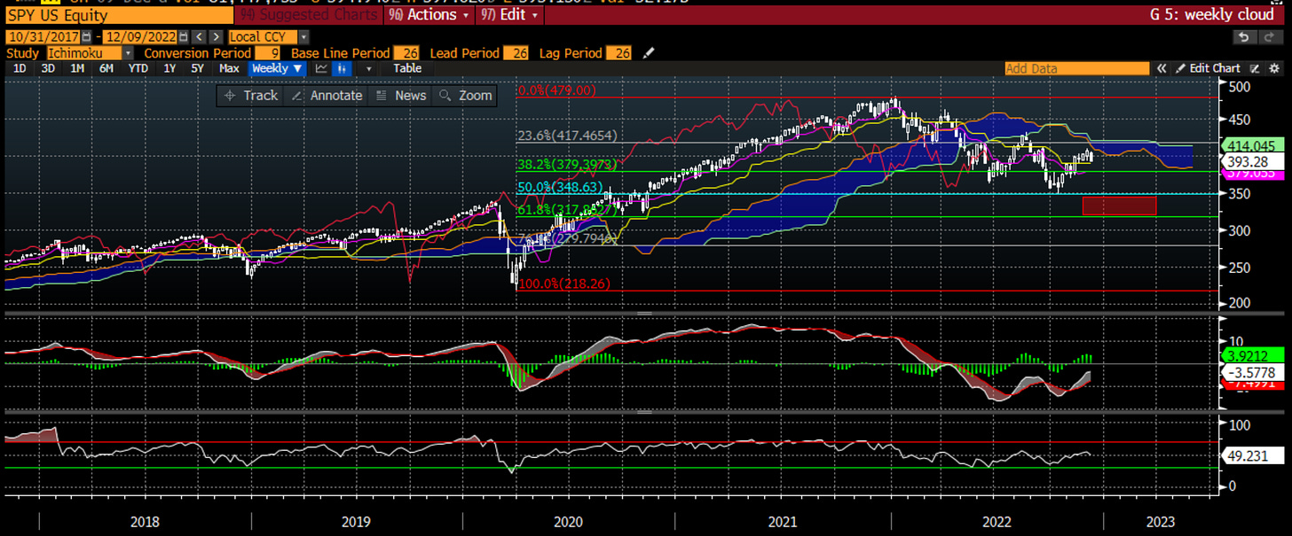
Again, I use technical analysis to try and stay objective. We are so focused on the discussion of recession vs. soft-landing, or peak Fed at 4% vs. 5%, or will housing lead to a crash or not. Sometimes we want to step back and look at the single best leading indicator of the economy is telling us. What is the medium-term trend of the stock market? If I didn’t put a label on this, you would probably agree that the trend of this asset is headed back toward that red-shaded area. At the very least, there is a lot of resistance above which means we need a lot of good news to change direction. The weekly trend still tells us the worst isn’t over. Objectively.
Framing Bias occurs when people make a decision based on the way the information is presented, as opposed to just on the facts themselves.
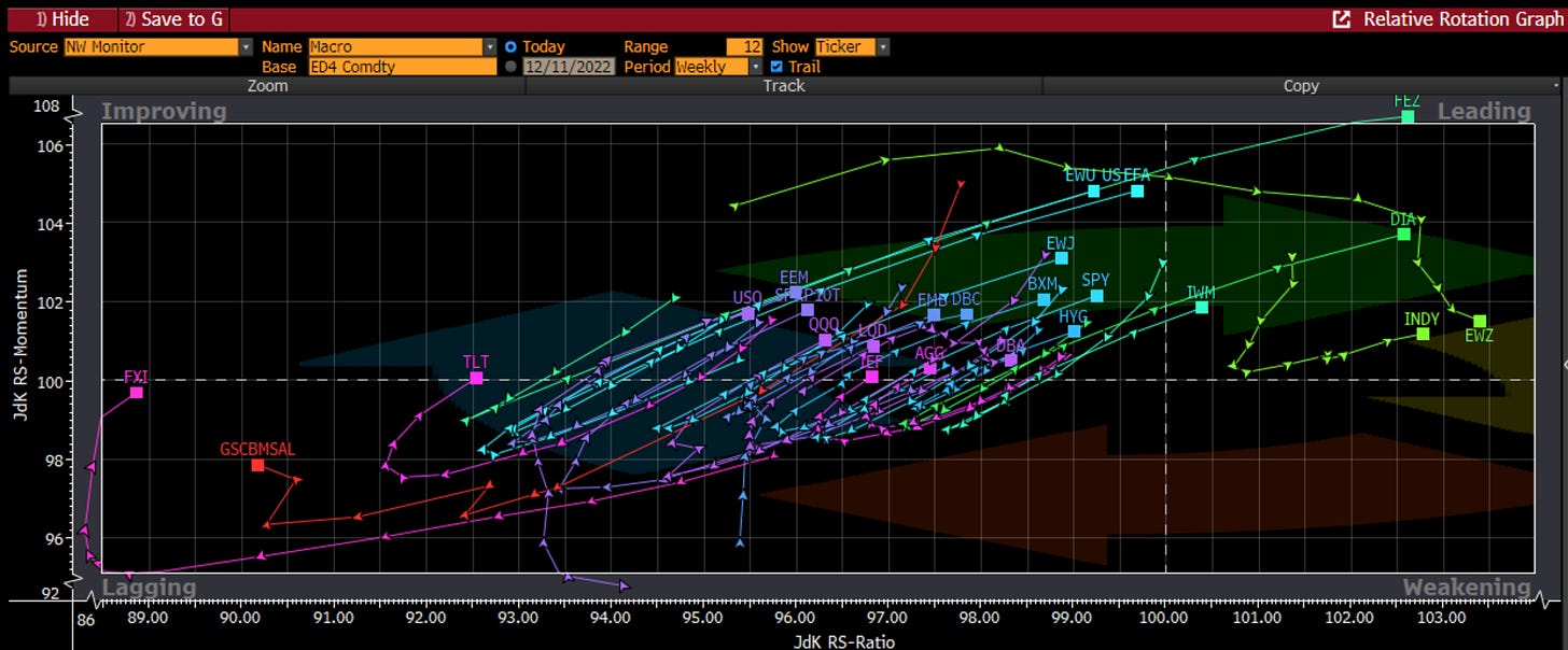
Market information and social media are both guilty of this. Put the two together in FinTwit and you have a dangerous combination of framing bias. Throw in the fact that you have equity people espousing one view, fixed income people another, and derivatives traders a third. Hedge funds are biased in ways that long only investors are not and vice versa. However, if you look at what they do and not what they say, if you look at what prices of the many assets globally are doing versus each other, you can start to avoid this bias. The leaders for the last several months have been Brazil, India and Europe. Within the US, the old economy Dow has been a leader. The high-short interest index has done poorly as has US Treasuries and China. All on a relative basis. If we look into that ‘Improving’ category, which can be the place of some very good returns, it looks like a pro-risk bias to flows - SPX, Japan, Emerging Markets, High Yield bonds. More and more commentary, even my own, is quite negative. The flows may signal something different.
Overconfidence is a well-established bias in which a person's subjective confidence in his or her judgments is reliably greater than the objective accuracy of those judgments, especially when confidence is relatively high.
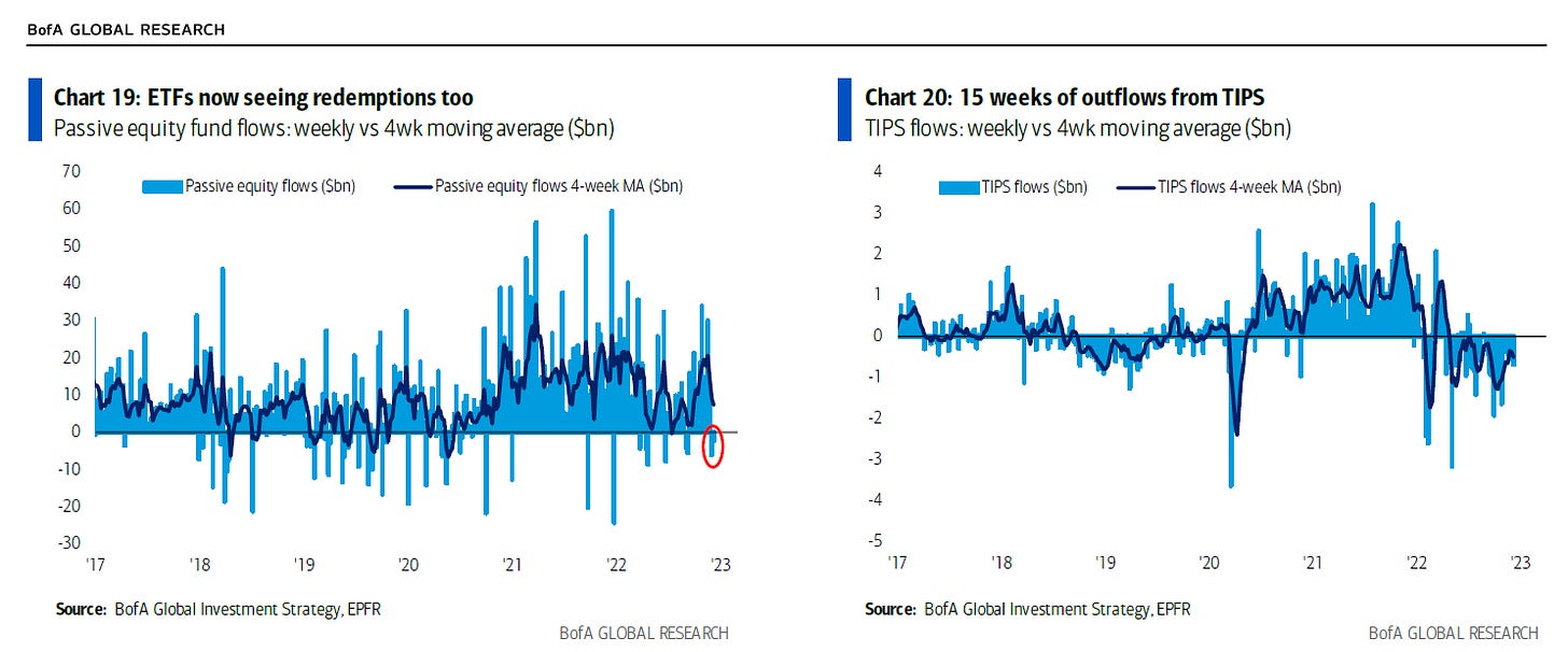
We see this the most in equity fund flows, corporate M&A, and IPOs brought by bankers. I looked at the latter two last week. This week, I show you the fund flows into equity and TIPS (Treasury inflation-protected securities). Equity flows had been positive but have gone negative. In addition, the flows to TIPS show that investors are no longer worried about inflation protection and are focused most likely on economic growth. This tells me bad news will be bad news going forward instead of bad news being good news in the sense that it would reduce the influence of the Fed. This pivot bears watching especially as we might be moving into a period of bad economic news.
CATALYST
Earnings Surprise
The economy drives earnings and earnings drive stocks. A key premise to my approach. In previous recessions this century, earnings have fallen 22-43%. This time might be very different. We don’t know. However, if the fall is about 25% which it was in 2001 and 2020, that would put S&P earnings at $175 in 2023. What multiple do you want to put on that? 20x? Seems a bit aggressive. Right now, the multiple is 17x which is still above 15x the average of the last 30 years. This points to an SPX in the 3000-3500 level. Want to know what else does? The red box on the weekly trend a few charts ago.
Economic Surprise
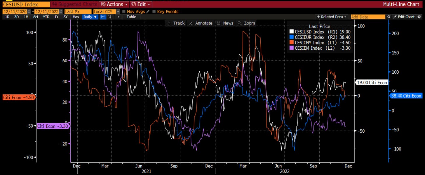
Markets move at the margin. Prices are set at the margin. Analysts and traders adjust to information. The economic surprises therefore have a mean-reverting tendency to them. Right now, in the US, the economic data has been better than expected but more likely that not will start to disappoint given this tendency. On the flipside, EM economic data has been consistent worse than expected and might start to improve. How does each of these possible events impact the relative markets? Is it time to look to allocate to EM and out of US? Particularly if the Dollar has seen its peak?
Geopolitics
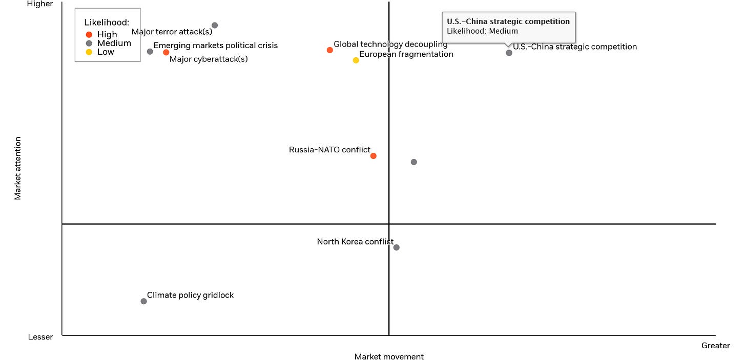
The final category, the final chart, is on geopolitics. This comes from Blackrock which does an interesting approach to framing the various problems to what would cause the market to move the most vs. what has the most market attention right now. Overall, Blackrock (and others) see us in a heighted period of geopolitical risk. What could move the markets the most? That gray dot in the middle (unidentified) is Gulf tensions. Could we see tensions come into the Gulf post the World Cup the same way we saw tensions rise in Europe post the Olympics? Is falling oil price enough of a trigger?
I hope you enjoyed my 14 Charts of Christmas. Remember, if you like Stay Vigilant, please like, subscribe and share. If you don’t, please let me know why so I can improve. Either way …
Stay Vigilant




great take, thank you! have a great Christmas soon ! :)
Lots of gems in here...Markets bottom when ISM bottoms and the Fed pivots---Of course markets are forward discounting mechanisms. So what we have here is divided opinion. Bears see ISM going lower, as recession is not fully reflected and equally they are sceptical that discounted Fed Funds peak and subsequent rate cuts priced in makes any sense. It has become quite binary because bulls see peak inflation, peak rates, and ISM bottoming in line with typical 18-21 month cycle as well as a belief that earnings downside is not typical in this cycle. Are you a glass half full or half empty sort more or less divides opinion